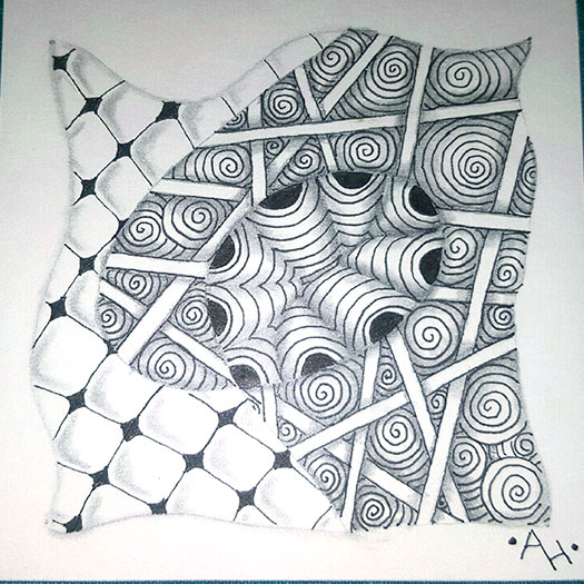
From the Zentangle Primer: Exercise 1, page 33.
For this exercise, we each had to create a Zentangle using the same tangles as the first. However, we were to shade them differently.
Amanda’s artwork is above. You can see how she shaded around the outside of the central bobble which makes it appear more like it is floating above the tile. She also altered Printemps from her original style. This version gives it a lot more drama and depth.
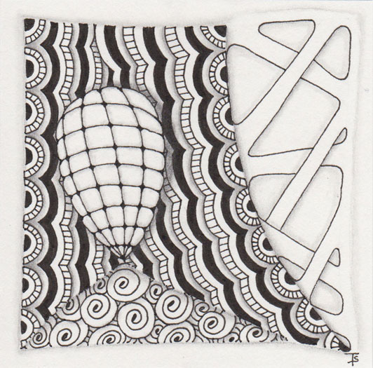
My artwork is above. In addition to changing the shading, I also changed the style of each of the tangles. I chose to wrap Florz around a bobble and give it more of a 3D, or dimensional feel. I took a lot of creative license with Cresent Moon, adding more details and treating it more like ruffles. I normally draw Printemps fairly small, but here, I tried to make it much larger than I normally do. And for Hollibaugh, I rounded out the areas where the strips ran into the border.
I actually really like the effect of all of these, and will add them to my repertoire to use again in the future!
Zentangle drawn on Strathmore Vellum Bristol using a black, Micron pen. Shading done with graphite pencil.
#zp1x1