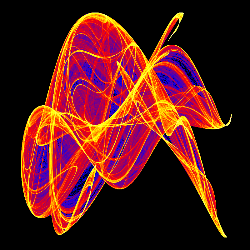
In my last post , I took a first stab at coloring a de Jong attractor. Here was my image:
The main problem was that I had wanted an image in which the points with the fewest hits were blue, transforming to red for points hit the highest number of times, but as you can see, the image was stubbornly mostly blue, whereas I would have expected a lot of shades of purple as the blue transformed to red.
Today, I’ll try it again. I’ll use a different image, one using the constants a=0.58582, b=1.90975, c=2.98483, and d=-2.00000. Here’s the initial greyscale image:
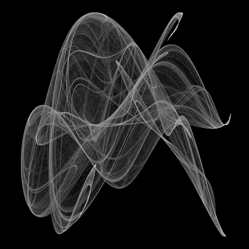
The change of image is just for variety, the techniques here will work on last week’s image as well.
In the greyscale image, the points are black where there were no hits from the de Jong equations, white where there were the most hits, and shades of grey in between. I’d like it to leave the black background, but otherwise have about a third of the pixel blue, a third red, and a third yellow. There would be a lot of purple and orange as the colors morphed from one to the next. Lets give that try:
Not bad, but it’s still fairly blue-heavy with almost no yellow. A look at the histogram for the grey image tells us why:
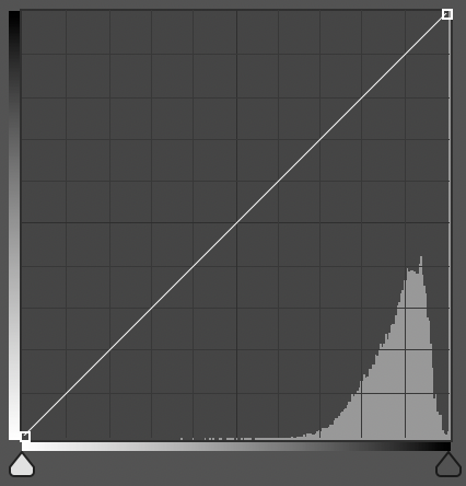
Almost all the points are dark! So if we have the darkest third of the range fade from black to blue, the middle third fade from blue to red, and the lightest third fade from red to yellow, then we’ll get a lot of blue, a little red, and pretty much no yellow. One other thing to note from the histogram, if you look carefully, you’ll see that while there is a peak in the dark third of the graph, there is a much larger peak all the way to the right for the darkest point. These are the background, and can be safely ignored when trying to apportion points to color ranges.
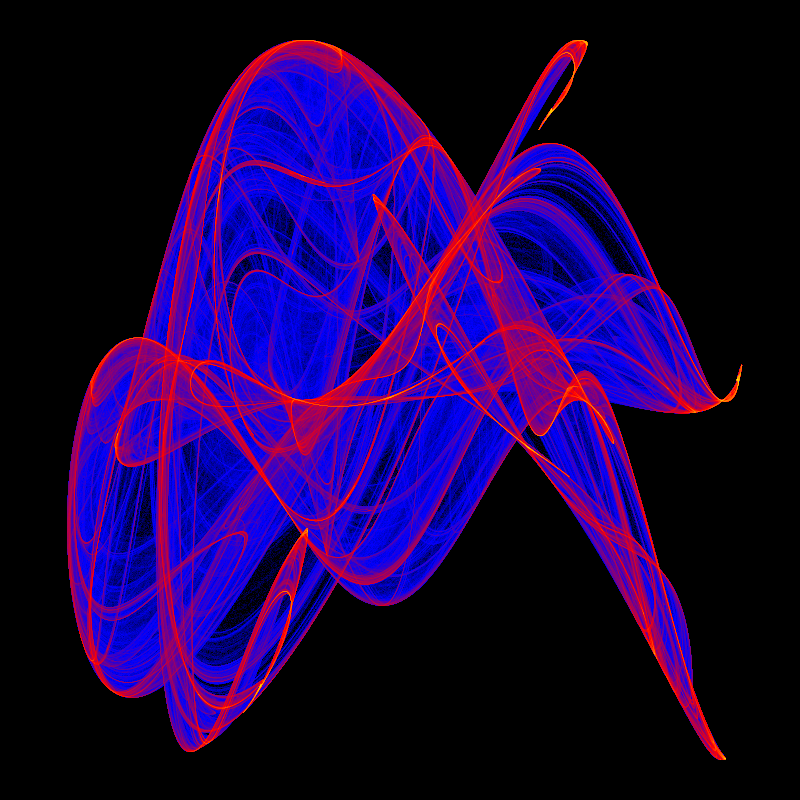
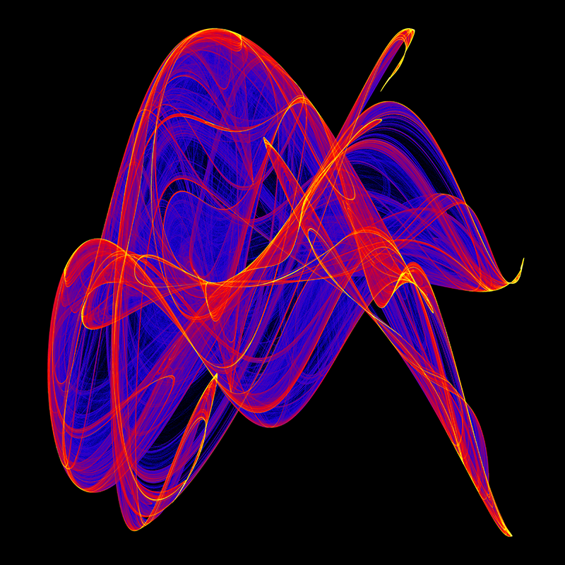
So what we should do is assign color ranges so that each will include about a third of the pixels instead of a third of the range of pixel values. The ranges you choose will vary from image to image, as each image has its own unique distribution of values, so you need to experiment. Here is the image again. I have added a fourth range for the very brightest points, they will go from yellow to white. Because we started with a 16-bit greyscale image, it had values from 0 to 65535. These values represent the number of times each point was generated by the de Jong equations, and in the greyscale image were used to represent brightness. For the following image, I mapped them as follows:
Values from 0 - 5461, about 8% of the range, are mapped proportionally to colors between black (#000000) and blue (#0000FF).
Values from 5462 - 27306, about 33% of the range, are mapped proportionally to colors between blue and red (#FF0000).
Values from 27307 - 38229, about 17% of the range, are mapped proportionally to colors between red and yellow (#FFFF00).
Values from 38230 - 65535, about 42% of the range, are mapped proportionally to colors between yellow and white (#000000).
Notice you don’t see much white in this image – that’s because there are almost no points in that range. However, somewhere in this image there is one pure white point. You may look for it if you like (or you can just trust me…).
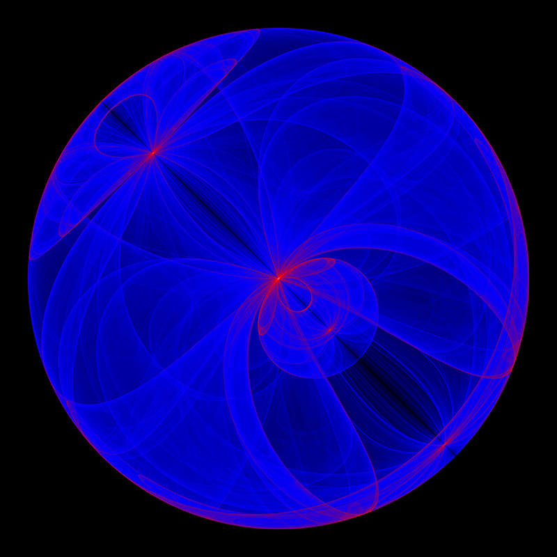
I mentioned earlier that you will need to experiment with different ranges for different images because of the differences in the distribution of values. It turns out that is true for the same image at different resolutions! The image above was generated at 800x800 so it would fit nicely in this post. Using the same ranges for the same image at 6000x6000, we get a very different result:
In this case, the percentages of the ranges need to be adjusted to get good results. This image was generated with the same colors as before, and with these ranges:
Values from 0 - 1424, about 2% of the range.
Values from 1425 - 15671, about 22% of the range.
Values from 15672 - 29918, about 22% of the range.
Values from 29919 - 65535, about 54% of the range.
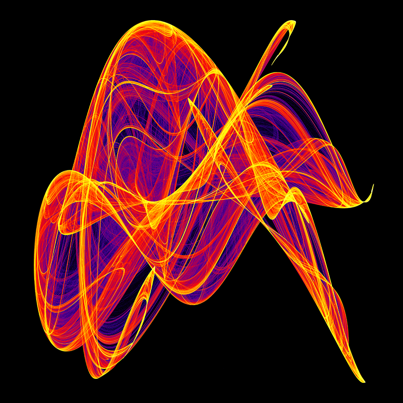
I’ve chosen to allow less blue into the image (just because I can!), but by adjusting the ranges, I can get whatever mix I want.
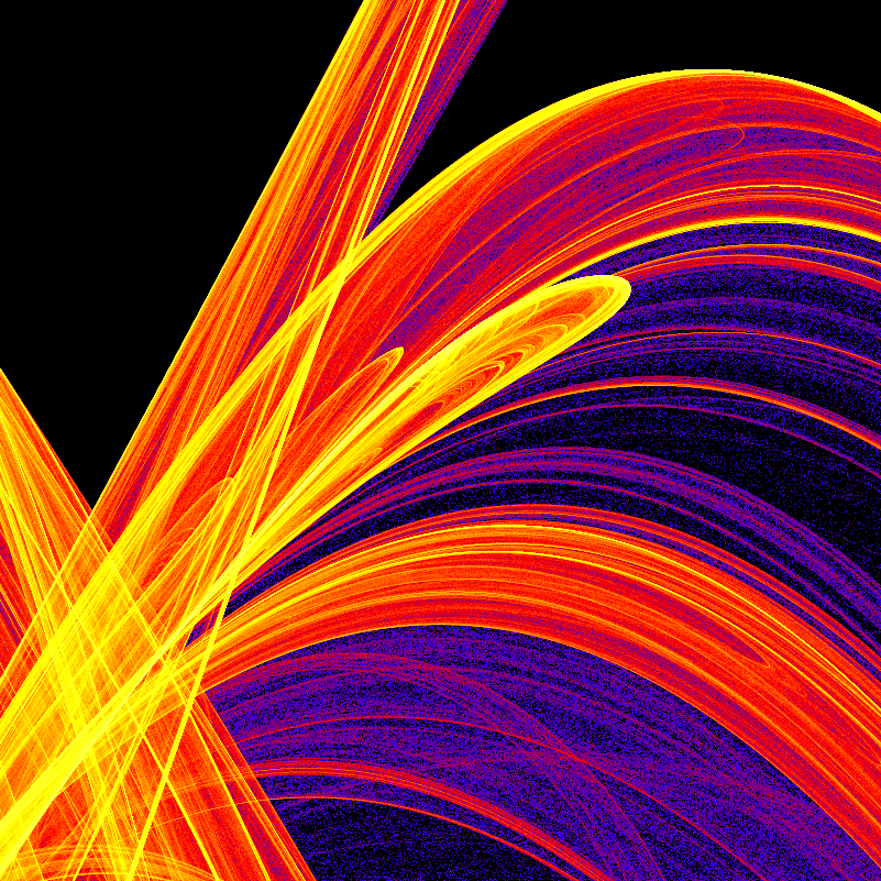
There’s no point in generating a 6000x6000 image without gratuitously showing some of the detail found in such a large image. The image at the top of this post is a small portion of the previous image at full resolution.