This final layout in the Collaborative Artists’ Journal features Judy’s response to the “Self Portrait” prompt on the left and an abstract collage on the right.
The background of the left page is more faux journaling, and stamping with a handwriting stamp.
Judy created a pocket, to hold a folder from beautiful, torn, aqua, hand-made paper. She’s accented it with two rows of emerald jewels.
The pocket contains a folder made from black paper and painted with aqua and white inks. It also has bits of faux journaling in white. Inside the folder is a bit of writing and a photo of herself. I didn’t take a picture of the inside of the folder out of respect for her privacy. I didn’t want to do it without her specific permission.
This spread was created to accomodate the back side of Judy’s response to the “Self Portrait” prompt. When she turned hers in, the back side had these beautiful, faux journaling markings on it. I didn’t want to completely cover them up because they were so wonderful.
Instead, I chose to create a contrast to the monochromatic paper by using this bright, turquoise blue paper on the left side, which has a rich texture on it’s own.
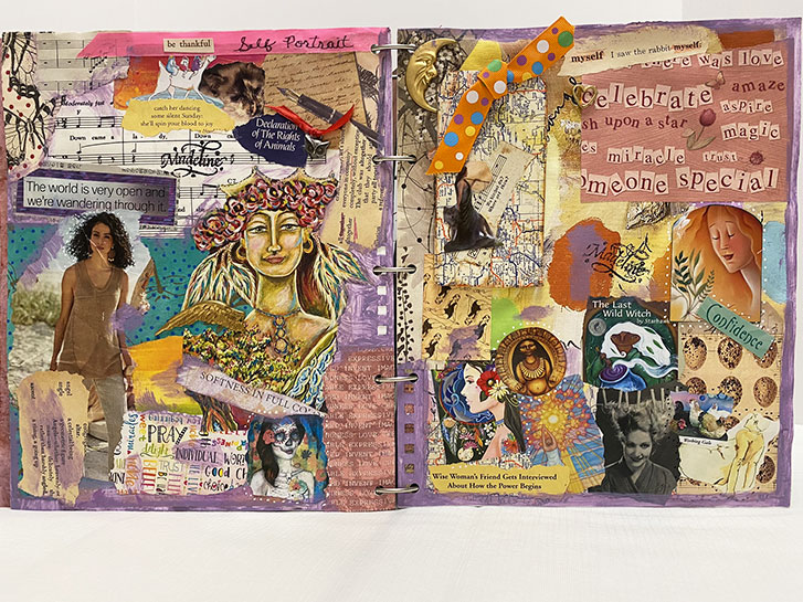
This wonderful layout is Madeline’s response to the “Self Portrait” prompt.
Madeline works in an intense collage style which yields lots of rich texture and interest. There are many 3D elements here, including ribbons and charms.
She has used papers, images from magazines, words from books and stamps, tape and paint to create this homage to the self!
Left: Madeline Hill Kasian Right: Madeline Hill Kasian
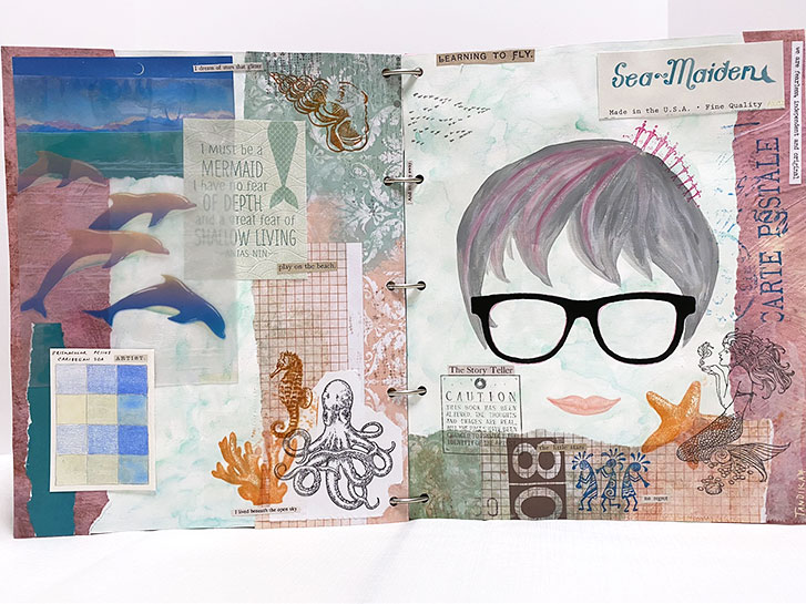
The final prompt in our collaborative book is “Self-Portrait”. I think that this is, hands down, the hardest prompt for most artists. We would much rather paint a beautiful, abstract scene than create something that is pointedly about ourselves.
So I chose to represent myself as my personal icon. Although I did make grey hair, with a bit of pink, rather than all pink.
I am surrounded by all the things from the sea that I love. I’ve also included a color swatch, to represent my art and a few hints of my southwestern heritage.
I wish you could see Judy’s wonderful pages in person. There is so much rich texture that I think is hard for the viewer to appreciate through a photograph.
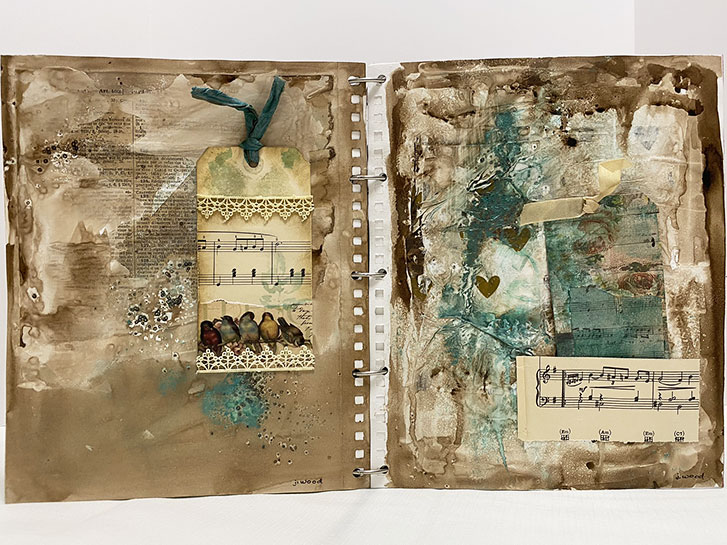
I chose to include these at this point in the book as a transition to the “Self-Portrait” pages. The beautiful walnut brown in combination with the teal feels calm, almost a bit antique. The feeling is reinforced by the bits of lace and ribbon along with the musical papers. Songbirds remind me of singing, and using your own voice, whether in speaking, singing or art.
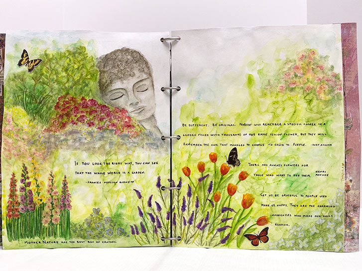
This is my shrine to my secret garden. I actually love gardens and gardening. However, where I live, they aren’t really practical. So instead, I draw and paint them in abstract.
I often imagin them with various benches and sculptures tucked in here and there. So for this one, there is a cement head sculpture overlooking the plantings. Perhaps it is some sort of guardian!
Aside from the butterflies, this was painted with Caran d’Ache, Inktense and Albrecht Dürer Watercolor pencils. Liquatex Matte Medium, mixed with water, was used to dissolve the pigments.
This layout serves as the introduction to the “Shrine” prompt. I think we all found this one difficult to work with because it could be interpreted so many different ways.
I chose to make two layouts, both somewhat related, for this prompt.
This is the first one, which in addition to being the introduction, is also a shrine to the past. It is about my childhood and events and people I remember fondly.
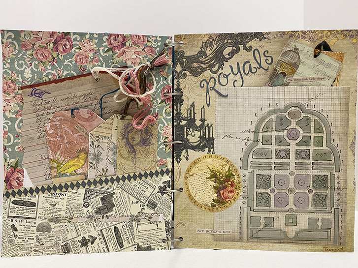
As I mentioned previously, Judy didn’t give any particular direction as to which, if any, prompts she followed for her pages. So I chose two of her submission that, to me, seemed to fall into the Princess category because of their beautiful colors and gold leafing and the feelings they evoked in the viewer.
I mounted her pages back to back, with metallic foiled paper underneath the square cut edges. The paper I chose to fall behind each side I felt would set off her designs.
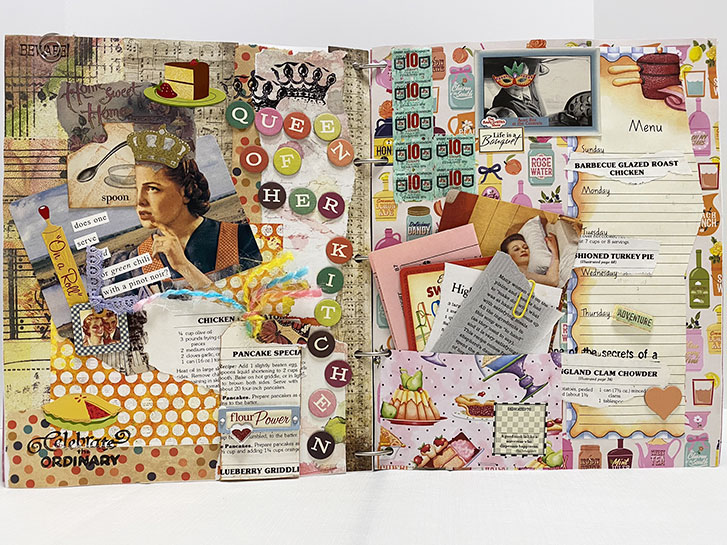
Madeline’s interpretation of the Princess prompt has a bit more of a regal tone because she’s created the Queen of Her Kitchen!
This is a fabulous layout with lots of interactive pieces including tags and things tucked into pockets!
I love the dimensional quality her pages have, inviting you to reach out and touch them!
p.s. The S&H green stamps brought back great memories. Many a kitchen royal collected them when grocery shopping and redeemed them for everything from new pots and pans to tableware!
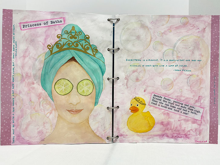
This is my interpretation of the Princess prompt, The Princess of Baths. One of my favorite things in the whole world is being able to soak a relaxing bath. I think it is a fabulous way to pamper oneself and a great addition to a self-care routine.
I knew, right away what I wanted it to look like: pink, girly, bubbly and both the duck and the princess would need to have crowns!
This layout is the transition to the Princess prompt. My thinking was, when I chose this as a possible theme, that even though we’re not “Rich and Famous”, each of us is deserving of being treated like royalty. I was also thinking that for each person, there is some aspect of our personality is regal or some way in which we treat ourselves as royalty.
On the left side, in the pocket, the sheet of paper has the words to “We’ll Never Be Royals” by Lorde. I felt that the chorus, in particular was appropriate:
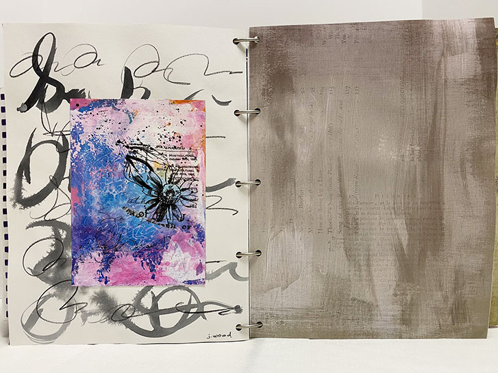
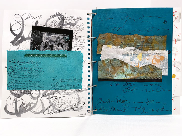
The left side was contributed by Judy Wood. Here her black and white, graphic pseudo journaling stands in strong contrast with the bright colors she chose for her center piece. The black motif in that piece ties both together.
I made the simplest possible addition here… I chose the paper for the right side. I liked the ink wash over old book pages in combination and contrast to the bright colors of Judy’s work. I wanted her work to maintain center stage.
The page on the left was created by me.
I chose this paper because it seemed to almost continue the theme from the previous layout. I also liked it in contrast to Judy’s beautiful black and white design.
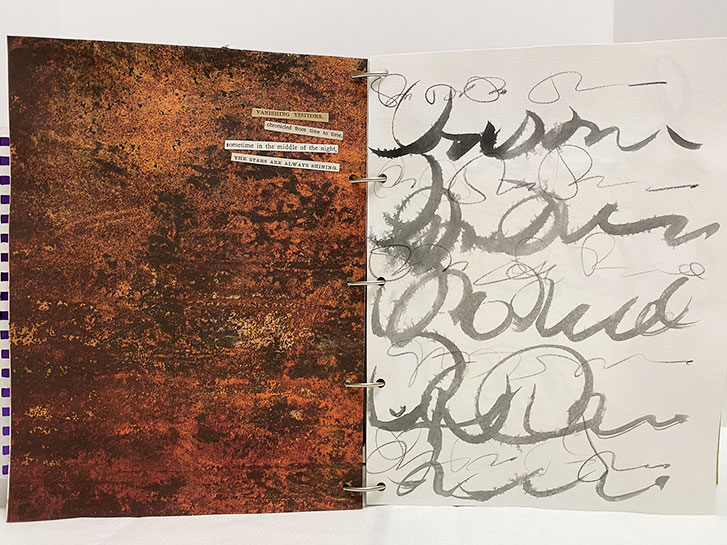
The words are really simple, with “found poetry” created from pre-printed phrases from a Tim Holtz sticker book.
VANISHING VISITORS
chronicled from time to time
sometime in the middle of the night THE STARS ARE ALWAYS SHINING.
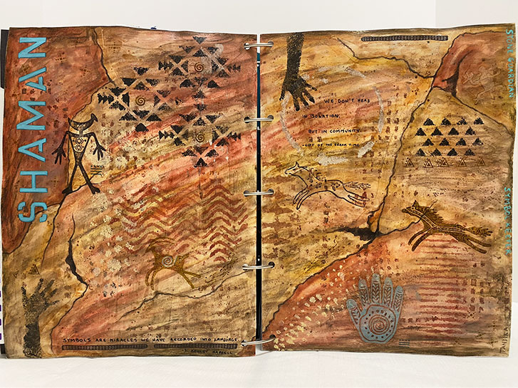
This is my contribution for the Inner Spirit prompt.
This mixed-media layout was created using several different materials and techniques. Caran D’Ache and Inktense for the background, craft paint used for stamping and colored pencil for shading and emphasis.
The words on the pages say:
Shaman - Stone Guardian - Symbol Keeper
Symbols are miracles we have recorded into language.
– S. Kelley Harrell
We don’t heal in isolation, but in community.
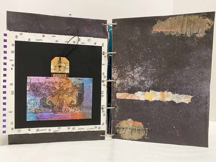
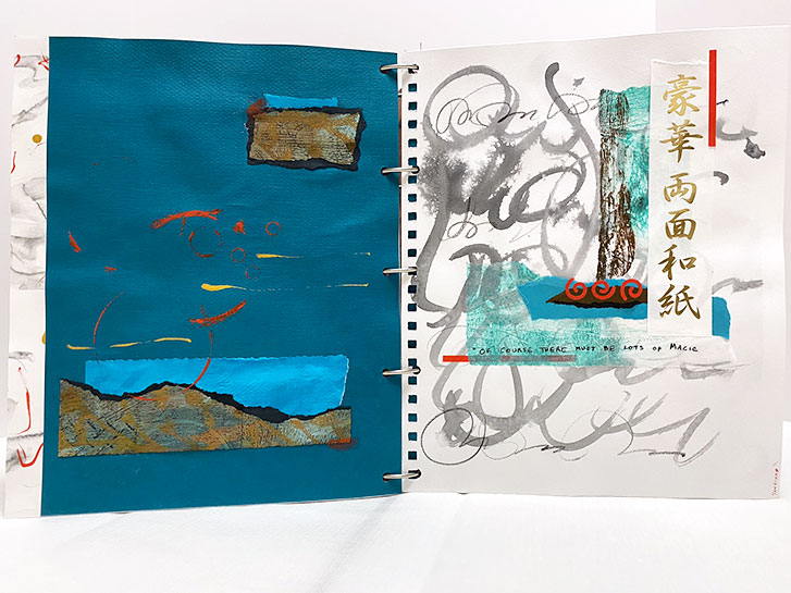
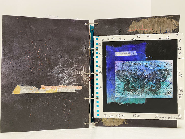
This is the other side, with the page flipped over to the left. Again, I chose to put these similar pages (yesterday’s and today’s) back to back and use them together because of the similar colors, icons and theme. I also added the metallic paper, between the two pages, that shows through the square holes along one edge of each layout.
The tag in this pocket says “LIVE WITH PASSION” and features wooden butterfly wings and a tiny key.
From Patron Saint, the book moves into the contributions for Inner Spirit. This layout is from Judy Wood, with my contribution being the background paper.
When Judy gave me her pages for inclusion, she made no specification for which prompt she followed, if any. So I made the choice to include these here, as an introduction to this section. I did this, because to me, they just “felt” like they belonged here.
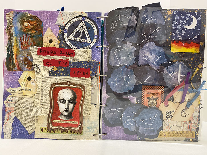
The fourth layout introduces the third and final artist of the book, Madeline Hill Kasian!
She has created the Patron Saint of the Stars based on the Saint prompt.
Madeline has a wonderful, dimensional style. She also journals quite a bit so there is hidden information that you can only see when you view the book in person.
Because of the raised elements on this layout, I chose to put a sheet of clear plastic between the two pages. This prevents them from getting entangled in each other when the book is closed.
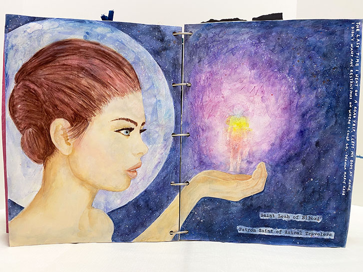
If you’ll recall, I mentioned that we had prompts that we could follow, if wished. This third spread in the book is my response to the Patron Saint suggestion. She is Saint Leah of Biloxi, Patron Saint of Astral Travelers.
The words on the side are:
“The last time I went on a road trip, I left my body at home. I didn’t want any restrictions on where I could go”
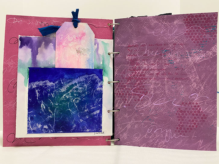
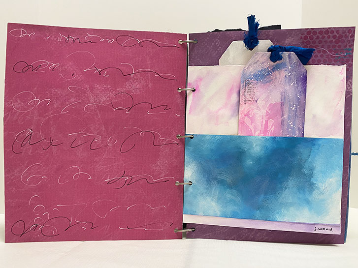
The is the second layout, created by turning Judy’s smaller page over against the other side of the layout.
I chose to make the additional papers on each side different to better showcase each of Judy’s pages. Then she added her own magic to each of the new papers.
Left: Judy Wood
Right: Judy Wood
We started out with a list of prompts that each artist could follow, or ignore. There were six categories:
Patron Saint Inner Spirit Princess Shrine Element Self Portrait Each artist could follow all, some or none of these. The general hope was to have 12 “pages” from each artist. These would then be mounted, back to back, in the order of my choice.
This first layout is by Judy Wood. She creates beautiful, romantic, abstract art using watercolor and mixed media techniques.