Classic.
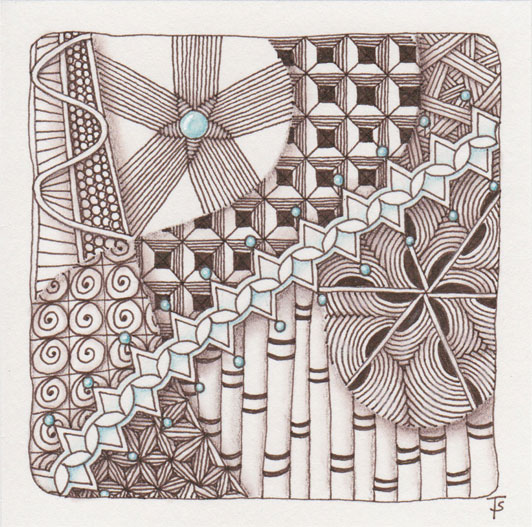
When I was drawing this Zentangle, I realized that it was becoming just way too complicated and busy. Even while I was shading it with the brown pencil, I knew I would have to do something to bring back some high contrast, or it would just be a really muddy tile. At first I was thinking I could add gold, metallic ink. But that really wouldn’t pop enough here. The center of the Arukas reminded me of a gem, and then the light bulb lit up: turquoise.
There are, in my opinion, certain color combinations that are classic. Brown and turquoise is one of them. Perhaps it is because a turquoise stone is found in the earth, which is brown. Perhaps it is because a turquoise sky contrasts so well with the dark brown mountains. Or maybe it is because of the turquoise water in the bay as it washes over the dark, lava-flow rocks. I don’t know why, but it is another of my favorite color combinations.
It’s amazing how your brain works during mindful meditation!
Zentangle drawn on Strathmore Vellum Bristol using a sepia Micron pen. Shading done with colored pencil.