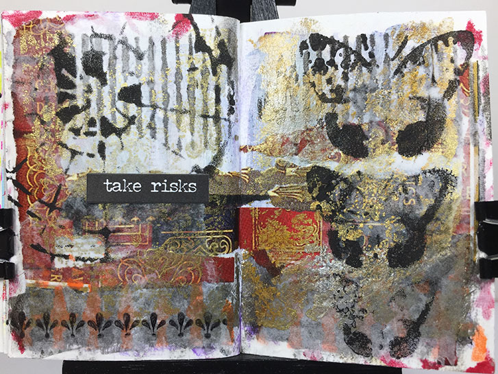
This layout, in my Tiny Traveler’s Notebook Art Journal, is all about taking risks.
It started with a page from a magazine that featured images of the spines of books, decorated in gold. I loved the rich, old-world, wealthy, royal look of them. They reminded me of a castle library somewhere in England.
So, I decide to use regal colors of purple, red and gold to paint on the page. I really didn’t like it after I did it because the purple was intense and transparent and just looked messy to me.
So, I gessoed over it.
Then I added torn strips from the book image. Hmmm… I liked that. but the purple was still showing through the gesso, making the pages look muddy. I added some black at the bottom, and orange red stenciling.
I decided to use black paint and stencil over the muddy white area. My thinking was the black would provide so much contrast, it would “lift” the muddy grey, making it appear lighter. Still not happy.
So I tore some deli paper and glued a large piece over each side. This lightened the whole layout enough to provide some contrast for black focal points.
I stamped a lot of gold/silver/copper texture on the entire layout. I was much happier with it at this point.
The rest went quickly. I’m happy with the end result, although this whole layout was risky, from being outside my “bright colors” comfort zone all the way through every experimental thing added!
I’m glad I didn’t give up, though. I like the end result!
#microart #microartjournal #miniatureartjournal #miniartjournal #miniatureart #tinyjournalnation #allthingstiny #allthingsminiature #microartjournaling #tinyartjournal #travelersnotebook