I showed you a page from my art journal on Friday. If you remember, it had a design issue: The way it was laid out, the page was divided into distinct quarters with no flow between them.
I decided to tackle a revision of the design. The first step was to get rid of the worst parts and restore the basic design as best as I could.
I began with Liquatex white and bright aqua green gouache. I dabbed these over the wording using my fingers and a brush to blend them out into the background.
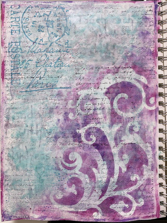
Next, I needed to return the texture back to the areas with some text stamping. I also needed to bring the postal stamp across into the right quadrant and break the visual vertical line of that stamp. I did that by adding another postal stamp to pull the viewer across. Then I added some white, texture stencilling to break the line.
I used the same color ink to stamp in the upper right and lower left with a pattern that repeated the feel of the large focal point. I added a bit more of the aqua color to the lower right and into the focal point.
To move a bit of the pink/purple into the upper and left areas. Again, I used a texture stamp, with the magenta ink to do that.
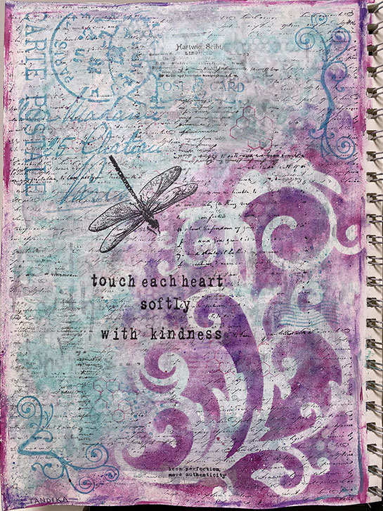
With a much better looking background, the final step was to add back the words.
I used a favorite trick for this: stamping on deli paper. I love doing this when I’m not sure exactly where I want to stamp things. I tear around the image or words so there is a rough edge. Then I can arrange and rearrange them on the layout until I’m happy with the position. I use Liquatex Matte Medium to adhere them to the page, with a layer underneath the paper and another on top. This results in the deli paper almost disappearing into the work!
The placement of the dragon fly was chosen to move the viewer from the upper left down through the center to the words. The words were deliberately placed slightly off center. A new set of words were added near the bottom. They say “less perfection” and “more authenticity”. These final words pull the eye the rest of the way through the layout.
I am now much happier with my page. I think the flow is much better, and I am happy that I challenged myself to “fix” it!