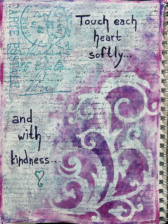
This is both a fail and a win. Initially, I started with the second color scheme challenge for February. I had brushed on streaks of Bright Aqua Green, Quinacridone Magenta and Dioxazine Purple. These colors are intense. I didn’t like what they looked like on the page.
After thinking about it for a while, I decided to tone it all down and possibly cover it up with a coat of gesso. When I did that, I liked it a lot better. All the colors were a pale value, which was easier for me to deal with.
Having calmed down the page, I felt it needed texture, so I added some handwriting stamping to the background.
I liked the page a lot better at this point and felt like it was going to work. So I added the reverse stencil focal point to the lower, right-hand side.
I created a border by picking up a bit of the colors still left on my palette with my fingers and ran them around the edges.
To bring in the bright, aqua color in a way that wasn’t overwhelming, I stamped the postal stamp in the upper left.
I added more texture with a bit of stenciling and paint splatters.
Then I added the words with Posca pens.
Now, here’s the “fail”: While this pages is pretty, and I love the background, when I added the stamp and words, I created distinct “zones” that are disconnected from each other.
So, I’m probably going to work on this some more, in the future, to see if I can pull it together so there is a better, over-all flow.
I’ll post it again, if that happens!
#colorschemechallengefeb