If you saw my New Year's post , then you know that I have challenged myself to work on black tiles more frequently this year. I want to develop techniques and find the materials that work for me. For that reason, for every challenge or lesson from Eni or any other artist, I am making a black tile for the theme as well as a normal one.
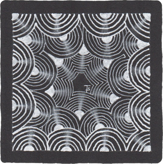
To that end, this is my black tile from Eni’s Zentangle Basics lesson. for this one, instead of charcoal, I tried using a white, colored pencil to do the highlighting. I found that it would actually move and blend, somewhat, with a clean stump. I do wish it was a brighter white where it was applied the heaviest, though. I will need to keep experimenting!
The newest Art Club video from Eni Oken's Art Club is a lesson on Zentangle Basics . Almost everyone, when they take their first Zentangle lesson from a CZT, creates a basic tile, using certain tangles that illustrate what Zentangle is all about. Eni’s video is no different, (after all, she IS a Certified Zentangle Teacher!) This is the tile I created while watching the video.
I’ve been tangling now for many years. My first actual tiles are dated 2010, but I was tangling before that in my sketchbook. If you go to the Zentangle Gallery page, by clicking on the link here or at the top, right of this page, I bet you will recognize more tiles that are based on the beginner’s instructions. This is the sixth tile to be added to the collection. Can you find them all?
When you are learning to tangle, Crescent Moon is one of the first that you learn. It teaches the concept of creating an “aura” near something that has already been drawn. Auras are frequently used to build repeating designs or to add emphasis or separation.
This Zentangle is from Project Pack 1.
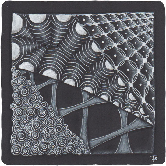
Zentangle drawn on a black, Official Zentangle tile using three different sizes of white, Sakura gel pens. Highlighting done with white charcoal pencil.
This tile is a direct result of following the instructions on the blog post for the First Day of the 12 Days of Zentangle over at zentangle.com .
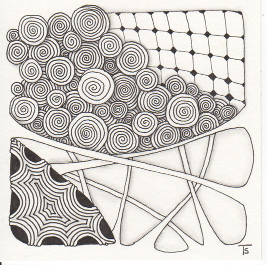
The purpose of this exercise was to draw each of the tangles that are used to teach a brand new person how to tangle. The most common tangles used for a beginner’s tile are Crescent Moon and Hollibaugh and they are often followed by Florz (or Bales) and Printemps. However, we are instructed to draw each of the tangles with a “twist.” For example, Cresent Moon is drawn using triangles and angled auras, and Hollibaugh is drawn so that the strips look more like roots and are intertwined with each other.
From the Zentangle Primer: Exercise 1, page 33.
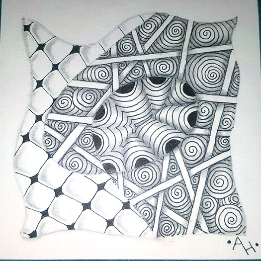
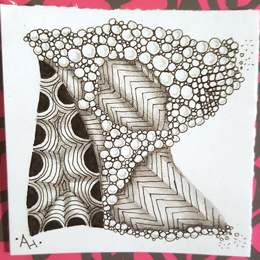
For this exercise, we each had to create a Zentangle using the same tangles as the first. However, we were to shade them differently.
Amanda’s artwork is above. You can see how she shaded around the outside of the central bobble which makes it appear more like it is floating above the tile. She also altered Printemps from her original style. This version gives it a lot more drama and depth.
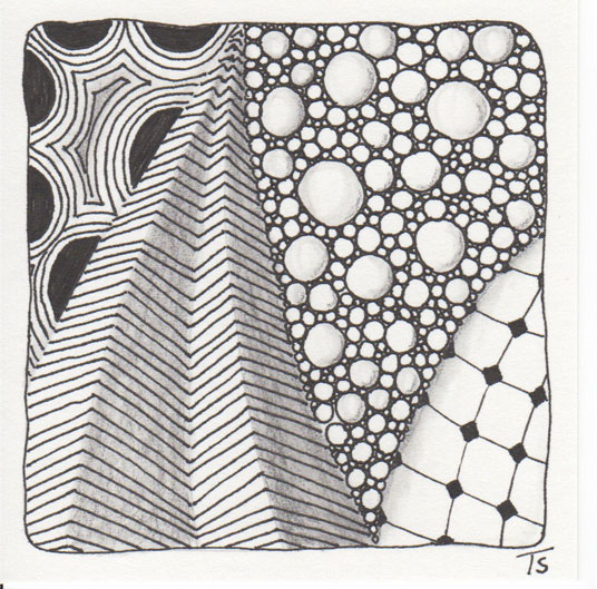
From the Zentangle Primer: Exercise 1, page 33.
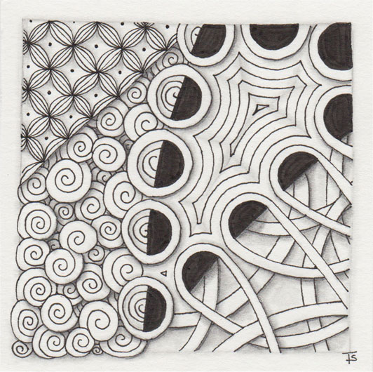
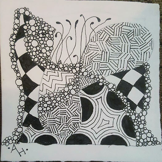
For this exercise, we were to create another Zentangle, using the same four tangles as the first tile. However, this time, we were instructed to shade each tangle differently.
In addition to changing the shading, I also changed the style of each of the tangles. I chose to wrap Florz around a bobble and give it more of a 3D, or dimensional feel. I took a lot of creative license with Cresent Moon, adding more details and treating it more like ruffles. I normally draw Printemps fairly small, but here, I tried to make it much larger than I normally do. And for Hollibaugh, I rounded out the areas where the strips ran into the border.
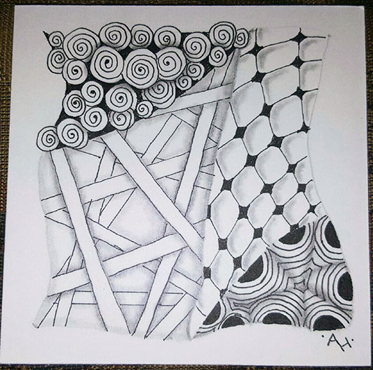
The Zentangle Primer.
Our group has changed books. We originally wanted to use the Zentangle Primer , but we had to wait because Amanda did not have a copy. So, while we were waiting for hers to arrive, we have been using the One Zentangle a Day book. Amanda received her Primer on Saturday, so we have both been reading/rereading the Primer. Today’s post is from the Primer, Lesson 1, Your First Tile.
Wrapped up.
This Zentangle is the result of two different Facebook posts.
In one group, someone asked about shading a Zentangle that was drawn in blue ink. That got me to thinking about how I would handle the situation. So, for this tile, I’ve used blue ink. For the shading I used both colored pencil and graphite. I think the combination of the two allows for more dramatic depth than using the blue pencil alone.
Day 2.
For this day, we are adding three new tangles to our repertoire: Fescu, Nekton and Knight’s Bridge. We were also instructed to practice making various strings.
For Amanda’s tile above, as you can see, her string is much more complex than on Day 1. She also used areas of repeated tangles to tie everything together.
Matthew did a wonderfully curvy string that gave him an interesting open space to fill with graceful Fescu! He decided to forgo any shading on his tile this time, because he felt it made his tile from the first day too muddy. I will be seeing him on Saturday, so I will give him a couple of shading tricks that should help him out.
Amanda’s Day 1.
You will recall that I said yesterday I was working on a challenge with another tangler? Well, here is her tangle based on the same lesson! I love how she made the Tipple into bubbles, including a few popping at the upper and lower right!
Amanda’s son, Matthew also did the Day 1 exercise!
Matthew is a 17-year old, highschool junior. He is in his second year of art classes and is a very talented artist. I love how he shaded each section of Cresent Moon differently. It shows the versitility of this tangle!
Day 1.
This week, I’m working on a challenge with another tangler named Amanda. We both have the book, “One Zentangle a Day” by Beckah Krahula.
Today’s tangle is for Day 1, which introduces Tipple, Static and Crescent Moon. I chose to follow the standard, Zentangle method, and started with dots in the corners and then connecting them with a frame. I used a simple string and filled each section with a tangle. I repeated Tipple in a second section because my string created four sections. Then I decided which way I wanted the tile to go and added my chop in the bottom right. Finally, I did some fairly simple shading to finish the tile.
Easy.
Some times, when you are tangling, you just want to do something simple, easy and relaxing. While I really love yesterday’s Zentangle, it was fairly time-consuming. As a result, I wanted the next one to just be something I could do to completely relax. I also didn’t feel like spending as much time on a single tile. And that’s perfectly OK!
So, even though it is simple, there is still a lot of depth and dimension. I like the way the Paradox section almost looks like the head of a strange bird. And Ennies looks like a ball-pit or a pool filled with pearls! Nekton is one of my favorite, go-to tangles, it looks like tossed bits of reed or straw.
We looked up at the ceiling and saw the fan, its blades moving slowly across the light. Blinking, bright, dim, bright, dim, it left us hypnotized on a lazy summer afternoon.
Zentangle drawn on Strathmore Vellum Bristol using a black, Micron pen. Shading done with graphite pencil.
Tangles: Antidots Betweed Crescent Moon C-Wing Footlites Nzeppel Orlique Printemps Tropicana
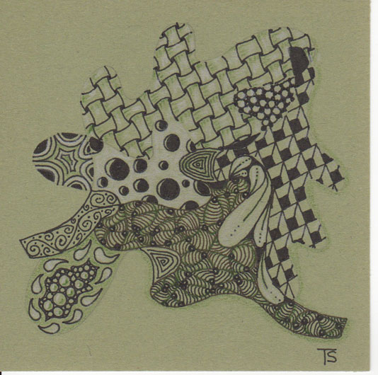
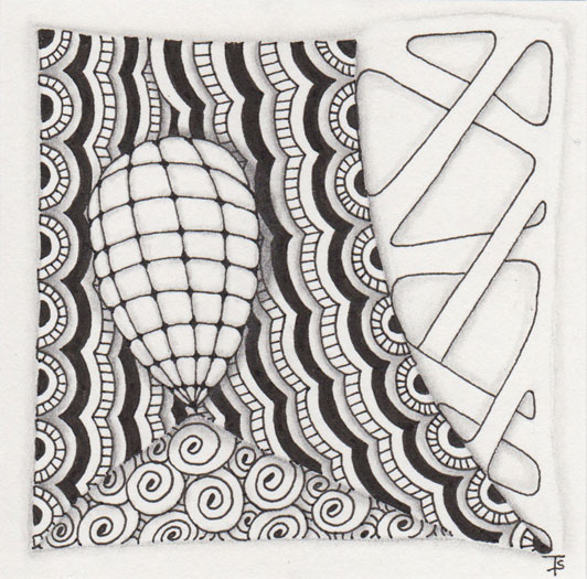
Leaves.
Take a close look at the string used for this Zentangle. Do you see it? I traced around a leaf template to create the basic string. The Ennies at the bottom left was added because I felt it needed something there, so it‘s in addition to the leaves.
Zentangle drawn on olive card stock using a black, Micron pen.
Tangles: Courant Crescent Moon Cubine Ennies Flux Holey Huggins Isochor Tipple
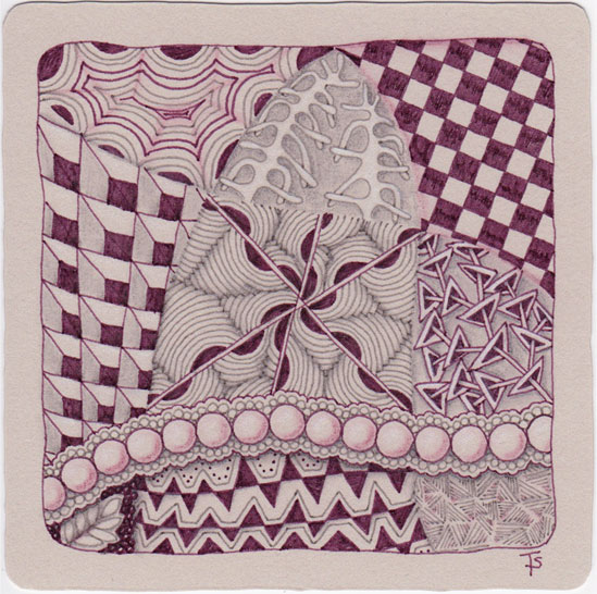
I‘ll have the cabernet.
Actually, this is more the color of Welch‘s Grape Juice! I really liked this color combination. The gray and purple played nicely with each other and allowed for a good amount of contrast.
Zentangle drawn on gray print making paper using wine and gray Copic multiliner pens. Shading done with Polychromos colored pencils.
Tangles: Crescent Moon Cubine Ixorus Knightsbridge Locar Quipple Rain Rixty Swarm Ynix
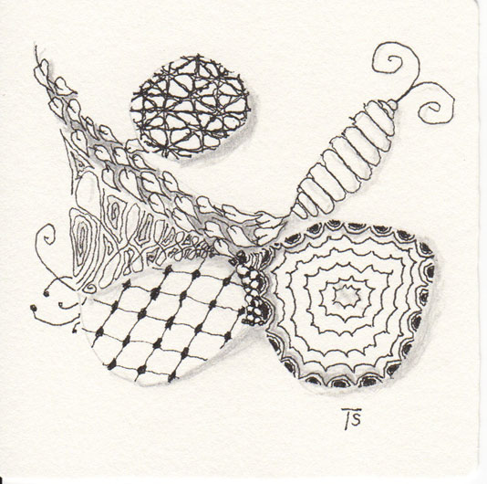
Leftie-Louie.
This tile was done entirely with my non-dominant hand. That includes the shading and even the date and signature on the back. I was actually surprised at how well it turned out!
Zentangle drawn on Official Zentangle tile using a black, Micron pen.
Tangles: Crescent Moon Echoism Fescu Florz Nzeppel Pokeleaf Tipple
Back to the future.
Last Friday, a book I ordered recently arrived. It is the Zentangle Primer. Vol 1, by Rick Roberts and Maria Thomas. This book represents the beginning instructions for the Zentangle method.
I have never taken a class from a CZT, (Certified Zentangle Teacher,) so I was really looking forward to reading this book. I‘ve wanted it for some time, but the price is pretty steep. I have to say, so far, I am not disappointed. Even though it covers things that I already know, the book is still quite useful and informative.
Simplicity.
I decided, for this tile, to return to the very roots of tangling. This string and these patterns are often used by CZTs when teaching the first Zentangle class.
Zentangle drawn on Strathmore Vellum Bristol with a black, Micron pen.
Tangles: Crescent Moon Florz Static Tipple