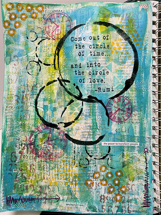
This is the big sister to a layout in my tiny art journal , which I showed you a few days ago.
While this has a different arrangement, it started with the same concept, circles and the same quotation. It also has the same paint colors. Both backgrounds were painted at the same time.
Just as with the tiny version, this began with text papers from a book, magazines and junk mail being attached to the page with Liquatex Matte Medium. When it dried, a layer of gesso mixed with a bit of water was brushed over the page to lower the contrast.
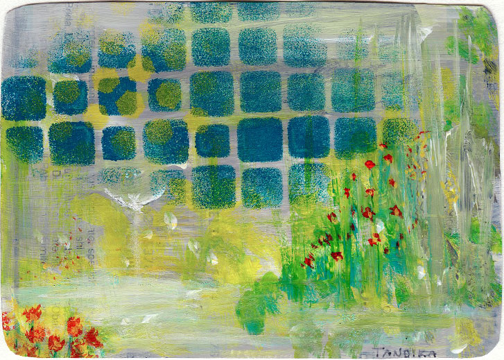
I’m tackling an older (from January) color challenge this week: Teal, Yellow and Grey.
This is another small (2-5/8" x 4") card cut from a junk mail advertisement.
I began by swiping the three colors in various places across the card.
When that dried, I used a stencil to add the deeper, teal-blue design. I also added a few yellow hexagons.
To me, the lighter color near one side of the card looked like water, so I reinforced that with a bit more streaks. I added some small touches of contrasting red orange to suggest the idea of flowers.
I showed you a page from my art journal on Friday. If you remember, it had a design issue: The way it was laid out, the page was divided into distinct quarters with no flow between them.
I decided to tackle a revision of the design. The first step was to get rid of the worst parts and restore the basic design as best as I could.
I began with Liquatex white and bright aqua green gouache. I dabbed these over the wording using my fingers and a brush to blend them out into the background.
This is both a fail and a win. Initially, I started with the second color scheme challenge for February. I had brushed on streaks of Bright Aqua Green, Quinacridone Magenta and Dioxazine Purple. These colors are intense. I didn’t like what they looked like on the page.
After thinking about it for a while, I decided to tone it all down and possibly cover it up with a coat of gesso. When I did that, I liked it a lot better. All the colors were a pale value, which was easier for me to deal with.
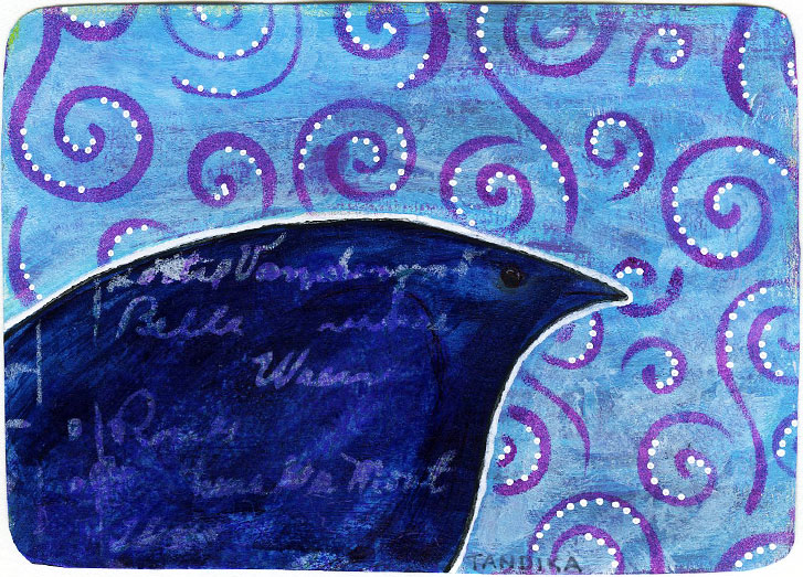
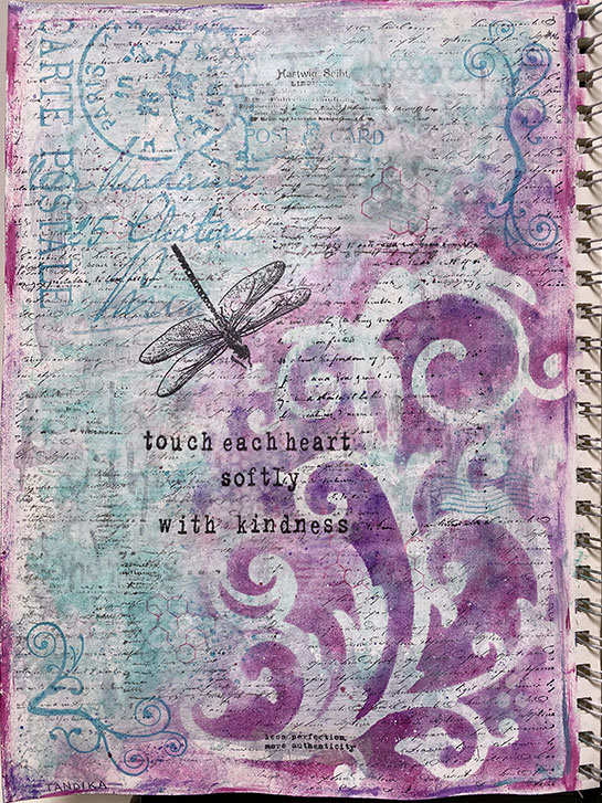
This is the reverse side of the card I showed you yesterday .
When I flipped the card over, there was this shape that was part of a speech bubble in the advertisement that was originally on the paper. When I flipped the card upside down, the shape reminded me of a bird, so I went for it.
This began with painting the lighter blue, and violet color on the card, avoiding the bird shape. Then the bird shape was painted in with the dark blue.
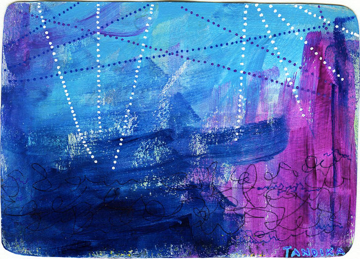
This is a simple color test for a color challenge for this month.
The colors are Light Blue Permanent, Deep Violet and Prussian Blue.
This is a small (2-5/8" x 4") card cut from a junk mail advertisement. I hate to throw perfectly good paper and cardstock away, so I often cut the cardstock into this size/shape pieces. Then I use the small cards for various small art. In this case, the card was mostly white with a small amount of printing.
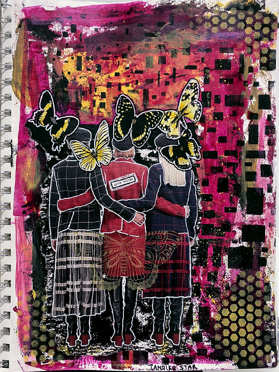
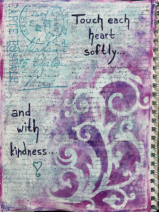
Yesterday, you saw my micro art journaling layout for a Facebook Color Challenge.
Today, here’s my full-sized page for the same challenge.
I began by using a palette knife to apply the three colors to my page. I didn’t have any particular style in mind, I just wanted to see what they looked like.
Then I used a couple of stencils to add more color to the page.
While that was drying, I started looking through a magazine that was in my office, because I was going to put it away, and I came across this image. It was absolutely perfect, repeating the rectangular pattern in the clothing, and picking up the color! I attached it to the page using matte medium.
Explore
Tags
12 days of zentangle
2017 review
3d
3z
6-ring
acrylic
acrylic paint
algebra
alphabetica
altered book
amanda
amigurumi
amour fou
angel
applique
apprentice
apprentice tile
aprentice tile
art
art club
art doll
art impressions mini journal
art journal
art journaling
art raffle
art stamping
arteza
articulatedmolygons
artist
artist trading card
artist's trading cards
artists book
atc
attractor
atz
aura
basic codex
batman returns
be well 2025
beanie peeps
beginner
beginners
behavioral animation
beth webber
betica
bijou
bijouisms
bina the bear
binary
biology
birthday
bitty bookz
black
black tile
blue
blue bottlefly
body
boids
book
book binding
book making
bookbinding
bristol board
brusho
bug
bunny
caran d'ache
cartesian coordinates
cat doll
chalk art
challenge
chaos
christmas
circles
class
classes
clockwork
clojure
clothing
collaborative
collage
collision detection
color
color challenge
color mixing
color wheel
colored pencil
colored pencils
convertable doll
converter
copic marker
copic markers
corona virus
cover
covid dreams
covid-19
crafts
crafty intentions
critter corner
crochet
crochet pattern
crochet you
crown
cymascope
cymatics
czt
czt 30
de jong attractor
delft delights
dick blick
dingbatz
dingsplatz
distress ink
diy
doll
doll clothes
doll pattern
doll shoes
doll wig
doodledoit
doodles
dragon
drawing
dressers
dressup doll
duotangle
ed emberley
editorial
eni oken
entanglement
examples
experimental
experimentation
fabric
facebook
fairy
fall
felt
fern
fiber art
finger puppets
forest pixie
found art
fountain pen
fractal
fractalized
fractals
fragment
frequency coloring
friends doll
gel pen
generative art
github
glass pen
glitter
go
golang
gold
gouache
green
grey
grey tile
grid
guest artist
halloween
hand made
handwriting
happy things
hawk
helping hand
hexadecimal
holiday
how to
hsb
hsl
hsla
hybrid
hypha
hyphae
ifs
ikea
illusion
illustration
inchies
index
inktense
inktober
inktober 2024
inktober2024
iterative function system
java
javascript
journal
junk journal
junk mail cards
koala and mila
kotlin
l-systems
lalylala
languages
lettering
lighting
liquatex
liquatex markers
llama doll
lord of the rings
luna lapin
map
markers
mask
math
matthew higbee
measuring
meditation
mental health america
mental health awareness month
mermaid
metallic
micro
micro art
micro art journaling
micro book
micro journal
mini
mini art
mini book
mini journal
mitsuki bun-bun
mixed media
monotangle
moon
mosaic
multi media
music
music monday
nannou
nannou app
nannou sketch
nano sized
new year's
noise
noodlers ink
october
ooak
ooly
organization
p5.js
page starters
painted rocks
painting
painting with friends
pants
paper
paper dolls
passport book
pattern
pattern drafting
pearl-x
penmanship
perfect binding
photography
physics
pilot
pink
pixie doll
planner
polar coordinates
pollock
polychromos
poo paper
primer
processing
project pack
project pack 1
project pack 2
project pack 6
project pack 7
pumpkin
purple
pva glue
quil
radial blossom
real life
red
renaissance
reticula
review
rgb
ring binder
rubber band bracelets
rust
scratch art
sculpture
sepia
setup
sewing
shading
shard
shoes
sierpinski triangle
silver
sketch book
sketchbook
slow stitch
software
sol lewitt
sound
spin art
splash ink
spooktacular2019
sproing
spundalaz
stamping
star
stash builder
stash maker
steampunk
step-out
stickers
strange attractor
strathmore
street art
string
studio
surprise
svensson attractor
sweet ami ann
tahga
tan
tan tile
tan tiles
tangle
tangleation
tangled words
tangles
technique
technique cards
techniques
ted talk
template
text
thanksgiving
the artists husband
the game of life
throwback
throwback thursday
tiara
tilda
tilda doll
tilda friends
tile
tints on tan
tiny abstract art
tiny art journaling
tiny book
tiny houses
tiny journal
tiny museum
tiny thing
tiny things
tool
tool tip
tools
tooltip
travel
travel kit
traveler's notebook
troll
tron
tuna
turquoise
turtle graphics
underoos
underpinnings
up
urban sprawl
utilitarian
valentangle
velocity coloring
video
vision board
wall drawings
watercolor
website
weebee
wings
wolf
wonder woman
wordless
wordless wednesday
yarn
yellow
zen gem
zenbutton
zendala
zentangle
zentangle kit
zentwining
zia
Tangles
0000 tangles here if any
2-n-5
3d mooka
3d-room
3pair
a-dalfa
aah
abukas
actinar
adante
african artist
african mask
afterglow
aiposaat
all stars
aloha
amaze
ambler
ammon
amphora
angel fish
antidot
antidots
apeel
apollonian waves
appearance
aquafleur
arc flower
archer
arckles
arrowheads
articulated molygon
arukas
asian fans
aura knot
aura leah
auragin
auraknot
auras
avreal
awdry
b'twined
b-horn
bales
ballot
balloya
bamboo
bannah
barbd
basket
baton
batton
batz
bb
beadlines
becki
beedle
beedz
beelight
beeline
berries & leaves
berry tops
betweed
birds on a wire
black box
black-eyed peas
blankett
blooming butter
borbz
boss
boti
botie
botto
box spiral
box spirals
brax
brayd
braze
bricks
bridgen
bronx cheer
btl joos
bubble love
bubbles
bucky
bulb lantern
bumper
bumpety bump
bumpkinz
bundles
bunzo
bursti
buttercup
b‘dylan
c-wing
cadent
callops
canard
caral
carpet daisy
carrés
casella
cat-kin
caterpillar
caviar
centipede
chads
chainlea
chard
chartz
checkers
cheesecloth
chevron
chicken wire
chillon
circfleur
circgleur
cirquital
claire
claws
cobbles
cockles 'n' mussels
cockles 'n‘ mussels
cogwheel
coil
connector
cool 'sista
cootie
coral
coral seeds
cornerz
courant
crazy 'nzeppel
crazy 'nzepple
crazy auraknot
crazy cadent
crazy huggins
crazy n'zeppel
crazy nzeppel
crazy nzepple
crazy'nzeppel
crescent moon
crescent wave
crewelery
criss & cross
criss cross
cruffle
cubine
cyme
d'rua
daisy beads
dandelion seeds
dansk
deco border
delftware
dessus-dessous
dewd
dex
dingbatz
diva dance - rock-n-roll
diva-dance
doo dah
doodle bugs
drack
dragonair
dribbetz
droplets
drua
drupe
dyon
d‘rua
echo
echo lines
echoism
eke
ellish
emingle
ennies
enyshou
equerre
evoke
eye-wa
e‘rutas
facade
fassett
façade
featherfall
feathers
fengle
fern
fescu
festune
feziii
fife
finery
fiore
five oh
flake
flee
floatfest
floating disks
floo
floo-ish
flooka
floom
floorz
flora
florez
florz
flovine
flukes
flutter
flutter bi
flutter pie
flutter tile
flux
flying geese
flyte
footlites
footprints
foundabout
fracas
fragment
fragment a13
fragment b11
fragment b13
fragment b2
fragment b7
fragment c15
fragment d1
fragment d2
fragment d6
fragment e5
fragment f11
fragment f2
fragment g22
fragment g7
fragment h15
fragment h2
fragment h3
fragment h4
fragment j1
fragment j15
fragment j2
fragment k14
fragment k2
fragment k5
fragment l16
fragment l2
fragment q2
fragment q5
fragment t7
fragment u3
fragment v2
fragment v4
fragment z2
fragment z7
frakas
frondous
fwell
garlic cloves
germie
gewgle
gingham
glacé
gloven
glukes
gneiss
gordgeous
gourdgeous
gourdous
grass border
grubz
gryst
gust
hamail
hamsix
hazen
henna drum
herald
hibred
holey
hollibaugh
hollis
honeycomb
huggins
hugins
hurry
hypnotic
ibex
icanthis
idoz
inapod
indy-rella
indyrella
ing
insydout
intersection
irradial
isochor
ix
ixorus
jalousie
jay six
jaysix
jetties
joki
jonqal
juke
kandy ribnz
kandy snakes
kathy‘s dilemma
keeko
kettelbee
king‘s crown
kitl
knase
knight's bridge
knights bridge
knightsbridge
knight‘s cross
knopen
kookeo
kuke
kule
kwazeela
küle
laced
lacy
lava juice
leaflet
lettuce farm
lightning bolt
lilah beans
linked
lobella
lobellia
locar
lokomotive
lollywimple
lotus pods
luv-a
magma
mak-rah-mee
man-o-man
marasu
marbaix
marbles
meer
melody
melting mooka
membranart
meshmerize 2
mi2
mist
mixed signals
molygon
monotangle
mooka
mooka 3d
mooka easy
moon pie
mr. e
mr.e
msst
muchin
mumsy
munchin
myrtle
mysteria
mythograph
m‘spire
n'zeppel
nacho
narwal
nebel
nekton
neuron
nexton
nipa
noom
noom repus
not-socc
nymph
nzeppel
nzepple
olb
onamato
oof
opus
orange peel
orbs
orlique
oval paradox-y thing
pais
paizel
palrevo
papyrus
paradox
patena
patina
pea-nuckle
pearls
pearlz
pellet
pendrills
pendrils
pepper
peppering
perfs
petal puddle
phicops
pickpocket
pilla
pina
pinch
pinwheels
pixioze
pixoze
plum leaf
pods
poke leaf
poke-root
pokeleaf
pokeroot
pop-cloud
prestwood
printemp
printemps
puf
puff-o
punzel
purk
purrlyz
quabog
quandry
quandu
quare
queen's crown
queen‘s crown
quib
quiltz
quipple
raddox
rain
rambles
ramy
ravel
reef
repeat pattern stacks
ripple
rixty
roller
rosette
roxi
roxi2
ruflz
rumpus
rundel
ruutz
sabi
sampson
sand swirl
sandswirl
scallops
scena
schiefer
schway
scoodle
screen
scrolled feather
scute
sea wave
sedgling
sez
sh-rock
sharalarelli
shard
shattuck
shing
showgirl
slab
snail
snare
snugz
socc
spawn
spinners
spoken
springkle
springle
sproing
squid
squill
squirmy
stacks
star map
starawn
starmap
static
stature
stef-ah-ni
stiritup
stoic
stonework
strata
striping
strircles
sugarcane
swag
swarm
tagh
thanksgiving
three_n_three
ticings
tidal
tidings
tink
tipple
tissoooh
toodles
tortuca
trelina
trellina
trentwith
trentworth
tri-po
triangear
triangle
triangle variations
triangles
trigue
trio
tripoli
tropicana
tuffit
tunnel vizion
tunnelvizion
turkital
twiggy
twing
twisted ribbons
twisted ropes
umble
undu
unyun
vega
venetian
verdigogh
vermal
vernazz
viaduct
vink
vitruvius
voxter
w-2
wadical
waes
warble
warmth
waves
wavy border
waybop
weave
web
well
well well well
well well who
wheelz
widgets
wiking
wildwood
winkbee
worms
xircus
xyp
y-ful power
y-knot
yin-yang leaf
yincut
ynix
zailz
zander
zazzle
zedbra
zenith
zenplosion folds
zinger
zingo
zonked