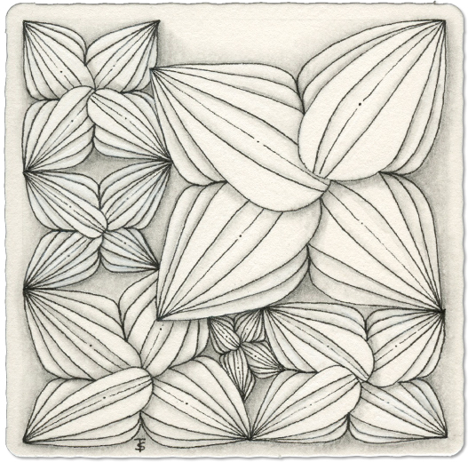
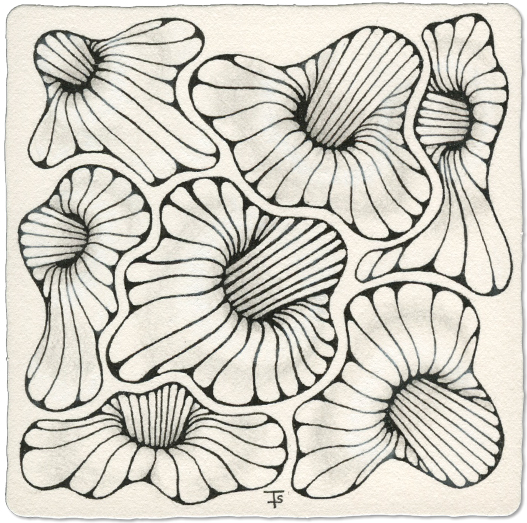
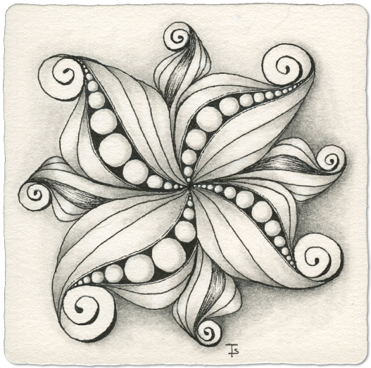
Inktober Tangles - Day 31 - Idoz by Zentangle
Idoz is a botanical, leaf or blossom shaped tangle. It is unique in that the center is a grouping of overlapped petal shapes, instead of having a clear, defined center point.
The “petals” can be plain or decorated. I’ve often seen it as if they were actually seed pods, with an opening in the center showing the orbs of the seeds.
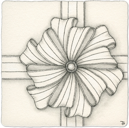
Inktober Tangles - Day 30 - Bownus by Angie Gittles CZT
Bownus is a lovely, curvy tangle that results in a realistic bow design. While the end result looks complex, it is actually really easy to draw.
I chose to “wrap” my tile as if it was a gift, placing a double bow off-center towards the lower right quadrant. I kept the decorations simple and elegant, allowing the actual shape of the bow stand out.
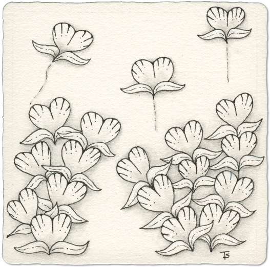
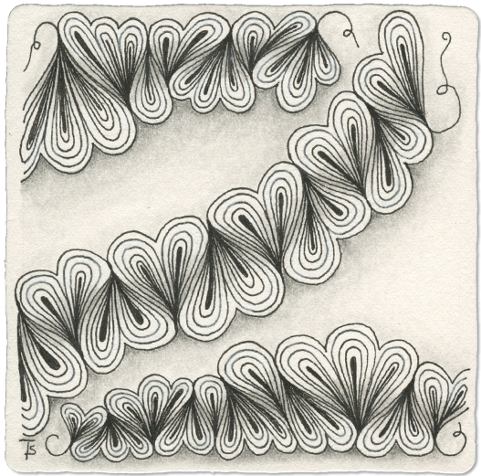
Inktober Tangles - Day 29 - Poke Heart by Henriëtte Robben CZT
Poke Heart is a lovely, flowing botannical tangle that can be used as a fill, ribbon, border, or vine. It offers lots of tangling possibilities.
I chose to create some growing plants of Poke Hearts. As I looked at my tile, I felt like my leaves looked a lot like wings, so I gave flight to 3 interations, just for fun!
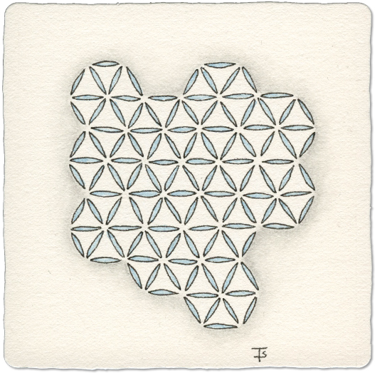
Inktober Tangles - Day 28 - Quandry by Zentangle
Quandry is a tangle that has been around for a long time. It uses small rice shapes arranged in adjacent triangles to make up larger, hexigonal shapes.
This tangle looks deciptively simple, but it actually works well for meditation because of the concentration required to keep things lined up! But don’t worry, if it gets wonky, it’s charming!
I kept my design very simple. I didn’t fill the tile completely, but I used an irregular shape to keep it interesting.
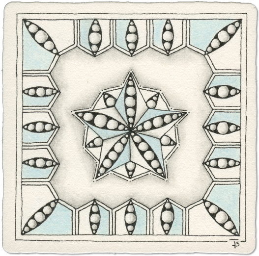
Inktober Tangles - Day 27 - Yeed by Midori Furuhashi CZT
Yeed is a lovely geometric tangle with a curved, rice shape in the center of each section. It can be used as a border or a medallion. Variation can be added by adding other tangles in the sections.
I chose to place it as a border all around the edge of the tile, and surrounding a central medallion.
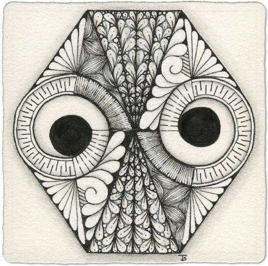
Inktober Tangles - Day 26 - Owlpeek by Susan Yeo CZT
Owlpeek is an interesting tangle that, depending on how you look at it, looks a bit like a stylized owl.
Susan has a couple of examples on her Instagram account of using this tangle as a string! So, I chose to do that here. So although the tangle itself is not use as a design element… it is the entire string. One iteration is drawn to fill the tile, and then the spaces are filled in with other tangles. Keep in mind that this tangle can be flipped upside down, and it will still look the same.
Inktober Tangles - Day 25 - Ing by Zentangle
Ing is a geometric tangle that is very easy to draw. It looks a bit like a folded paper drinking straw cover or a little like a lightning bolt.
I’ve used it in it’s plain, undecorated form many times. But here, I’ve added three decorated companions to the plain version.
This tangle works well as a dividing line between other patterns on a tile. It can also be “bent” around to create either a rectangular or circular border. You could do several iterations all radiating from a center point to create a medallion.
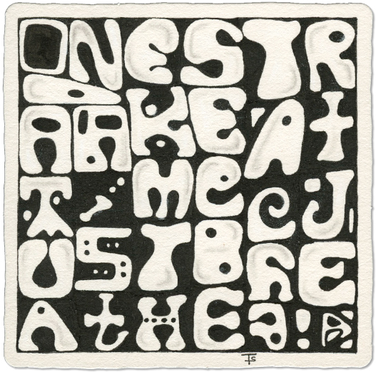
Inktober Tangles - Day 23 - Letterish by Jody Genovese CZT
Letterish was originally designed to look like letters… almost. However, it has also been adapted to actually BE letters, but in an interesting, 60’s vibe way!
Being an old hippie, I couldn’t resist creating my own take on this. Some icons are actually letters, some are icons.
Can you figure out what it says? If your not sure, log into the Mosaic app and look for this tile.
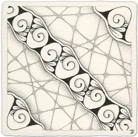
Inktober Tangles - Day 23 - Qurtuba by Avida Rico Mon CZT
Qurtuba is an interesting swirling tangle that can be used as a border or individual elements. It takes a bit of practice, but it is actually easier than it looks.
I chose to draw it as a ribbon, diagonally across the center of my tile. I added two elements to the opposite corners.
After looking at it for a bit, I decided I needed something in the background, but I didn’t want that tangle to overwhelm the main theme, so I chose Crazy ‘Nzeppel and I used a light grey pen.
Inktober Tangles - Day 22 - Shattuck by Zentangle
I love Shattuck! It can be drawn “curved” or “straight” as you can see in these examples . There are many examples because I’ve used it quite a bit over the years! I think that the curved version is the most common.
You can also create decorative version by adding perfs, dots or orbs to lined areas and I sure you can think of even more ways to put your own spin on this tangle.
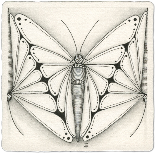
Inktober Tangles - Day 21 - Butria by Ute Andresen CZT
Butria is a relatively simple, beautiful tangle that produces a winged butterfly shape.
This tangle is not difficult to draw and provides lots of space for adding enhancements. You can even fill the wing shapes with other tangles if you wish.
This tangle can be used as a central motif, individual free-floating designs or even to fill corners of frame or tile.
Inktober Tangles - Day 20 - Kangular by Tomàs Padrós CZT
Kangular is a geometric tangle that can be used as a border or medallion. I can also see it in a grid, although I have not explored that here.
I began this tile by drawing the medallions. It was fun figuring out variations on the theme.
Then I thought I would put a border at the top and bottom of the tile. At that point, I think my brain went out to lunch without me. I started having problems drawing my lines evenly spaced, and then had issues making them straight. Things just didn’t line up.
Inktober Tangles - Day 19 - Mrth by Zentangle
For this version of Mrth, I’ve used the Pangea Reticula, which is based on an irregular shape with rounded corners. If you are familiar with drawing Tripoli, where you aura a side of the previous triangle, this reticula is similar. After placing the first shape, you aura part of it while creating the next shape.
While this reticula is what I see most often, when Mrth is drawn, it doesn’t have to be. You could just as readily use a circle, square or triangle. I’ve seen all of those used.
Inktober Tangles - Day 18 - Middleton by Yu Ru Chen
Middleton is a very geometric tangle that is created in a square frame.
I chose to make this as a grid tangle, rotating the square in different directions to create a symetrical pattern.
To start, I drew a 4x4 grid string with my pencil. I find dividing the tile into four sections pretty easy, since you can start in the center of an edge, and then divide up each side.
Inktober Tangles - Day 17 - SwiSit by Amy Broady CZT
SWiSit is an abbreviation of “Stick With it, See it through.”
This swirly tangle grows organically to fill the space. It begins by drawing a curving line ending in a swirl. Add more and more swirls until the space is filled, or until you are done.
The next step is to add weight to the lines and then to add rounding to corners or wherever you feel it’s necessary. Finally you can add auras around the outside and decorate with dots and perfs.
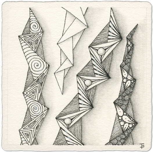
Inktober Tangles - Day 16 - Tripoli by Zentangle
Marth introduced this version of Tripoli in Project Pack 8. It has become my absolute favorite although I like Tripoli in general because of it’s versitility!
Here, I added various fragments inside each of the triangles to make unique “jelly fish” species, making them more decorative and fun.
This tile was a lot of fun to make and went very quickly.
Inktober Tangles - Day 15 - Puffle by Sandy Hunter CZT
Puffle is a ribbon tangle that starts with a continous, sinous line. The most common way I see it drawn is with each “section” having two lobes, which make it look like a heart. However, it can have one, two or three lobes or perhaps all of those in one ribbon!
Pay close attention to how you draw the initial base line! It takes a bit of practice to make sure the pointed ends come together. It helps to make the lobes exagerated, so they fill in the space completely.
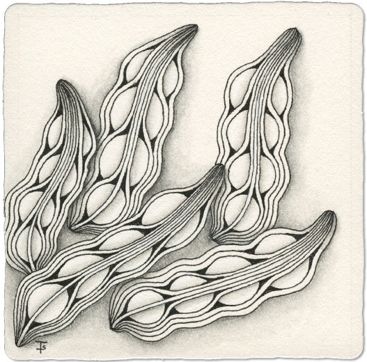
Inktober Tangles - Day 14 - Schoggi by Annette Rünpler CZT
I don’t remember ever seeing this tangle until it appeared on the list for InktoberTangles2025. If I had seen it, I think I would have remembered it, because I really like the design.
To me, it looks like seed pods for some exotic plant. I chose to draw a group of these pods as if they were just picked and dumped on the potting bench.
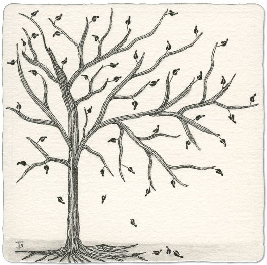
Inktober Tangles - Day 13 - Mythograph by Zentangle
Mythograph is a tangle that builds from the center out, line by line. It generally looks more like a pine tree, or a strange fern. You can see a more traditional version on the tile here .
My Inktober version is meant to celebrate fall, when the leaves change color and drop from the trees. It still follows the same path as the standard version, I just put the new fronds out as branches.
Inktober Tangles - Day 12 - Ole-Ole by Reyes Galindo CZT
Ole-Ole is a new tangle for me! I found it very fun to draw, making nice fat sections of the central motif, as you can see above. It offers areas in the main body to add all kinds of enhancements.
This tangle could be used as a border, a ribbon, or a medallion. I can even see how it might fill a section of a multi tangle tile.