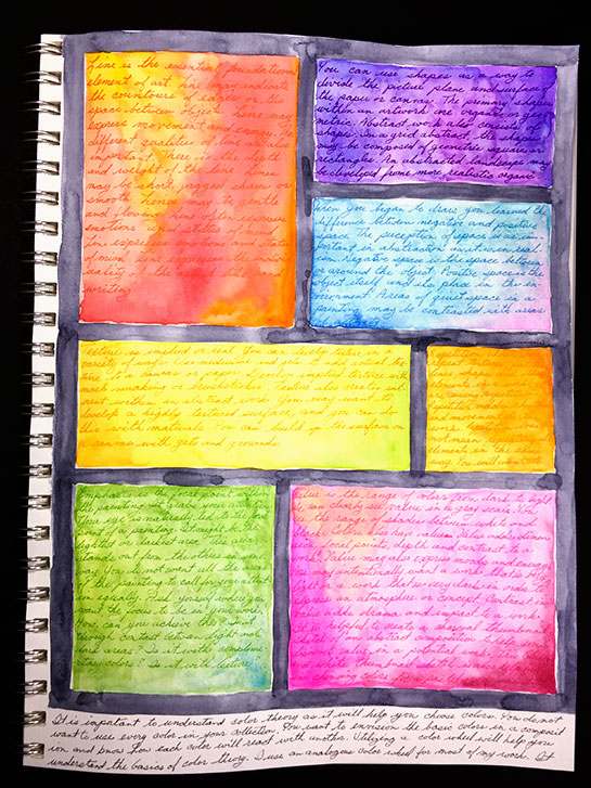
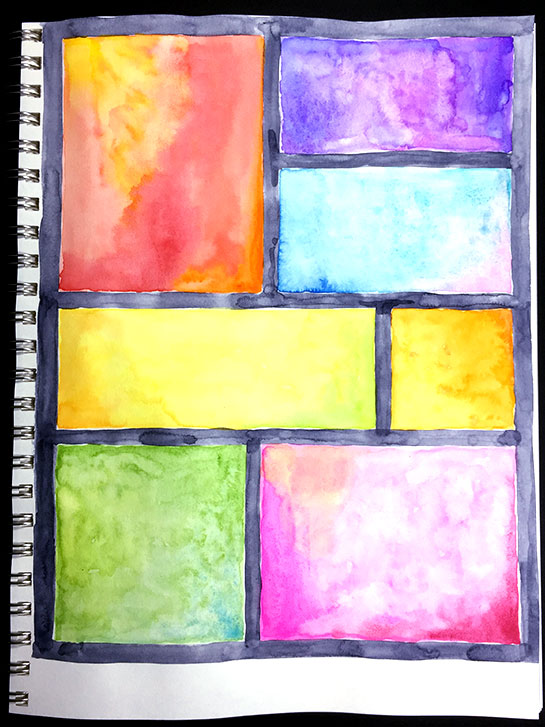
Yesterday, you saw the first page I am working on in my new sketchbook. I had done a watercolor grid on the page, as an underpainting.
The next thing I have done is to add texture to the color block using handwriting. Each block is a description of one of the main elements of art. They are: line, shape, space, texture, repetition, value, emphasis and color. The actual text comes from the book "Abstract Art Painting: Expressions in Mixed Media" by Debora Stewart .
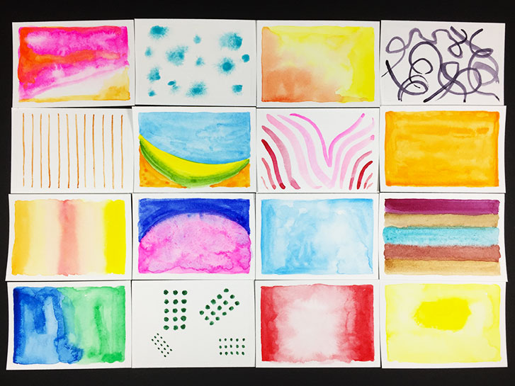
Last week, I did the Daisy Yellow Tiny Museum Workshop . It was a lot of fun and allowed me to try a variety of techniques while using watercolors.
I am switching to another project which will take up several months. For part of it, I’ve started a new art journal.
I am using a Bee Super Deluxe Mixed Media book.
I’ve used these books for years as my daily sketch book. I love the paper in them. The covers are really sturdy and I’ve even taken them apart by rolling out the spiral binding and then put them back together again without any issues.
Fewer images to show you today because each one took more time.
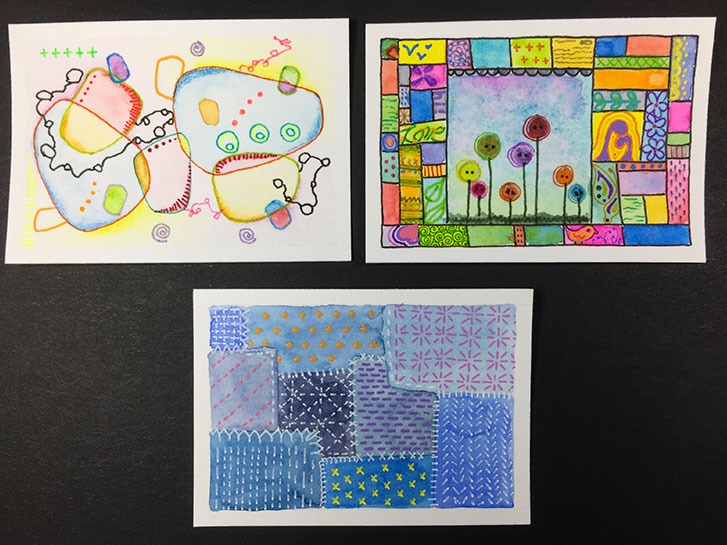
These go beyond the workshop I am taking. I decided to go with some mixed media techniques. In addition to watercolor, I used markers and gel pens to add tiny details to these.
I have to say, I’m kind of in love with this technique!
The credit for the inspiration for these are: Artist Harriet Osborne, Cloth Paper Scissors Magazine, Japanese sashiko techniques.
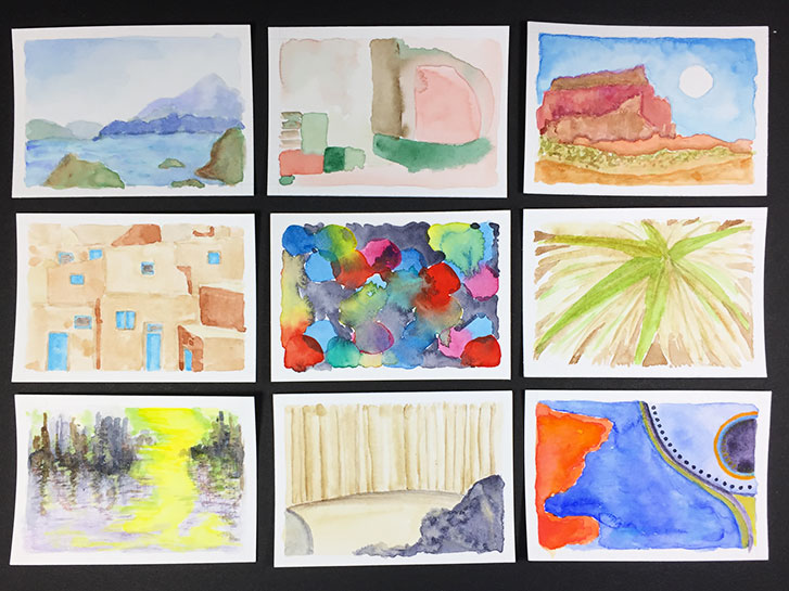
For this lesson from Daisy Yellow’s Tiny Museum Workshop, we are using pictures as prompts. In some cases, I did a fairly literal copy and in others I copied just the feeling or shapes or colors.
This was a lot harder than what I had been doing, but it was still fun!
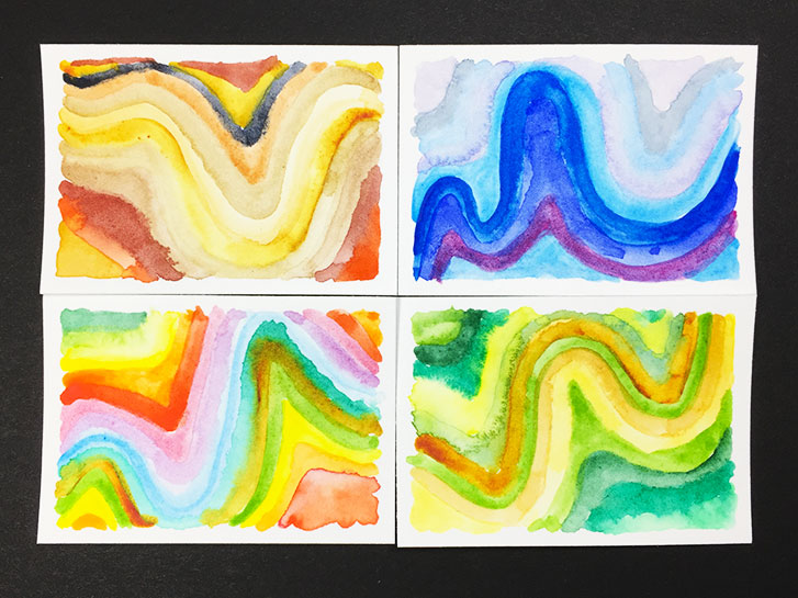
Another set of tiny, abstract backgrounds. I have to let these dry over night so that I can add more to the pieces without the base layer moving all around when it gets wet.
This time, I’ve used a combination of the Winsor Newton and Daniel Smith watercolors. They are working very well together. I find that the Winsor Newton box works just fine for most of the colors. It contains a larger selection of colors, there are 27 different ones in the box. That allows me more variation without a lot of mixing.
As I mentioned last Friday, I am taking the Tiny Museum Workshop from Daisy Yellow .
One of the short videos illustrates how to blend colors together. In the process, these curvy images are created. These reminded me of banded agate stones.
I did mine, again, on individual, tiny art journal sized pieces of watercolor paper, rather than on a large sheet.
I didn’t blend these as much as the video showed. It turned out to be more difficult than you might think!
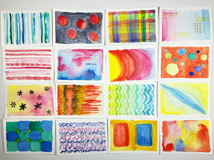
I decided to take the Tiny Museum Workshop from Daisy Yellow ! It’s a lot of fun, and I can recommend it to anyone who isn’t sure how to work with gouache and/or watercolor. You’ll get plenty of practice using either (or both!) in this series.
I decided to take it because it looked like fun, and I wanted to learn more about working with watercolors to create tiny, abstract art journaling pages.
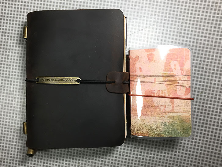
I get asked all the time: “How small IS your art journal.” Well, they say a picture is worth a thousand words…
However, I’m still going to say a few! On the left is my Passport Traveler’s Notebook from Chris.W on Amazon.
On the right is the A8-sized Traveler’s notebook that I use as my art journal.
As you can see, the A8 is much smaller, and the inserts are even smaller than the cover.
I realized that I forgot to show you all the pages that I made for the Mermaid Book!
Right now, they don’t have anything much on them, but you can see the bases for the right-hand pages above.
And this is what the back side of each of them looks like!
I hope that over the next two weeks, I can finish at least some of them!
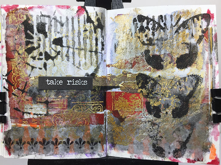
This layout, in my Tiny Traveler’s Notebook Art Journal, is all about taking risks.
It started with a page from a magazine that featured images of the spines of books, decorated in gold. I loved the rich, old-world, wealthy, royal look of them. They reminded me of a castle library somewhere in England.
So, I decide to use regal colors of purple, red and gold to paint on the page. I really didn’t like it after I did it because the purple was intense and transparent and just looked messy to me.
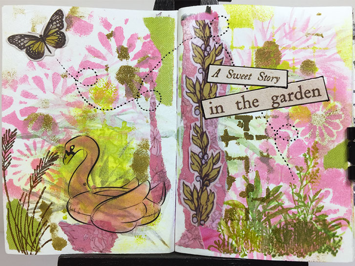
A spring layout in my Tiny (A8) Traveler’s Notebook!
I was putting this together over the weekend, and I kept thinking of Easter and Spring. It made me think of how pretty the gardens are this time of year.
I loved the pink and green combination that developed as I practiced making grass-like strokes with them. The base design ended up looking so pretty.
I deliberately looked for a stencil with a variety of flower shapes to add to the page.
Originally, the binder mechanisim of my Mermaid Book was held in place by brads, one in each end of the mechanism.
I started having problems getting it to stay in place after I added lots of pages.
Looking for a solution, I headed off to the local Tru-Value hardware store. I love to look through the hardware bins anyway, and the people are always very helpful.
The person at the store I went to helped me to find 1/4" screws and nuts to put on the shafts. I initially wanted a flatter head, but these worked fine.
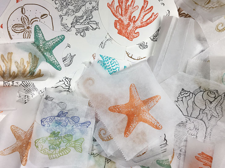
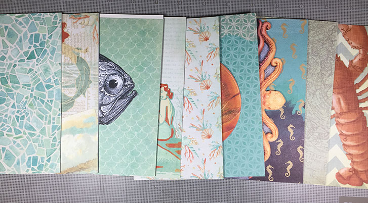
I’m making pieces that can be added to my mermaid book!
In this case, I’ve stamped on multi-media paper and deli paper. I’ve used various colors of ink because I’m not sure exactly how I will be using all of these.
Next, I will use Inktense pencils to add some watercolor effects to some of them. I may also use some paint effects over that, such as high gloss or crackle.
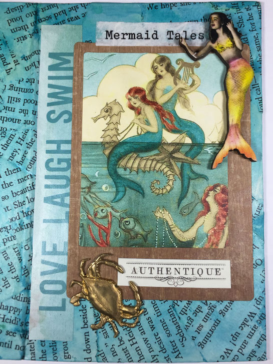
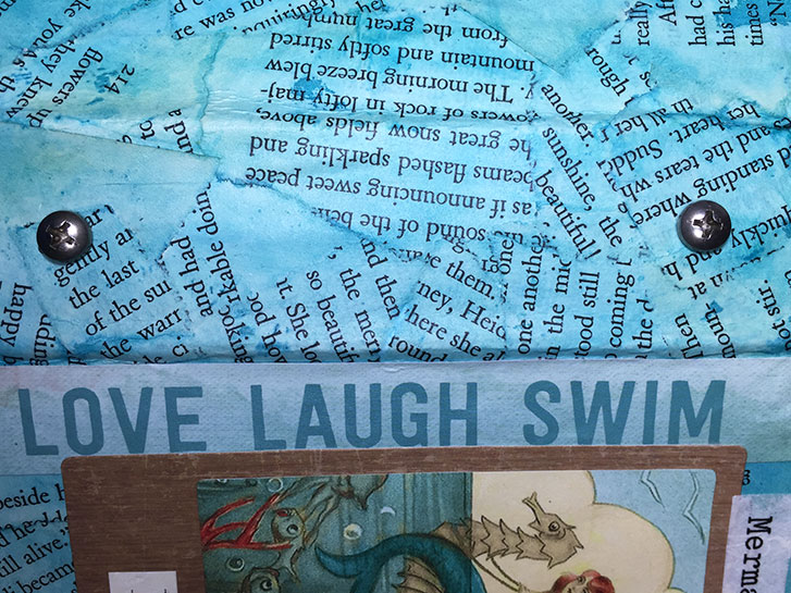
I worked on the cover of my mermaid book yesterday. I have decided that the title is “Mermaid Tales”. I added a picture of mermaids to the front, along with some word art.
I was given the dimensional mermaid by a friend, and the crab may or may not stay. I’m thinking about it.
I want to add some more dimensional materials to the cover, but I have to let this all dry first, so I don’t disturb it.
On Monday, you saw the start of the mermaid book that I made during the class on Saturday. You saw one page in the book.
Yesterday, I made more pages. Specifically, I worked on shaped pages! They aren’t finished, but I thought you might like to see what I have so far.
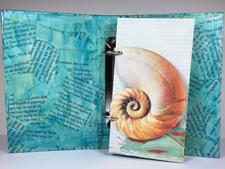
The first one is a nautilus shell. I like the shape because it reminds me of Leonardo Pisano Bigollo (c. 1170 – c. 1250) – aka Leonardo of Pisa or sometimes just Fibonacci. Fibonacci laid the groundwork for our modern-day mathematical understanding of certain shapes in nature, including Nautilus shells. As you can see, this flip-shape has the same picture on both sides of the shape.
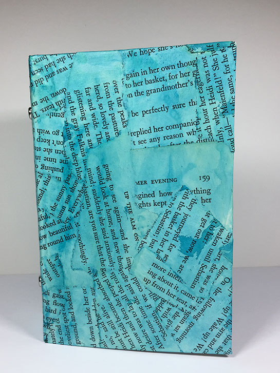
On Saturday I attended a class given by Regina Portscheller, in which we created ring binder art journals.
We made the binders from scratch, building them up from book board, collaging and painting the cover and attaching the ring mechanism.
I am making a book about Mermaids, so I chose to paint my cover a watery aqua color.
The inside of the cover is also collaged and painted just like the outside. In the image above, you can also see the ring mechanism.
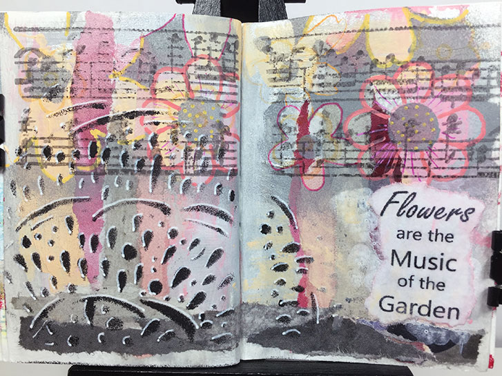
This was a struggle. I loved the underlying colors (you can’t see the silver, but it is there,) and design. I loved the flowers and the black design on the left.
And then a period of time went by, and I tried to finish this last night so I could post it for today.
You know what? That’s not a good reason to make art.
I have lost the flow, I’m tired now. I’m not loving this.
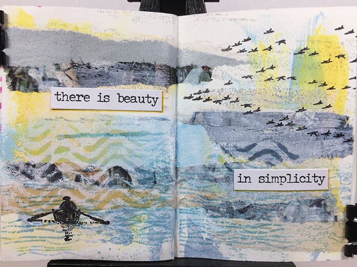
As I was creating the background for this layout, I had nothing specific in mind for finishing it. I just liked the soothing, calm colors.
I got to the point where I felt it was finished, but I didn’t know what to add for a focal point. So I went window shopping in the stamp cabinet. I was drawn to the rowing person. To me, it also was calm and serene. I also took the flying geese from the same shelf because they seemed to go well with the boat.
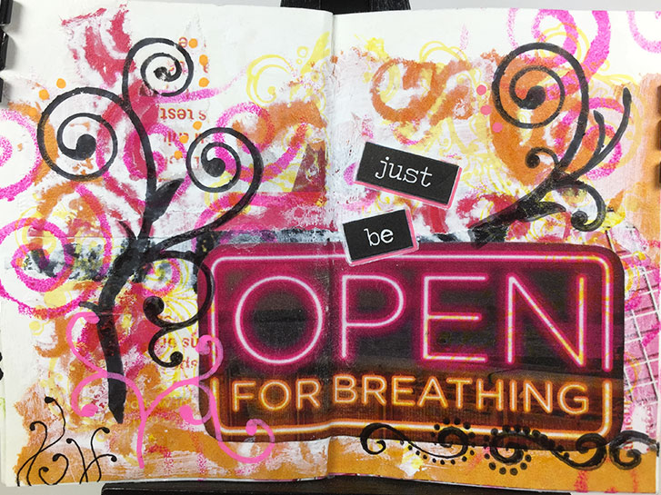
I found this sign in the magazine that I was tearing up to make these pages. I loved the colors and the shapes of the letters. So I cut it out, not having a total plan in mind at the time.
Yesterday, I was looking at it, and I also found scraps of papers with the pink and orange colors, so I decided to make this page.
In particular, I wanted strong, swirly shapes that reminded me of air, and breathing.
Sometimes it’s hard to know when to stop. This one almost got away from me.
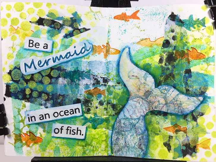
I am making a larger Mermaid book, so I thought I would turn this page into a tiny version of one of the quotes.
It didn’t originally start with that in mind. Originally, I was going with the influence of dots and circles.
But the colors were so watery looking, I just went for it.