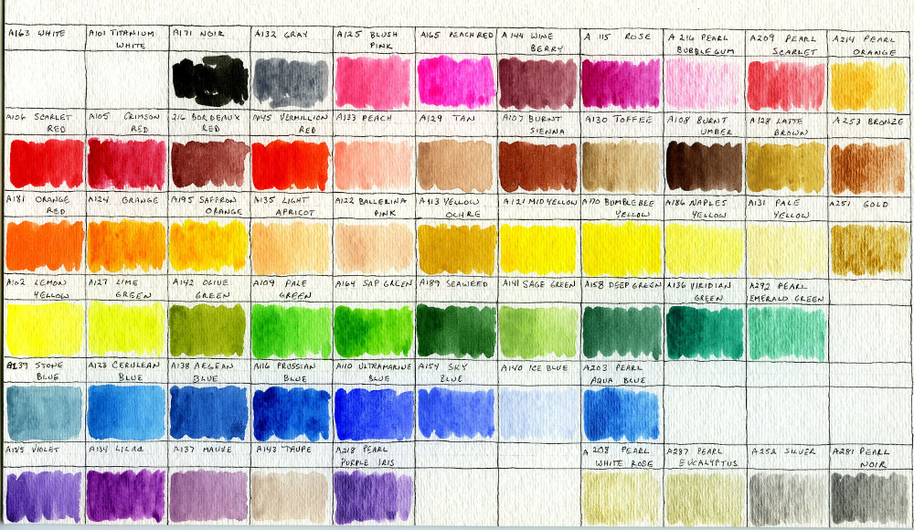
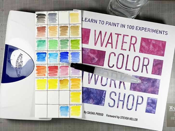
This is my new, Arteza Gouache swatch board, based on the layout of the colors in my boxes. The top three rows are in the blue box, and the bottom 3 are the grey box. There are 60 colors, total.
When I did the original swatches, I used paint right from the tube. For this board, water was added to the dried paint and then painted in each rectangle. This is more of a watercolor style and I like the colors much better this way.
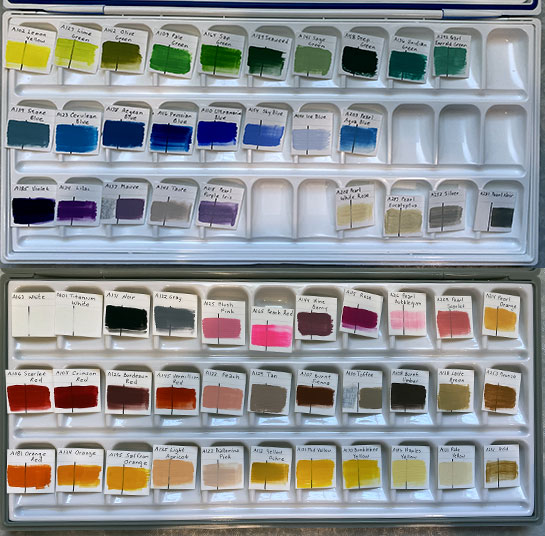
Yesterday, I showed you my planned palette set up for my Arteza gouache.
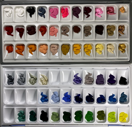
Here, you can see that I’ve added the paint to each well, in the pre-planned positions. I let it dry over night. It is really interesting to see how matte the colors are now that they have dried. Originally, they were very shiny and wet looking right out of the tube.
The paint was very creamy and easy to squeeze out of the tube. Even though I had previously opened these, there didn’t appear to be any problems with the paint being dried out. A few of the covers had a small amount of dried paint in the top, but it fell out onto my mat without any problems. And the covers went back on easily.
I have had a large set of Arteza Gouache for several months. When I first got it, I swatched out the colors but then I put them away to concentrate on another project.
Now that I have a lot of time on my hands, I decided to pull them out and set them up in the palette boxes.
I cut apart the little swatchs, and that allowed me to arrange them on top of the wells in the order that I want.
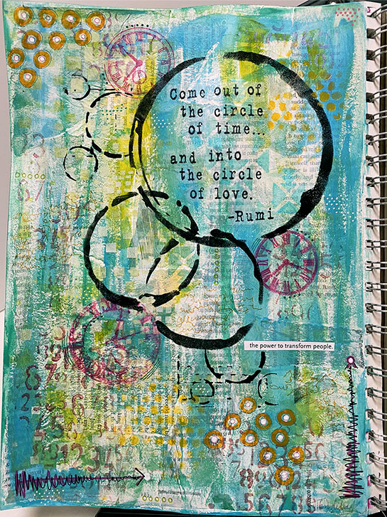
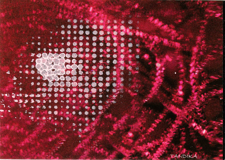
This is the big sister to a layout in my tiny art journal , which I showed you a few days ago.
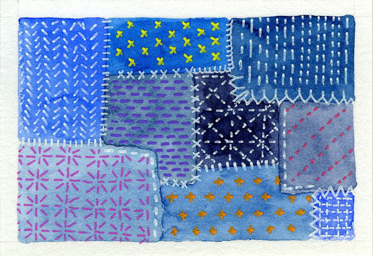
While this has a different arrangement, it started with the same concept, circles and the same quotation. It also has the same paint colors. Both backgrounds were painted at the same time.
Just as with the tiny version, this began with text papers from a book, magazines and junk mail being attached to the page with Liquatex Matte Medium. When it dried, a layer of gesso mixed with a bit of water was brushed over the page to lower the contrast.
While we are in the PT (Pandemic Time), I am, like many others, having trouble concentrating on long-term projects. I am finding myself drawn to new and different things that I hadn’t previously considered. For example, I tried knitting an stuffie. It went well, until I got to the head. I want to knit the “hair” as I am knitting the head. I keep loosing my pattern count and I still don’t have a completed head, although I’ve started over many times.
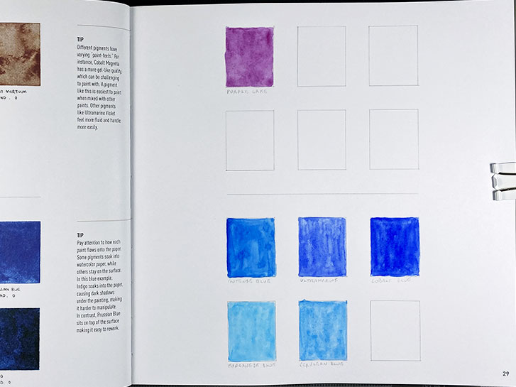
This is the third exercise in the Watercolor Workshop book (by Shasha Prood).
Here we are swatching our blue and purple paints. I had several blues in my box, but only one purple, which I’m not thrilled with.
I am thinking that I will, eventually, purchase another couple of tubes of purple paint. But I’m happy with the variety of blue.
I am doing this with my friend Sandra Mitchell. Look for her results on Facebook!
This week, I challenged the members of the Micro Art Journaling group on Facebook to create a micro layout, micro page, or tiny artwork using circles as the theme. They were also given the quotation below.
This layout began with various pieces of paper, including some text, being glued down to the page with matte medium.
When that dried, I added a light, irregular coat of gesso that had been thinned with some water.
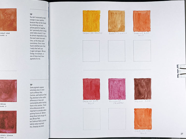
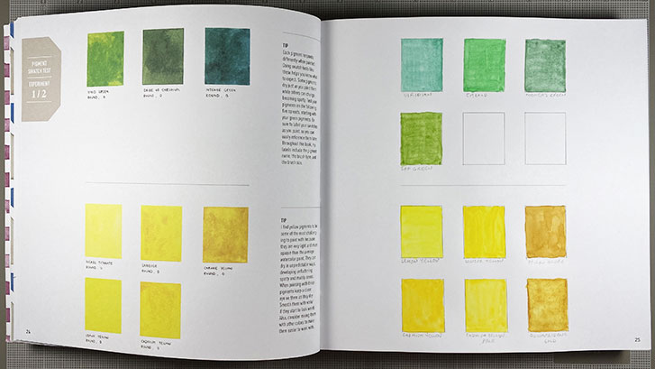
On the second day of working on the Watercolor Workshop, (by Shasha Prood), we’re making swatches of oranges and reds.
I have one true orange, Cadmium Orange, but I think these other two colors, Burnt Sienna and Cadmium Red Pale, fall into this category, also.
For reds, I have a primary color, Cadmium Red Deep, and another that is a cool red, Alizarin Crimson. Indian Red is a very earthy red and (again) Cadmium Red Pale is a very orangy red.
Another card, but this was actually cut from a greeting card.
I liked the red printed texture and I didn’t want to cover it completely. But I did want to add to what is there.
While not finished, by any means, the bit of stencilling added has given me an idea of where I might go from here. I will be working on this one some more.
#liquatexacrylics
Another junk mail card. Here, I’ve used leftover paint, swiping it across the card. Then I used the other end of the brush (the handle) to draw into the wet paint.
I saw a splotch of red-orange and decided to set the card aside to dry. Later, when I examined it closely, I realized it was person, that I think is either on a skate board, or roller skates.
This is another junk mail card. The base is, again, created by peeling paint off my palette and sticking it to the card using Liquatex Matte Medium.
When that dried, I used a few different Liquatex markers to add some interesting marks around the sides and edges.
Then I used fresh paint with stencils to add more interest.
Now I’ve set this one aside to think about. I may want to add more to it to create a firm focal point sometime in the future.
This is my first day of working on the “Watercolor Workshop” (by Shasha Prood) with my Facebook friend, Sandra Mitchell.
For the first exercise, we are painting swatches of green and yellow. We are just making a color reference and understanding what happens when each color is applied to the rectangle on the paper.
I started out with a “waterbrush”. You know the kind, it is sometimes referred to as a travel brush because you can fill the handle with water and take it with you. It turned out that it didn’t work very well. If you made a second pass over a wet area, the nylon bristles caused the paper to pill up.
A Facebook friend of mine posted a photo of a book she had that she was thinking about learning from. It turned out, I have that same book, and I’ve never gone through it!
Both of us are needing some extra motivation to get things done around the house. So we have decided to use this book as motivation.
Here’s how it works. We set some chore that we dread, but really need to get done. When it’s finished, our reward is we get to do one exercise from the book. We will be taking an “art break” in between our chores!
Yesterday I was determined to accomplish something, anything in the studio.
I’ve been wanting to experiment with peeling paint off my palette and using it in some manner. So I decided to try it on one of the junk mail cards. It peeled off in chunks and strips and I used Liquatex Matte Medium to glue it to the card.
I discovered that side that is against the palette is often very differently colored than the front, so you get some surprises. I also found that it is very slick and shiny. I like the texture the pieces created.
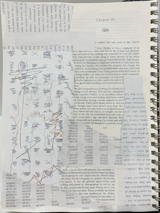
Another underpinning! Again, this is a text example, but this time, the text was added to a gessoed page using rubber stamps and various colors of Archival ink.
When the stamped images dried, I went over them with a heat gun, just to make sure they were set.
Then a light coat of gesso was applied. This knocks back anything that is too strong, and insures that the next layer will not cause the ink to bleed.
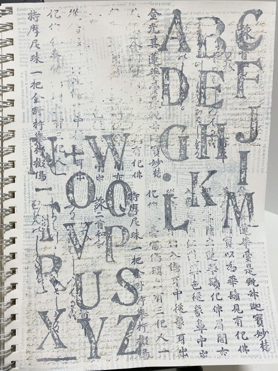
Today, I have another underpinning. This week I am experimenting with different ways to get text texture added to the backgrounds of pages.
Here, I’ve used various sheets of printed text, torn into pieces and glued to the page with matte medium. There are pieces from books, junk mail, calculation sheets, a print out, and even some hand written notes.
After the papers dried, I added a light coat of white gesso to knock back the contrast while allowing the texture to still peek through.
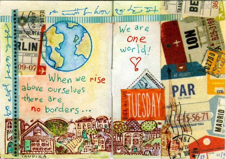
Things are changing rapidly over the world. That got me to thinking about all of my friends who live, not only in my country, but around the world. My art friends, my Zentangle friends, my Facebook friends.
I want all of them to know that I think about them. I worry about them. I pray for them. And if I could do something for them, I would and I will.
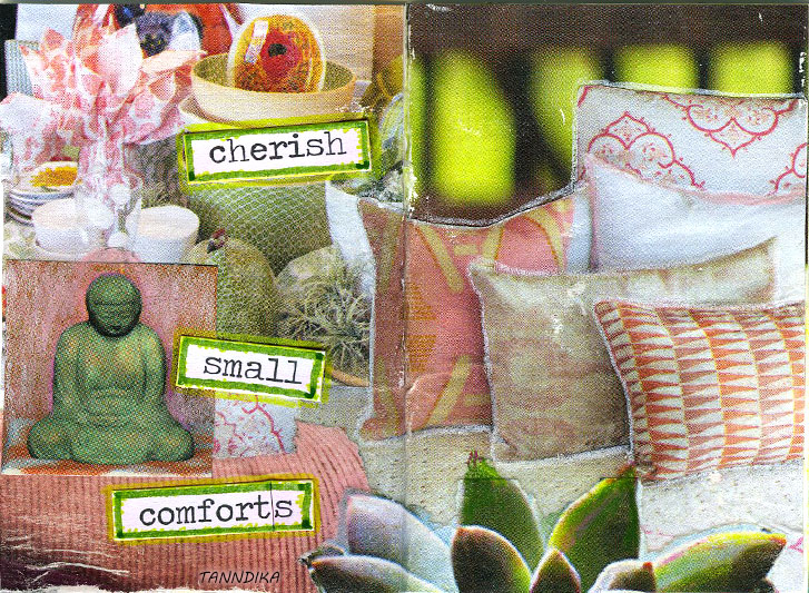
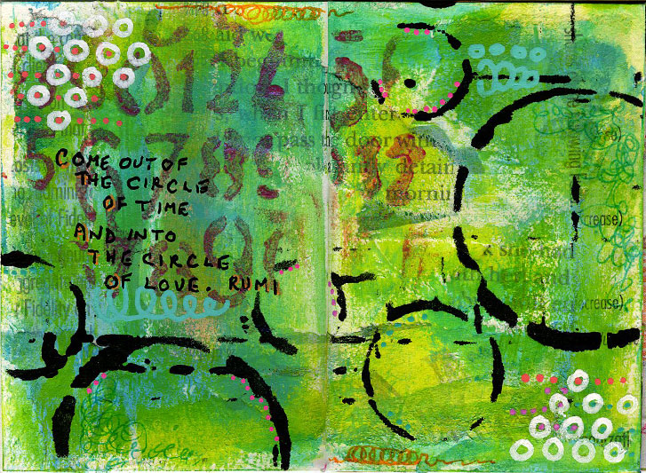
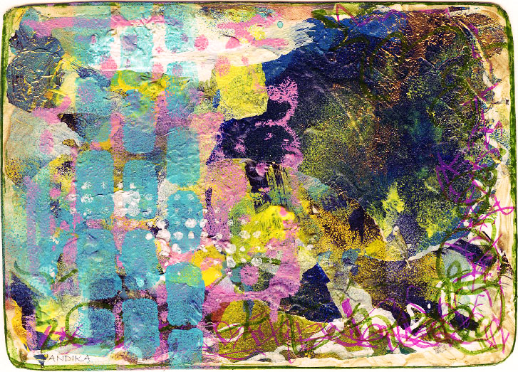
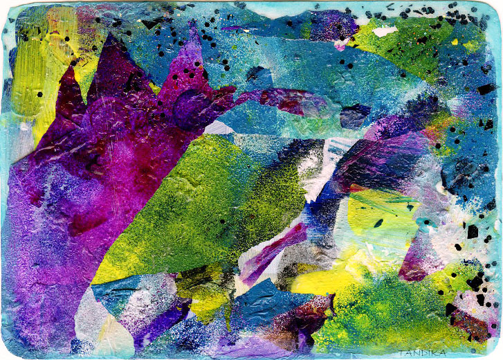
This week, I challenged the members of the Micro Art Journaling group on Facebook to create a page or layout that included the color green, with the theme of healing.
It’s a stressful time, and we need to think about taking care of ourselves. It is important to maintain as much inner peace and calm as possible, along with taking care of ourselves and our community.
Because of this, I’ve chosen to create a “glue book” style layout using colors chosen to represent watermelon tourmaline. This is the stone of the heart chakra, and represents healing for health, emotions and spirit.
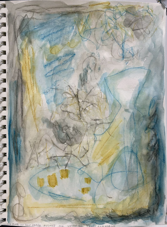
A while back I showed you a page in my art journal that was just a scribbled background. I call this kind of page an “underpinning” because it is what will end up under whatever else goes on the page. It may or may not show in the final version.
I’m making a section in my journal of various type of underpinnings.
I’m showing you this one this week because I’m working with teal, yellow and grey. I used those colors for this example.
As I mentioned yesterday, I’m working with the colors Teal, Yellow and Grey this week.
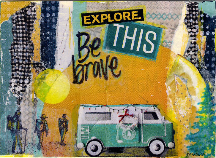
I decided to do a layout in my micro art journal. As I was looking for papers in the appropriate color scheme, I came across this big yellow partial circle shape in a magazine. I didn’t know what I was going to do with it, but I cut it out and set it aside.