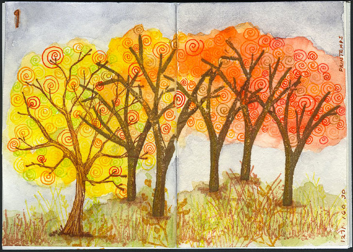
On the first day of Spooktacular2019, I incorporated the Inktober Zentangle prompt, which was Printemps in my tiny art journal layout. Here, I used them to make the brightly colored foliage in the trees.
The tree trunks were stamped on the page, then the tangles were added. Watercolors were applied and the foreground was stamped. Additional watercolor was added to the background and foreground. Finally some colored pencil was used for shading, color and texture.
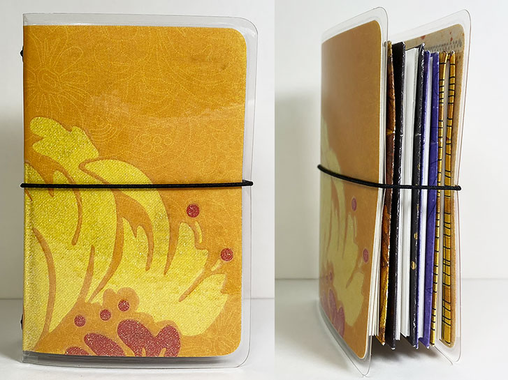
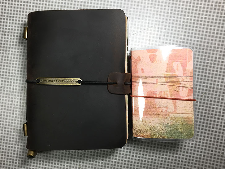
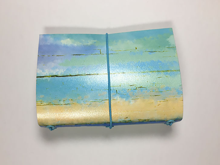
Yesterday, I showed you the cover of my tiny, Spooktacular2019, traveler's notebook . Today, I have the completed set for you. Above, you can see the set, closed, from the front and opening edge.
Right now, the inserts are blank inside. Today I will be beginning the artwork. The paper is from Bee Paper Company. It is from the spiral-bound, Super Deluxe Mixed Media book. I love this paper because it’s not too thick to use in a small book, but it holds up well to wet and dry mediums. Each insert has four, folded pieces of this paper and a decorative cover. This creates sixteen individual pages for art, or seven, double-page spreads. If used for spreads, there is a remaining front page for a table of contents and a last page that can be used various ways.
It’s almost time for the Spooktacular Anniversary on Facebook's Micro Art Journaling Group !
In honor of the occasion, I am making a new journal cover and inserts to use during the month of October.
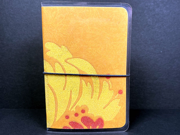
The outside of the cover is a nice combination of fall colors with touch of sparkle.
The paper I used for the cover was blank on the reverse side, so I used various stamps to add color and texture to compliment the theme.
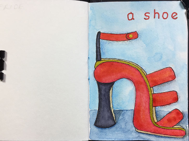
For the month of June, the Micro Art Journaling Facebook Group is doing an interesting challenge. There is a “cloud” of prompts. When you have a list, people usually start and the top and work their way down. With a cloud (the prompts are placed randomly positioned in an image) there is no starting, ending, or ordering. You can just choose randomly.
So, the first one I’ve done, is “a shoe”. I thought it would be fun to just do a super-high, bright red, strappy women’s high heel! It wasn’t difficult and lots of fun.
I get asked all the time: “How small IS your art journal.” Well, they say a picture is worth a thousand words…
However, I’m still going to say a few! On the left is my Passport Traveler’s Notebook from Chris.W on Amazon.
On the right is the A8-sized Traveler’s notebook that I use as my art journal.
As you can see, the A8 is much smaller, and the inserts are even smaller than the cover.
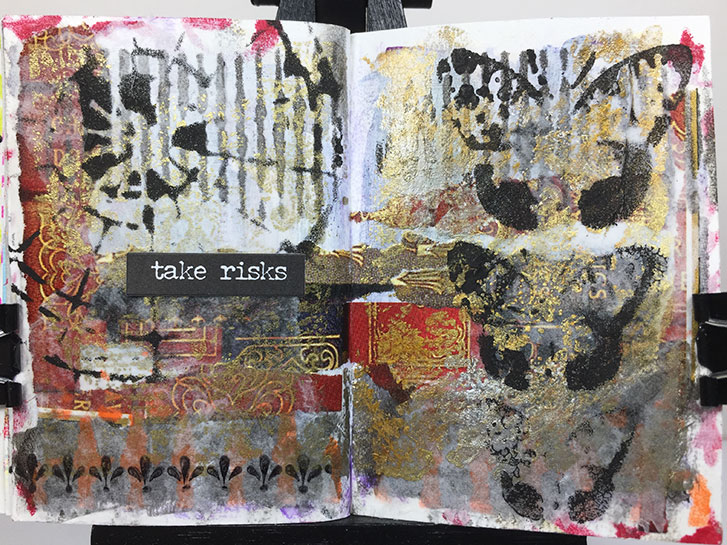
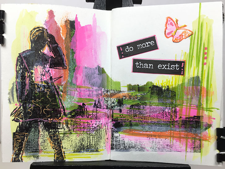
This layout, in my Tiny Traveler’s Notebook Art Journal, is all about taking risks.
It started with a page from a magazine that featured images of the spines of books, decorated in gold. I loved the rich, old-world, wealthy, royal look of them. They reminded me of a castle library somewhere in England.
So, I decide to use regal colors of purple, red and gold to paint on the page. I really didn’t like it after I did it because the purple was intense and transparent and just looked messy to me.
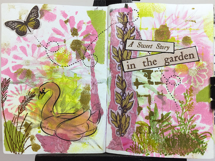
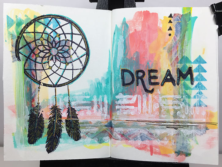
A spring layout in my Tiny (A8) Traveler’s Notebook!
I was putting this together over the weekend, and I kept thinking of Easter and Spring. It made me think of how pretty the gardens are this time of year.
I loved the pink and green combination that developed as I practiced making grass-like strokes with them. The base design ended up looking so pretty.
I deliberately looked for a stencil with a variety of flower shapes to add to the page.
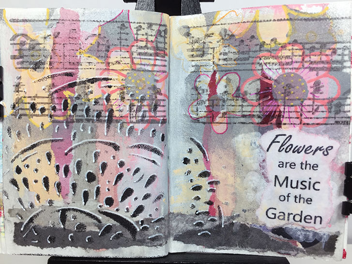
This was a struggle. I loved the underlying colors (you can’t see the silver, but it is there,) and design. I loved the flowers and the black design on the left.
And then a period of time went by, and I tried to finish this last night so I could post it for today.
You know what? That’s not a good reason to make art.
I have lost the flow, I’m tired now. I’m not loving this.
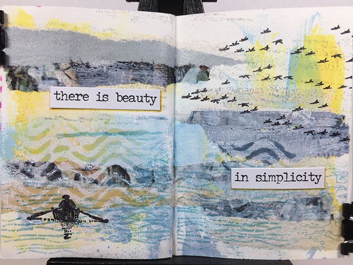
As I was creating the background for this layout, I had nothing specific in mind for finishing it. I just liked the soothing, calm colors.
I got to the point where I felt it was finished, but I didn’t know what to add for a focal point. So I went window shopping in the stamp cabinet. I was drawn to the rowing person. To me, it also was calm and serene. I also took the flying geese from the same shelf because they seemed to go well with the boat.
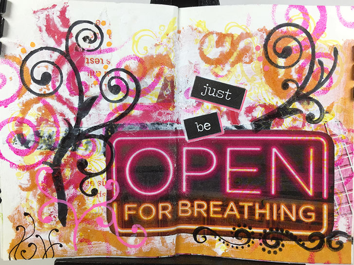
I found this sign in the magazine that I was tearing up to make these pages. I loved the colors and the shapes of the letters. So I cut it out, not having a total plan in mind at the time.
Yesterday, I was looking at it, and I also found scraps of papers with the pink and orange colors, so I decided to make this page.
In particular, I wanted strong, swirly shapes that reminded me of air, and breathing.
Sometimes it’s hard to know when to stop. This one almost got away from me.
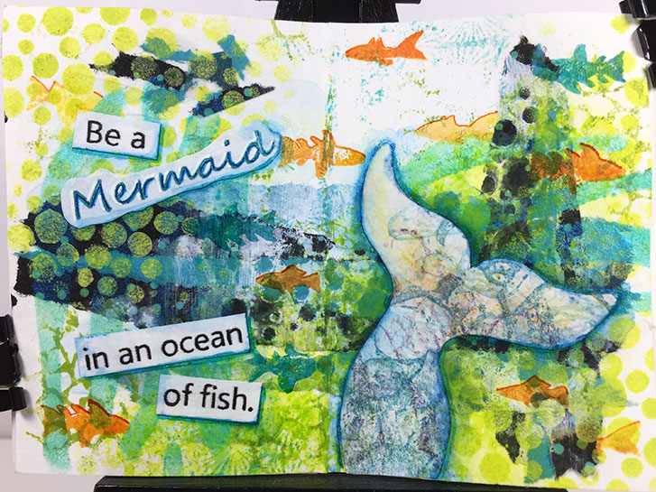
I am making a larger Mermaid book, so I thought I would turn this page into a tiny version of one of the quotes.
It didn’t originally start with that in mind. Originally, I was going with the influence of dots and circles.
But the colors were so watery looking, I just went for it.
I am definitly falling in love with this style. I’m considering doing it on a larger scale when I finish this month’s self-challenge!
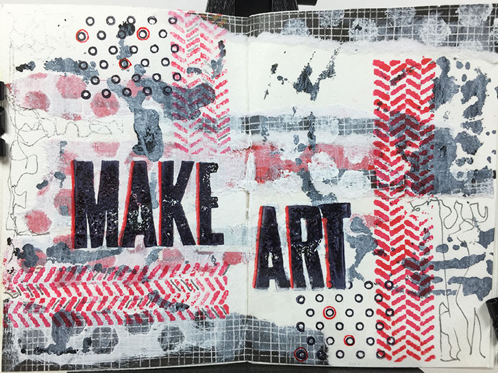
This started with some red strips torn from a magazine advertisement. I decided to add some strips of black scrapbook paper with a check pattern.
At that point I made the decision to go with black, white and red only to see if I could make it work.
Another spready in my tiny, Traveler’s Notebook art journal. This one uses the same materials as yesterday. However, it turned out to be more of a challenge.
I am enjoying the process of these. But now I’m wishing for more pen colors. I may have to switch to acrylic paint to get what I envision!
#microart #microartjournal #miniatureartjournal #miniartjournal #miniatureart #tinyjournalnation #allthingstiny #allthingsminiature #microartjournaling #tinyartjournal #travelersnotebook
I haven’t posted any pictures from my tiny TN art journals in a while, so I thought I would show you the one I did yesterday. The materials used here are torn design paper, matte medium, Posca pens, stamps, Archival ink, metallic gel pens and regular gel pen.
This is a fairly simple technique that creates a big impact. I am really happy with the way it came out.
Even though this was one of the first tiny Traveler’s Notebooks that I made, I never wrote a post about it. So now’s the time, since some people are looking for easy, simply way’s to make a cover for their tiny art journals.
This was made from a piece of an inexpensive, plastic placemat. You can find these at dollar stores, walmart, and some grocery stores. They are in the kitchen section. The price ranges from $1 to $5 and each place mat can make several covers, depending on the size you select.
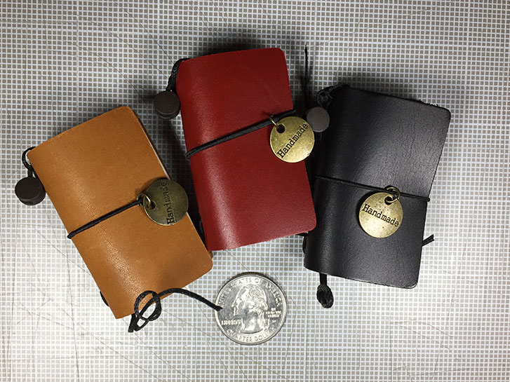
I have a few, very tiny Traveler’s Notebooks that I actually purchased. These are from Chris.W .
The leather is very nice. Stiff, but sturdy. The come with two, fat inserts, with 20 sheets in each for a total of 40 pages in each. The size of the insert is almost A9, but they are a little bit shorter and definitly not as wide. You can purchase refills from the same link, above.
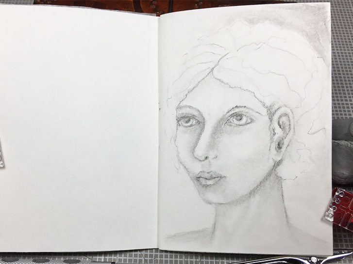
This is the third portrait in my tiny art journal. This three-quarter view was challenging in that there is some differences to the features on the right side of the face.
I had some trouble with it, but over all it’s ok.
On a side note, the reason I skipped over a page is that I had to find some paper to put between the first two pages before I could draw on page three. That’s so that the graphite doesn’t transfer from one page to the other as I draw!
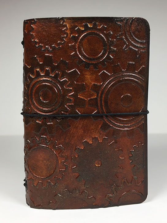
I decided to use the side that had a bit more mahogany coloring to make the cover! I absolutely love the way this turned out. Although it doesn’t show up in the photo above, there are some metallic touches on the gears. They’re subtle, so you have to move it about in the light to actually see them easily.
This photo came out distorted, but the cover actually is a real rectangle. I just wanted you to be able to see the entire cover. This time, the camera picked up a little of the metallic.
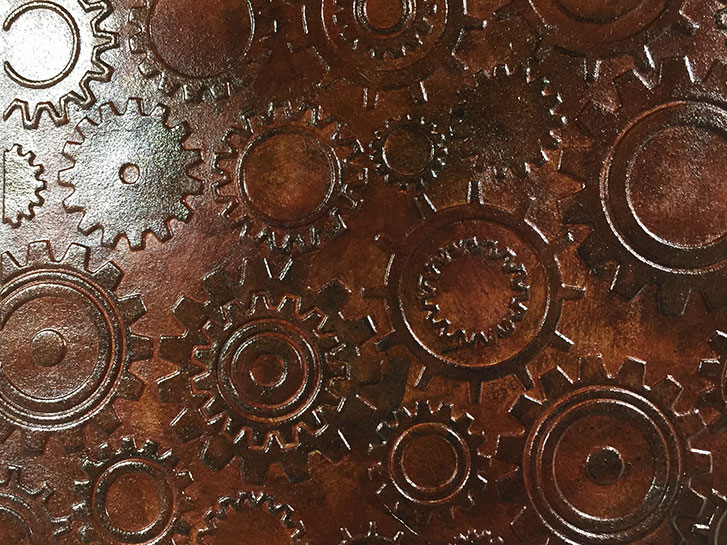
Oh my! I’ve done the coloring on both sides of this, and I’m not sure which color way I like better!
The side that is supposed to be the front, with the raised gears has a gorgeous mahogony leather tone with some metallic sheen on the gears.
Above is what should be the “inside” of the Traveler’s Notebook. It’s a cooler brown color with the metallic sheen.
I love both of these and have written down the “recipe” for both. Hopefully, I can repeat either color again, on a different swatch!
I’ve done several swatches, but I think these would be good for a steam punk theme!
If you would like to join a group of fellow art journalists, follow along with tutorials, and show off your work, you can find this and more in the Micro Art Journal group on Facebook!
#microart #microartjournal #miniatureartjournal #miniartjournal #miniatureart #tinyjournalnation #allthingstiny #allthingsminiature #microartjournaling #tinyartjournal #travelersnotebook