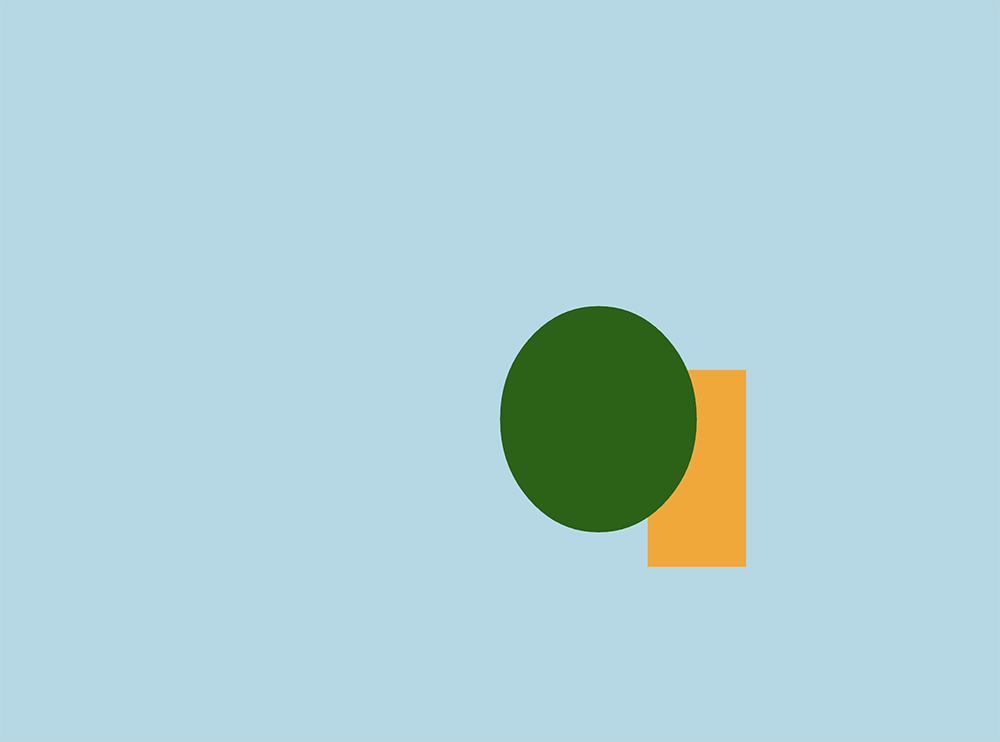
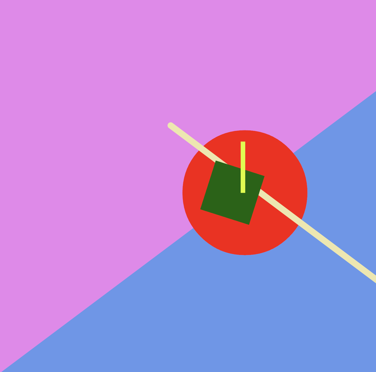
Now that you have Rust and Nannou installed , lets look at a basic Nannou sketch. A sketch in Nannou is a fast way to get a drawing displayed. Here is a simple one which just draws a rectangle and an ellipse on a colored background.
use nannou::prelude::*; fn main() { nannou::sketch(view).run(); } fn view(app: &App, frame: Frame) { let draw = app.draw(); draw.background() .color(LIGHTBLUE); draw.rect() .color(ORANGE) .w(100.0) .h(200.0) .x_y(200.0, -100.0); draw.ellipse() .color(DARKGREEN) .w(200.0) .h(230.0) .x_y(100.0, -50.0); draw.to_frame(app, &frame).unwrap(); } So what is going on here? At the top level, the three important parts of this sketch are the use statement, which imports all the Nannou components we need, the main() function, and the view() function. This is, in itself, a complete Rust program as well as a Nannou sketch. In Rust, the main() function is where the program starts – it’s the code that is executed when the program is run. In this case, that is just one line: nannou::sketch(view).run();, but there’s a lot going on on that line!
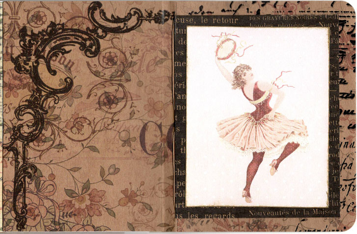
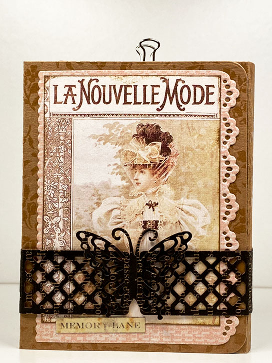
These are the final pages in my La Nouvelle Mode art journal.
While they are not complex, I felt that the last page, on the right, celebrates the joy of the journey as it might have been felt by the imaginary traveler.
The page on the left has space to add a sticker or two, or some other decorative item of the user’s choice. It could also be left, just as it is, as a beautiful contrast to the dancer on the right.
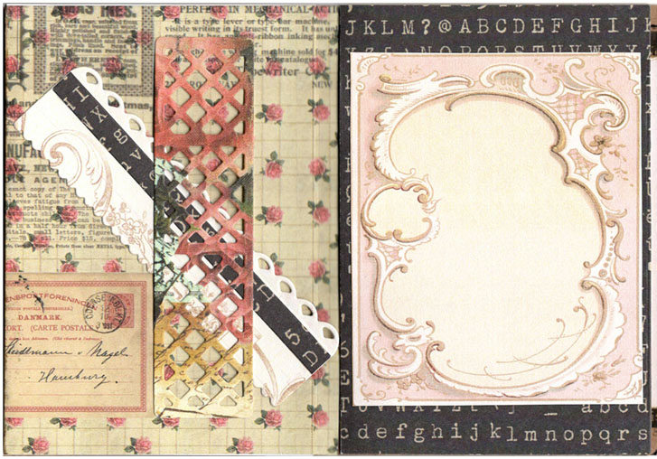
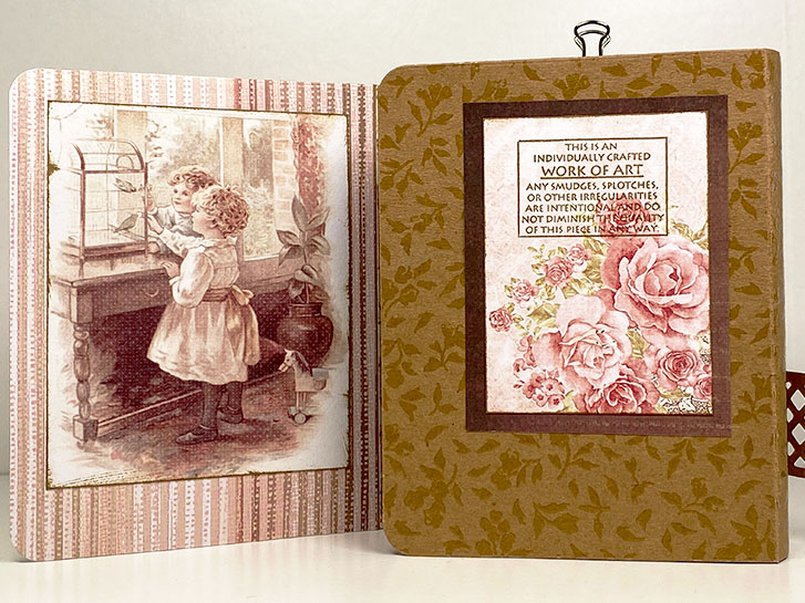
This is the back side of page 6 and the front side of page 7.
On the left page is a frame around an empty space. This space could be used for a quick sketch or additional journaling.
On the left side of this layout, there is a decorative strip that holds a book mark. This strip is often referred to as a “belly band”. It can be a piece that is attached at both ends or a strip that wraps around a page.
Today we’re looking at the back side of page 4 and the front side of page 5. These pages are tipped into the right fold of the trifold cover.
On the left side, you can see the front of a journaling card. This card is held into the journal by a tiny binder clip.
Here, you see the back side of the card. There are two different spaces for journaling or notes.
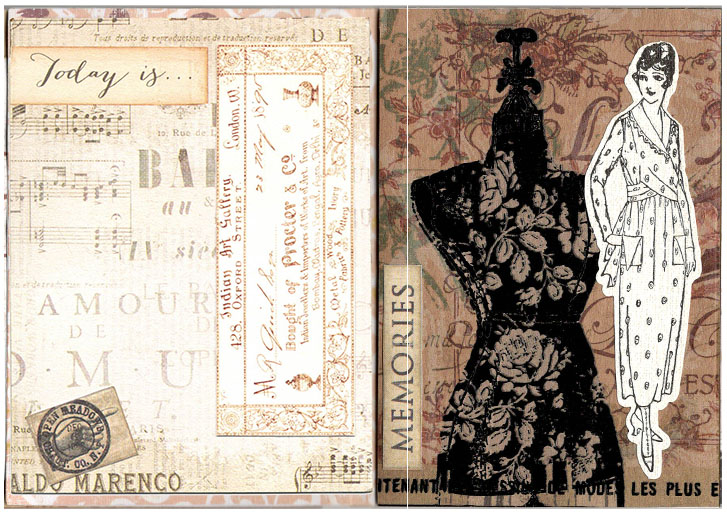
Today, we’re looking at the half-way point in the trifold journal! The image above is the back side of page 3, the center back of the trifold cover and the front side of page 4.
Above is a closer look at the back side of page 3 and the inside, center of the trifold cover.
This is a closer look at the center of the cover and the front of page 4.
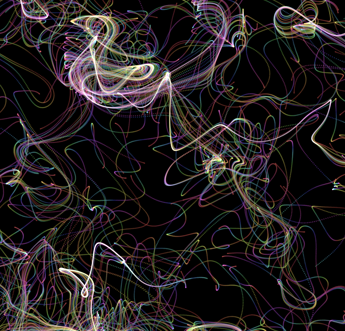
In my last post , I mentioned Nannou , a generative art framework for the Rust programming language. While I am focusing mainly on drawing here, Nannou goes much further dealing with user interface, audio and video, and even lasers ! Its goal is to provide tools for artists building any kind of art installation.
For drawing, it is similar to Processing in how it is used, and therefore similar to all the other frameworks I’ve discussed here, which are all based on, or at least inspired by, Processing.
If you recall, last week we were looking at my first journal made using the Journal Template Die Set from Art Impressions .
Here, you can see the back side of page 2 and the front side of page 3.
The left side has a small envelope attached to the page, and inside there are two, translucent, washi-style stickers.
The right side has a decorative pocket. I managed to cut it to frame the typewriter, which was on the paper, nicely.
Today we’re looking at the back of the first page on the left side of the tri-fold book. This page has an additional pocket added to it. The pocket, itself, has a slit in it which holds a tag.
In the pocket behind the tag there is decorative card and a decorative tag. The last item to the right is the journaling tag from the pocket slit.
The back side of the shirt tag is plain white, so I didn’t include it in the photo above. However, the decorative card and the tag in the slit pocket have more space for notes or journaling on the reverse side.
Continuing from yesterday’s post, this is the first view when you open the cover of Victorian Dressmaker’s Notebook. Because this book is a tri-fold, you see the part of the outside cover that is folded to the inside of the book when it is closed.
When the cover is opened, you see the first pages, which are attached to the left side of the book.
This book is set up with three double-sided pages tipped into the cover on each side, giving it 12 inner pages. The actual number of pages can be more, depending on the construction you choose. You’ll see an example of this when we get to the page on the right side.
I made this book some time ago, but I thought I would finally share it here. It is constructed from scrapbook papers, found items, card stock, and some odds and ends I’ve had for a long time.
The theme is a Victorian Dressmaker’s Notebook in Paris. It could be a book in which she kept notes, samples of fabrics, and sketches of designs, perhaps.
The book is constructed as a tri-fold. Above you can see just the outside, front cover, with the butterfly-clasp, closing band removed.
This is my first real new post since 2020. All the ones posted at the end of 2023 were written back in 2020, and have been backlogged while we dealt with personal issues. New year, new posts!
In my previous posts, I’ve explored some basic generative art in a variety computer languages and art frameworks. We tried Javascript with p5.js , Clojure with Quil , and Java and Processing . I don’t have any post to document it, but in the past few years, I also experimented with Kotlin and Go for artwork.
Welcome to 2024!
I am beginning my year by going back to my roots. I realize, it may seem strange to go backwards to go forward. This year, however, I want to continue doing things that worked for me, while leaving behind the things that didn’t.
One of these is my tiny art journals. I love them because they give me just enough space to do a bit of journaling, keep track of some things that I need/want to remember and just enough room to create a small art piece. They are fun to do, and don’t take up a lot of time.
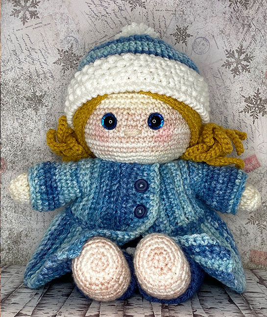
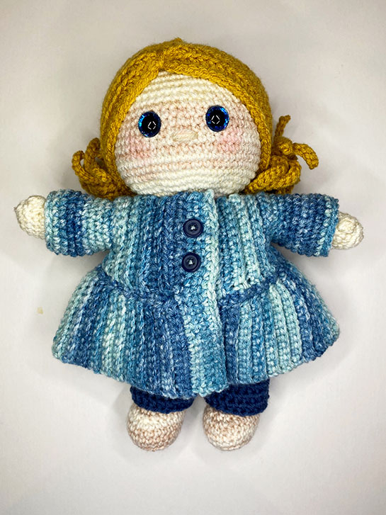
It’s finished!
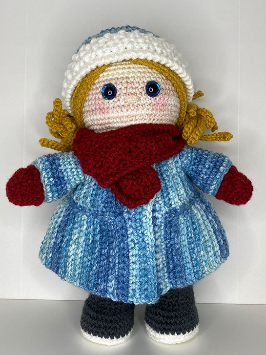
I can’t believe that I’ve finished my first Crochet Along project! It’s been a lot of work, and I had to fit it in with all the crazy stuff we have to do during the Christmas holidays.
I did make a couple of mistakes. However, the more I did, I feel like I made fewer mistakes and got better at keeping my tension under control.
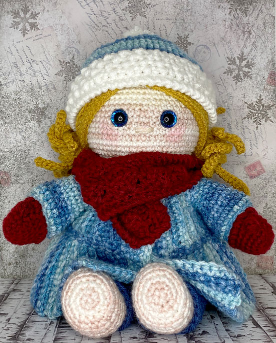
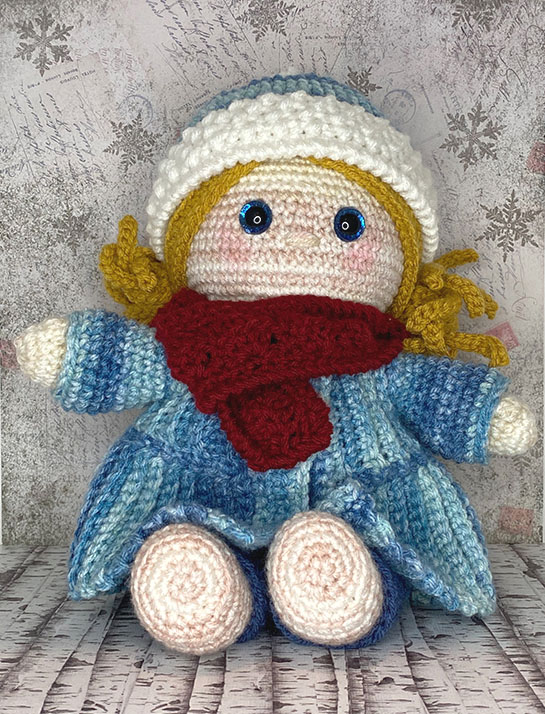
I love the end results, and I’ll probably make more clothes for this doll over time.
The week before Christmas is always so busy! It seems like I’ve just gotten up and it’s already time to sleep. I had only a little time to myself. However, by working a few minutes here and a few there, I managed to finsh the scarf for the MCAL.
I chose the deep red color as a contrast to all the blue and white in this set so far.
“Everybody should learn to program a computer, because it teaches you how to think.”
— Steve Jobs
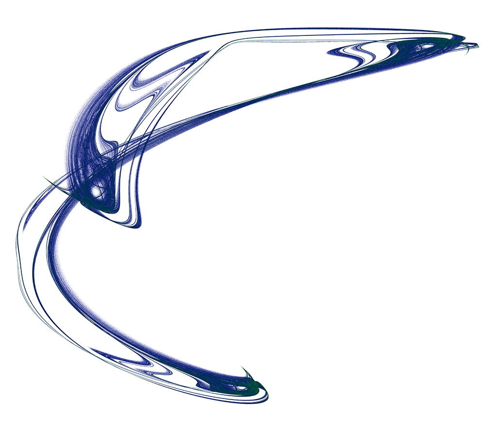
I’ve shown many attractor images I have generated over the past few weeks, but how have I been drawing them? I have been writing code to do so, but stopped including it in the posts because it was getting long and complex. I promised that, someday, I would share the code. Today is that day!
I finished the hat from the 4th set of patterns! This hat uses Front Post Double Crochet, Bean and Twisted Single Crochet stitches to create rich texture for the hat. While these stitches have already been used on other parts in this project, they all come together in the hat. I am now feeling much more confident about doing these and I’m sure I’ll be using them for other projects.
This pattern is fairly easy. It is a repetitive pattern, so once you understand how it works, it moves along fairly quickly.
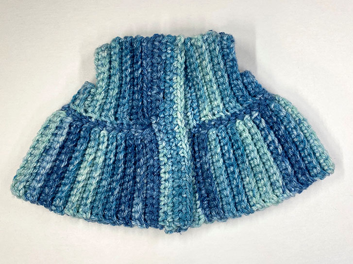
Here, you see the top part, skirt and button bands are completed.
All I have left to do is to sew on the buttons and crochet the sleeves!
#weebeeappreciationsociety #weebee #weebeedoll #crochetmakealong
