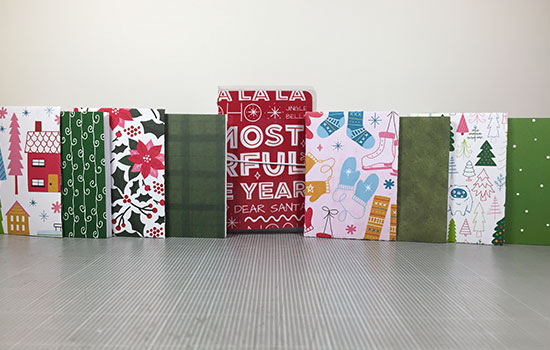
There are so many things that signify the Christmas season to various people. Everything from trees to ice skates come to mind. Poinsettia flowers, holiday lights and mittens might appeal to you or a friend. For this nano Traveler’s set I tried to pick designs that have universal appeal!
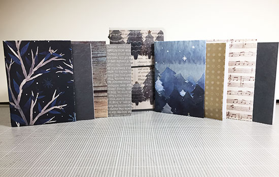
The inserts are just under 3" high and 2" wide. Here, you can see the inside of the wraps and the inside of the cover.
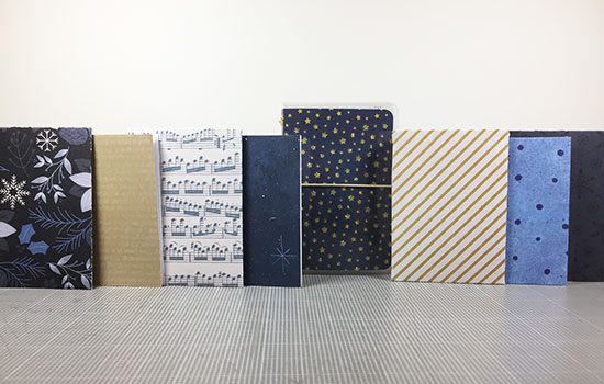
Blue and gold is a really elegant holiday color combination. It reminds me of night skies, twinkling lights and peacefulness. The addition of a bright, lighter blue gives this combination a nice modern touch without overwhelming the elegance!
The inserts are just under 3" high and 2" wide. Here, you can see the inside of the wraps and the inside of the cover.
I love the size of these. They are a perfect pocket size!
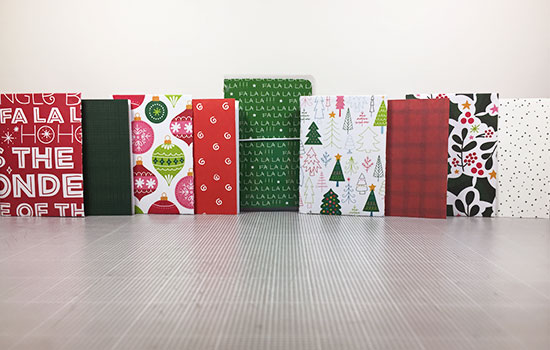
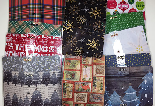
Red and green plaids are always popular around Christmas. To me, they have a “country” feel to them. I chose prints for the accessories for this one based on the “little bit country” idea!
The inserts are just under 3" high and 2" wide. Here, you can see the inside of the wraps and the inside of the cover.
I love the size of these. They are a perfect pocket size!
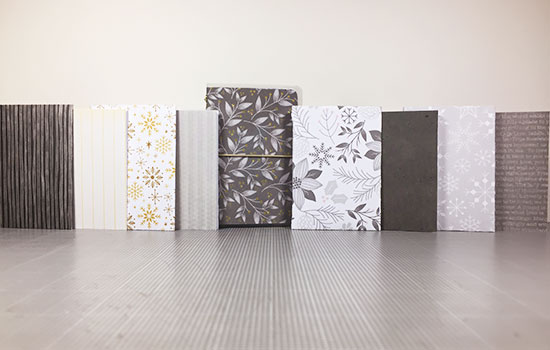
Ok, it’s not exactly Christmas. But not everyone celebrates the holiday! So I decided to make one that is just Winter-themed. Lots of snowflakes, shades of grey and white with a touch of gold! The berries on the cover are made of gold glitter, but it won’t make a mess in your pocket or purse because it’s sealed under protective plastic!
The inserts are just under 3" high and 2" wide. Here, you can see the inside of the wraps and the inside of the cover.
Another modern Christmas nano-sized Traveler’s Notebook! This time the cover is a graphic, word-based design. There’s nothing like decorating a traveler for Christmas! Oh, wait, there IS: A Traveler’s Notebook that fits in a pocket and the palm of your hand!
The inserts are just under 3" high and 2" wide. Here, you can see the inside of the wraps and the inside of the cover.
I love the size of these. They are a perfect pocket size!
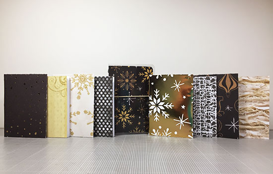
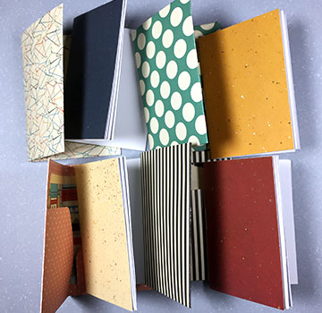
I think black, gold and white is such a grownup, sophisticated color scheme for Christmas. I don’t know about you, but sometimes I just get overwhelmed by all the regular red and green stuff and it kind of just blurs all together. This set would also work into the New Year’s celebrations because it reminds me of tuxedos and gold gowns at a midnight ball!
The inserts are just under 3" high and 2" wide. Here, you can see the inside of the wraps and the inside of the cover.
I want to take this time to thank everyone who’s followed my art journey over the years. It has, over time, taken various twists and turns (and even a few hard lefts and reversals.)
I love looking back over what I’ve accomplished and somewhat stunned: I did THAT?
But throughout it all, there are some of you who’ve been there on almost every step… encouraging, suggesting, helping and enabling.
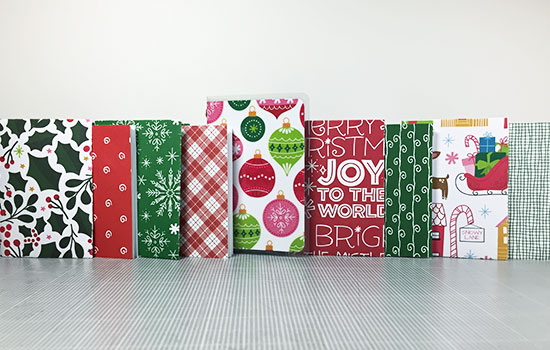
Looking for a more modern Christmas design? I love tree ornaments and these with the touches of pink and lime really appealed to me. In keeping with the theme, I chose designs for the inside inserts and pocket wraps with strong, graphic designs.
The inserts are just under 3" high and 2" wide. Here, you can see the inside of the wraps and the inside of the cover.
Although I made this tiny Traveler’s Notebook for the Christmas Collection, it could also be used all the way through January. The color and themes carry all the feeling of winter!
The inserts are just under 3" high and 2" wide. Here, you can see the inside of the wraps and the inside of the cover.
I love the size of these. They are a perfect pocket size!
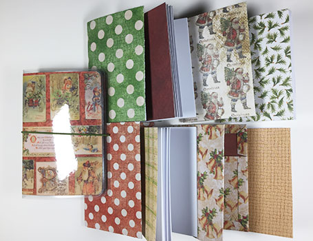
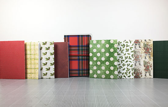
I spent the weekend making pocket wraps and inserts for my tiny Christmas Traveler’s Notebooks! Here’s the first one. I liked the old-fashioned look of the cover design with images of Christmas seals.
The inserts are just under 3" high and 2" wide. Here, you can see the inside of the wraps and the inside of the cover.
I love the size of these. They are a perfect pocket size!
Yesterday , I mentioned that I was going to make another micro Traveler’s Notebook with a Christmas theme.
I couldn’t make up my mind and choose just one, so I went for a dozen! Everything from Olde Tyme to Modern to Designer Chic!
Today I will put in the elastics and make folders!
Enjoy,
Tandika*
#journaling #travelersnotebook #microtravelernotebook #microsizetn #tnlife #tnplanner
Yesterday, I showed you the Micro Retro Traveler's Notebook that I am creating for journaling.
Today, I wanted to show you the folders that I made to go with it. I happen to like pocket folders. They give me places to put store receipts, stickers, washi tape dashboards (I also like those washi dashboards), business cards and other such pieces of paper and journaling things that I need to keep track of.
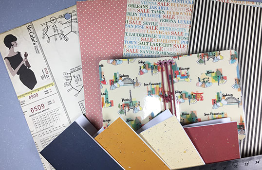
I have several different Traveler’s Notebooks. Some, I’ve bought and some I’ve made. They range in size from the classic Midori down to passport and I even have some that are teeny, tiny.
What I didn’t have was one that was really small, but still big enough to actually journal in. So I made one.
I realize it looks huge in the image above, but the inserts are only 3" high by 2" wide. So that still falls into the micro book category. A standard Micro Traveler’s Notebook is approximately 4-1/8" high by 2-7/8" wide.
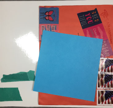
This envelope arrived in the mail last Friday! I knew it had to be from an art friend, because of how it was decorated! I started pulling off the washi tape, to save it and then I realized I should take a picture first! I covered up the address, and here it is.
This is the back. The orange scribble I added to the photo because the return address was written on the flap. More washi tape for my collection!
All the leaves are falling quickly. It just takes a bit of a breeze to knock them right off the trees.
I guess I should go out tomorrow and clean up the yard. I’ll put all the leaves in the composter so that I can start with a fresh batch of compost in the spring!
Last year, when the kids helped, some of the yard decorations ended up in weird places. We had better be more careful this year!
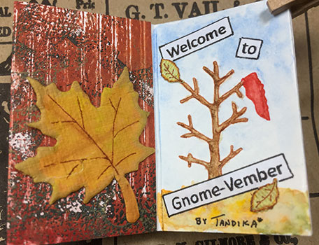
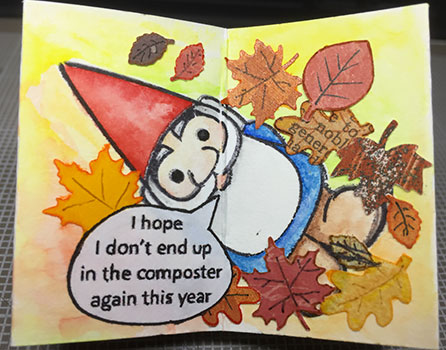
Welcome to Gnome-Vember!
I’m starting a new mini art journal! This time, it is about Autumn, Gnomes and the month of November.
The weather is getting colder, the plants and trees are shedding their leaves, and the garden is fading away, soon to be buried in snow. All of those wonderful garden ornaments have been forgotten and left to fend for themselves until spring!
Instead of working in a micro Traveler’s Notebook insert, for this volume, I’ve made a little, self-contained book. The paper inside is Aquabee, Super Deluxe Sketch book from the Bee Paper Company . The closed book measures 2" high by 1-1/4" wide.
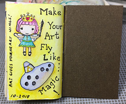
When all the monsters are vanquished, you can fly!
If you don’t let all those children of the Inner Critic get in your way, or stop you from creating, just imagine what you could accomplish!
I have to shove my monsters in a closet, force them to go away, or just not listen to them… and then I can pick up my brush, or pen, or colored pencils. And art is what brings me joy, so it’s very important.
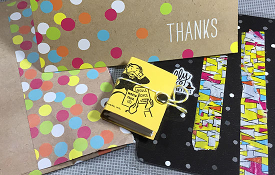
The Micro Art Journal Facebook group is currently having a trading session where we are each making a blank micro art journal and then mailing it off to our trading partner.
My partner sent me this tiny journal made from a Monopoly game card! I think it’s amazing! And it came in a fantastic envelope with a thank you card inside and a note from the sender. The envelope was sealed shut with washi tape, which I carefully peeled off and stuck to the Halloween dashboard that you see here. I am saving all of these parts to use again!
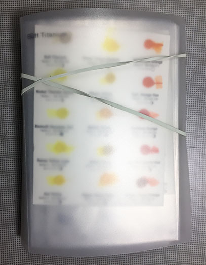
Instead of showing you art, today, I want to show you something that I use to make it.
I’ve been using watercolor a lot lately. I decided, since I’m making tiny pictures, to get a set of Daniel Smith Dots from Amazon. This is a set of small “dots” of every color of Daniel Smith watercolor paints.
I wanted to be able to take them with me when I travel or want to work at the local coffee shop for a change of pace. But the large sheets are awkward to transport.
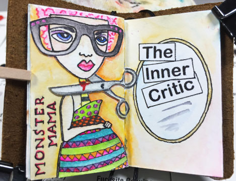
She’s the Mama of all the other monsters!
We each have our own Inner Critic. It’s that voice in your head that tells you you’re not good at something, or that you need to lose weight, or maybe that you’re not pretty/handsome. You know, that voice that makes you feel bad about yourself, what you do, what you want to accomplish. That voice that diminishes your confidence with each whisper.