This post is going to be more about Rust than about art. You have been warned!
As I was working on moving the Hyphae code into TAHGA Lib , I found too much complexity and repetition in what I had done before. What I was doing to modularize it for the library was making matters worse.
The problem was that I needed a structure to define a hypha, a single strand that grows over time until it dies. Then I needed a structure, to define a list of hyphae (for those of you who are confused by these terms: hyphae is the plural of hypha.) The Hyphae struct would not only hold the list of Hypha instances, but some housekeeping information as well. In particular, I wanted to set various parameters there which would affect how the hyphae would grow (for example, a initial growth speed, a maximum speed, etc.) So the Hyphae structure would provide a method to generate a new Hypha struct and add it to the list of hyphae.
Those of you who are paying close attention (all of you, I am sure…) may have noticed that things are getting just a bit unwieldy. Two recent posts, The Return of the Boids and Flying Triangles , both use the Boids algorithm. Likewise, two other posts, Watercolor Stroke and Revisiting the Watercolor Stroke , both rely on the Watercolor Stroke code. What’s more, the Watercolor Stroke is intended to be used in several future projects. This means all that code ends up being copied into a bunch of different programs. This is not very efficient! There must be a better way!!
I recently did a post about the watercolor stroke, a method to add a color wash along a line. I’ve extended this to use multiple colors.
You can still pass it just one color as before, using the color() method. But now there is also a colors() method by which you can pass in any number of colors. Watercolor stroke will choose a color from the list at random, and will use that color until one of two things happens:
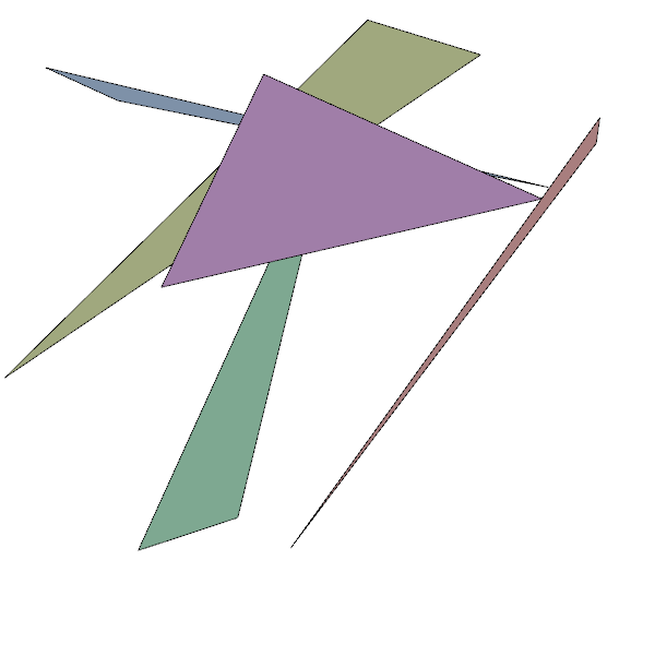
Today, I’d like to try something and see how it works out. Using the Boids work I did recently as a starting point, I’m wondering if I could get something interesting if I grouped boids into groups of three, and instead of drawing the boids themselves, draw the triangles defined by the positions of each boid in each group of three. I’m not sure how well that will work, but let’s give it a try!
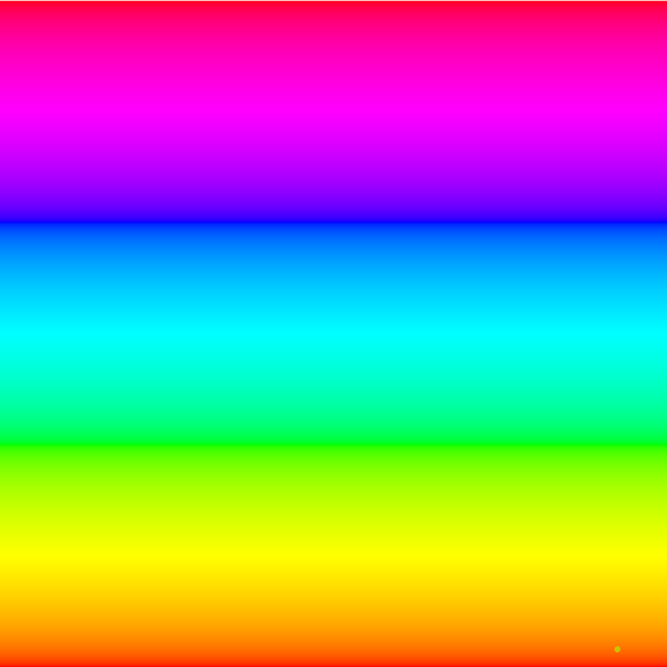
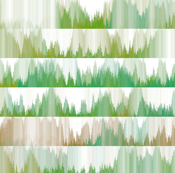
You may have noticed that, in my Nannou apps, I tend to use hsla colors. hsla is hsl plus an alpha channel, a, to control transparency. The hsl part defines the color. hsla stands for hue, saturation and lightness. In this color model, hue is the color itself. You can think if it as being chosen from a color wheel. In many implementations, this number is a number of degrees (0 to 360) or radians (0 to 2pi). In Nannou, it is a number from 0.0 to 1.0. Note that, because of the circular nature of the hue, 0.0 and 1.0 are the same color! Look at the image at the top of this post. It displays hues from 0.0 (along the bottom) to 1.0 (along the top). 0.0 is red. increasing it cycles through all the colors of the rainbow, and back to red at 1.0. If you were to keep going past 1.0, the colors would all repeat. For example, you would find that 1.1 is the same color as 0.1.
Recently, I had an idea about adding a color wash to a line. Suppose, in real life (not digitally,) I made a line of watercolor paint on some paper. Then suppose I took a very fine brush and smeared the paint at right angles to the line. I could go down the line and smear each part of it a different amount. This being watercolor, the darkness of the color in the smear would be greatest if I smeared it just a little, but if I smeared it a lot, the color would become quite light. I decided to try and do this digitally (so I don’t have to clean any paint brushes afterwords.)
A while back , I wrote an article about Boids , a flocking algorithm. I didn’t actually implement it at the time; I just talked about it. Now I have some ideas for using it to create some interesting art, so I thought I’d implement it in Rust and Nannou.
There many examples of Boids implementations on the internet. Mine is a straightforward translation of Ben Eater's javascript example into Rust. Here, we are creating 50 “boid” objects, in random positions around the screen and moving at random speeds in random directions. As they pass close enough to “see” each other, they will tend to cluster into flocks. Each boid is a different color to make it easier to track individual ones while watching the app running.
I find myself, when I start a new project, spending a lot of time setting up a basic app before I get to the point where I can create something fun. I have to create a Rust application, set it up to use Nannou, create a basic Nannou app, test it to make sure it’s working (typos are inevitable, it seems). Then I have to add in any cool features I may have come up with from past apps I have done, which means remembering where I did it and copying in the code. The obvious fix for this is to make a template to use as a starting point for new projects. Unsurprisingly, that’s exactly what I did!
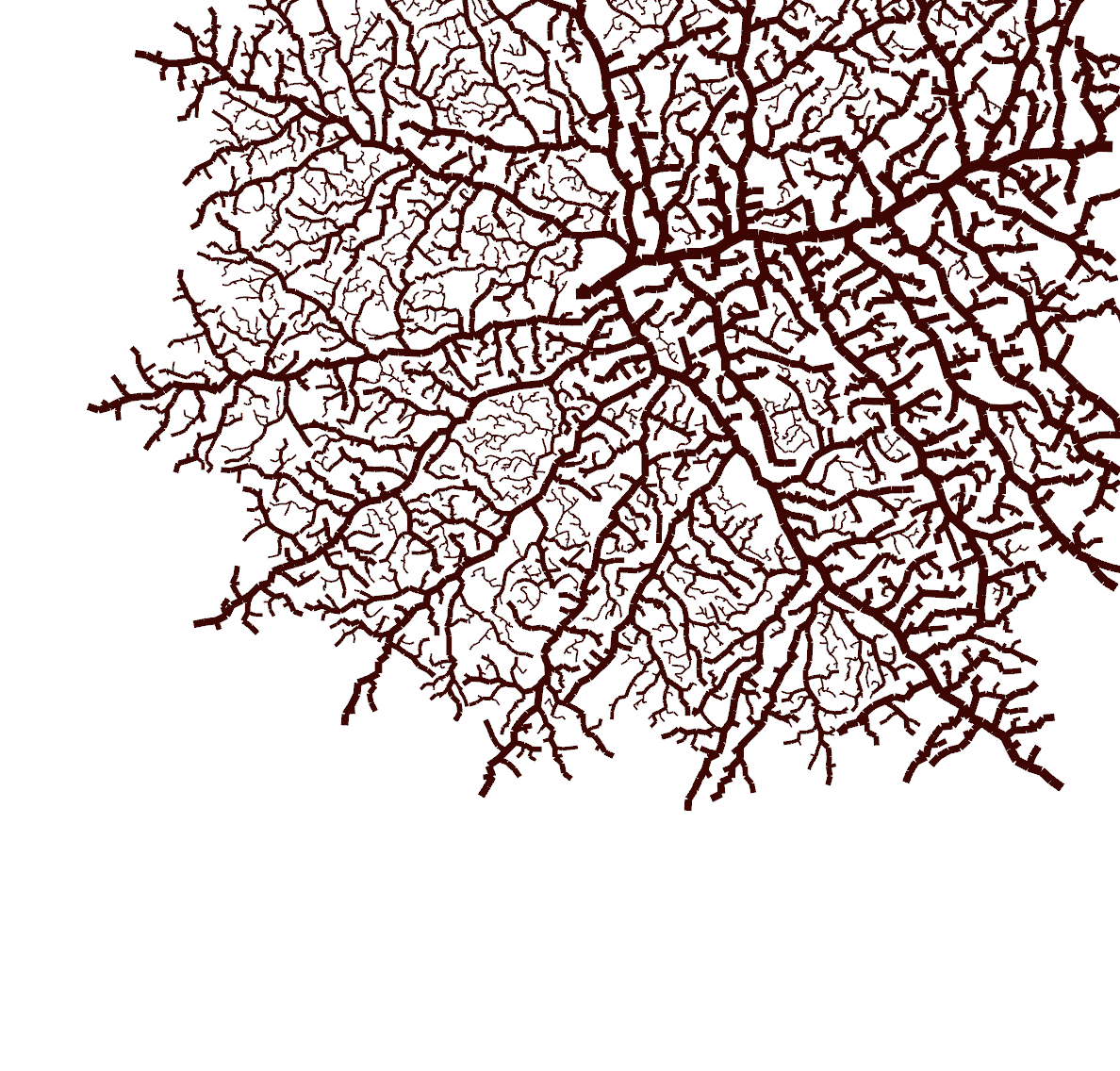
inconvergent has a great article about generative art, with many excellent examples of various techniques. While reading the section about Hyphae , I decided to give it a try and see what I could come up with along those lines.
Hyphae (the plural of hypha) are long tendrils that grow from fungi. They grow from their tips, and will often branch new tendrils. My goal was to come up with a system to simulate their growth by following these rules:
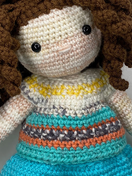
I skipped over pants and shorts to get to the T-Shirt, so that my doll would have a top to go with her skirt. I chose a varigated yarn that I thought would match the skirt. IRL, it matches better than the photographs. The color changes didn’t work out as well as I hoped… I wanted the turquoise up higher on the shirt so it had a different color right next to the blue. However, this isn’t terrible.
Sol LeWitt was an artist who worked in many mediums. and was known for his association with the conceptual art and minimalism movements. As you know if you have been reading my posts here, I am interested in generative art. While Sol LeWitt was not a digital artist, he did do some interesting work in algorithmic art: his Wall Drawings .
LeWitt believed that the idea behind a work of art, rather than the act of producing it, was the actual art work. He rejected the idea that who did the actual work was of primary importance. So he produced instructions (algorithms) for various pieces of art and had others draw them. Some, like Wall Drawing 46 , were very vague:
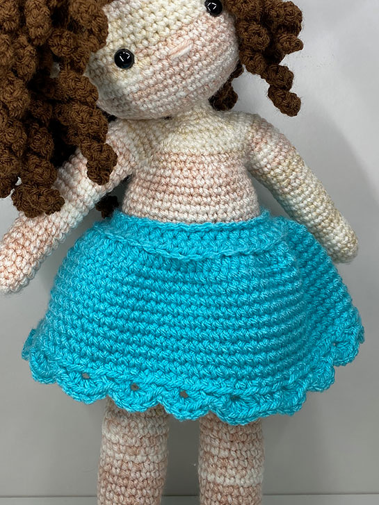
The next article of clothing in the Crochet You book is a cute skirt with a scallop trim on the bottom.
I liked this blue color with the hair and skin of the doll. I also have a varigated skein of yarn that I think will look cute used for a tshirt to go with it.
The skirt is worked in continuous rows around, except for a few rows at the beginning. They are worked back and forth to create an enlarged opening for dressing the doll.
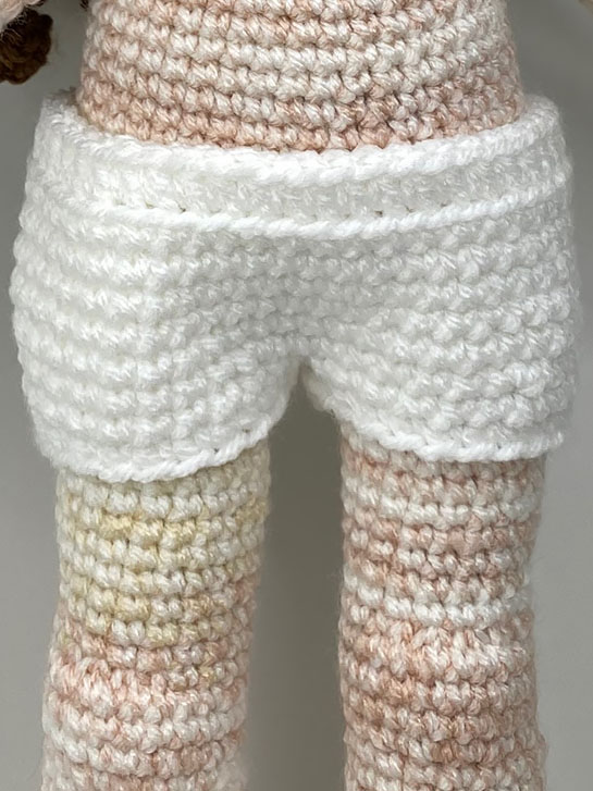
The first clothing pattern in the book was for Underwear. Because I’m not using the same weight of yarn called for, it required a bit of experimentation, but I settled on ILTY from Hobby Lobby in white, and a 3.75mm hook.
The pattern is simple and works up quickly. However, the way the “legs” were done seem a bit awkward to me. The pattern is worked from the bottom to the waist.
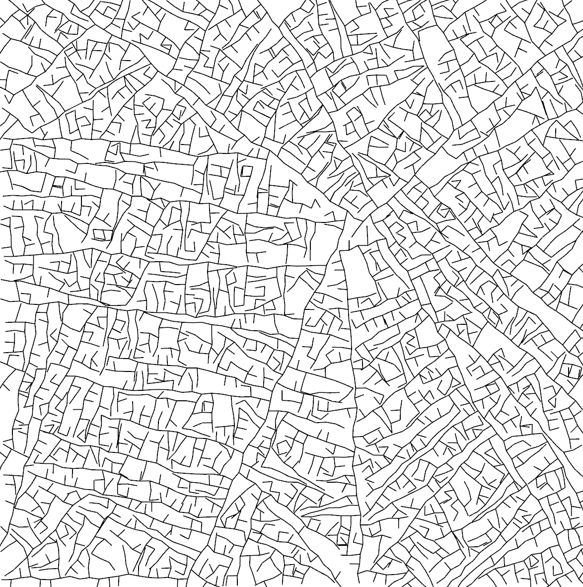
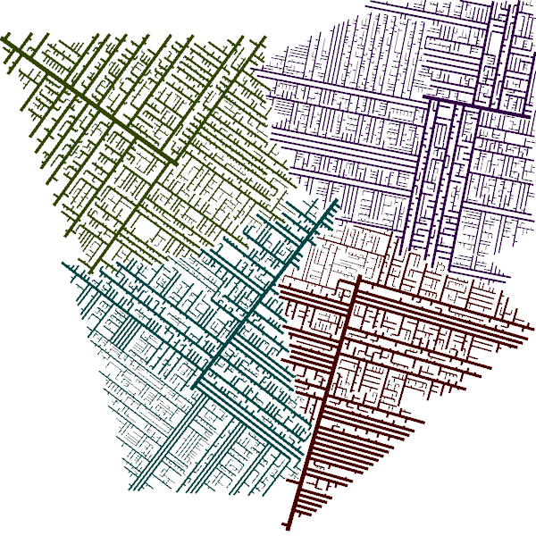
While working on another project (stay tuned!), I came up with this. It’s not what I was shooting for, but I think it’s kind of interesting. It looks a bit like a city street map from a time before urban planning.
What is going on here is that a single particle is placed on the canvas in a particular position and with a particular direction. At every iteration, the particle moves a small amount in its given direction. There is some random variation in the exact direction, but it ends up leaving a straight line, albeit a slightly wobbly one. Also at every iteration, there is a change that a new particle will be spawned and will branch off in a new direction, roughly 90 degrees from the previous particle’s path. A particles “dies” if its next position would leave the canvas or cross another line.
I posted the first installment of this project on March 4th. Finally, after almost two weeks, I’m back on track. Unfortunately, my whole family came down with a nasty virus, and we’ve ALL been sick, including me! I sincerely hope that is in the past, and I can move on with this project!
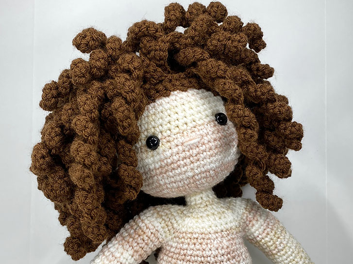
When the body is finished, the next step is to give the doll hair. A kind of wig cap is crochet, creating “rows” by only using the back or front loop of the rows. The wig cap is sewn onto the head, and then individual strands of hair are crocheted into the remaining loops.
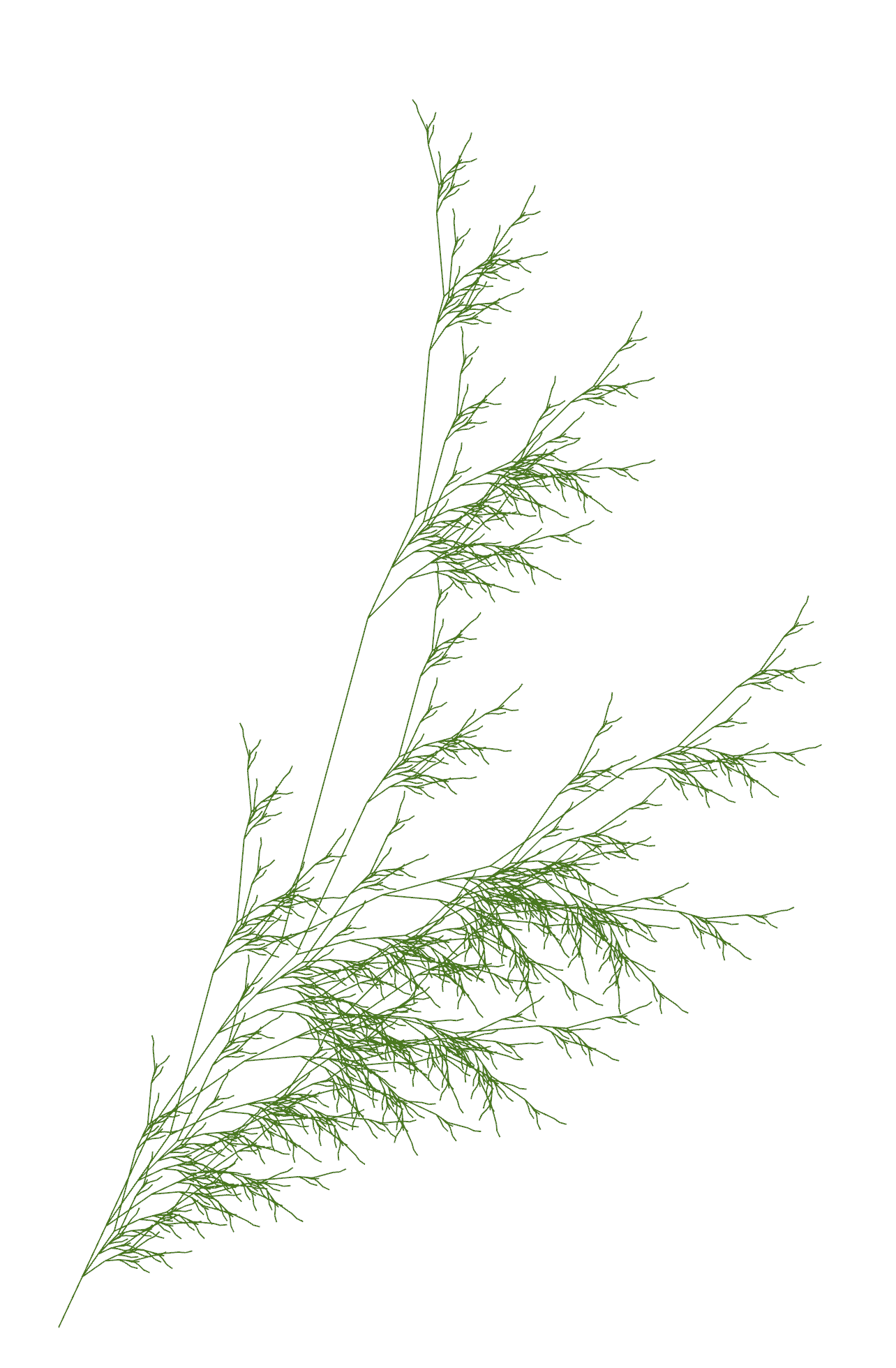
L-Systems can be used to draw plants! To make this work, we need to add some capabilities to our Turtle structure. Up until now turtles could either move ahead or turn. To draw plants, we need to be able to save a turtle state, do some drawing, and then move the turtle back to the saved state. This has the effect of magically teleporting the turtle to someplace it has already been, restoring its position, direction and color.
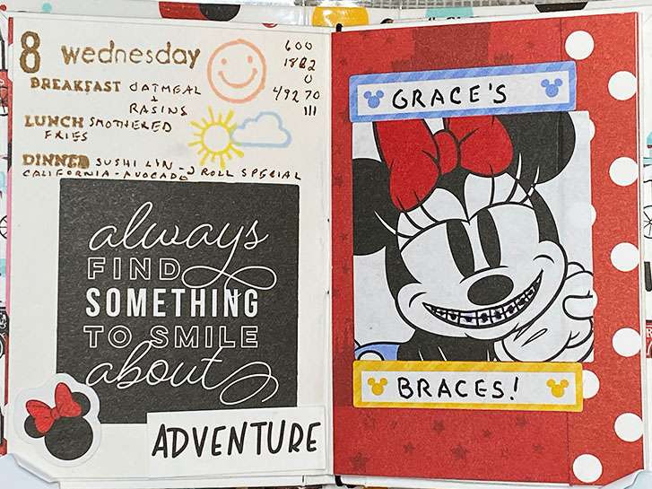
This spread is in the Micky Mouse journal I made last year. One year ago, on this date, the kid got her braces! She chose to have hot pink bands around the brackets, but the technician wasn’t paying attention and she ended up with purple!
I found this image of Minnie in my stash with a big smile, so I modified it to include the braces.
I showed it to the kid. Her comment was “You put THAT in your book????”
Let’s look at L-Systems ! Also known as Lindenmayer Systems, after their inventor, Aristid Lindenmayer , L-Systems are sets of rules for manipulating symbols. They consist of an alphabet of symbols that can be used to make strings, and a set of rules used to transform those strings. When fed a starting string, it will produce a sequence of new strings based on its rules. This was originally a way to formally describe the growth of fungi, algae, etc.
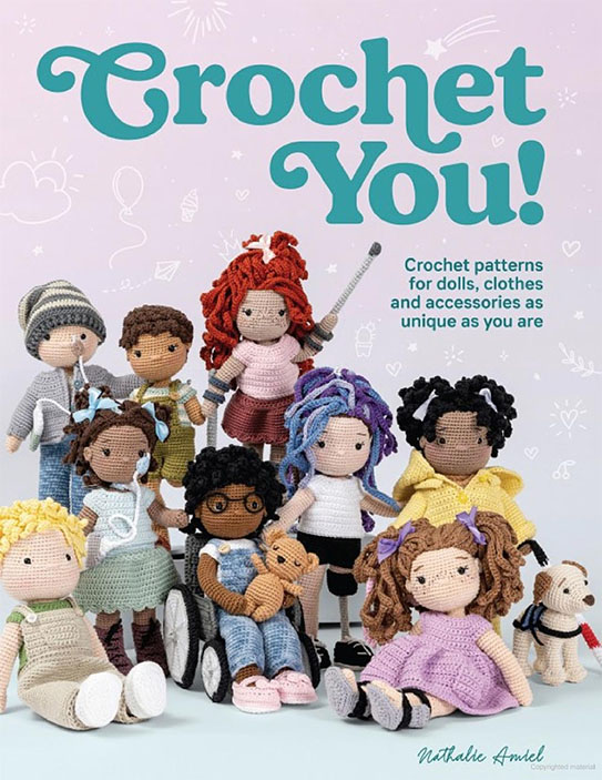
I’ve had this book on my shelves for a while now. I finally felt like I could handle the patterns, so for the last week, I’ve been crocheting the basic doll.
I used I Love This Yarn (from Hobby Lobby) in the “Fuzzy Slippers” color. I use this color a lot to make doll bodies. I don’t mind that it’s varigate shades from white to peach, and I think it makes an interesting doll body.
Turtle graphics are a form of vector graphics. In its most basic form, there is an object that moves around the canvas, leaving a trail as it goes. It’s called turtle graphics because you can think of the object as turtle with a pen strapped to her shell. The turtle can do two things: 1) move in a straight line for a certain distance, and 2) rotate to face a new direction. With a combination of move and rotate commands, the turtle can draw many kinds of objects.