It has taken a lot of persuasion to get Maize to appear… she is extremely shy!
Maize, partner to Trout, is a Corn Singer. She plants, waters, and cares for the tribe’s corn crop. She sings to the stalks so they grow tall and strong. She sings to keep away pests. She sings so the corn provides a bountiful harvest for the tribe.
Maize takes her coloring from the dried ears of native corn. She often takes her winnowing tray with her on outings because it is very handy for carrying lots of things, including the smaller fish Trout catches.
Today, we’ll try to come up with something interesting based on the noise concepts we discussed in the last two posts. We’ll put some dots (which we’ll call particles) randomly on a canvas and have them move according to rules based on our noise functions. This will create streams of particles; we’ll be able to see their paths on the canvas. In a fit of not-very-creative naming, we’ll call our project Streams. This project is based on a similar project from the SARPEX blog and uses many of the concepts found there.
Last week we talked about noise, specifically Perlin noise, which lets you vary a value randomly but incrementally, leading to a slowly changing value. We used it to draw the outline of a mountain range, but it can be used anywhere you need a value that changes a tiny amount at a time.
Conveniently, this also works in two dimensions. In 2-dimensional noise, the x and y axes each have their own noise, and (and this is important) they are not the same. So instead of asking the noise generator for a value at a position along a line, you have to pass it two values; you are asking for a value at a position on a plane.
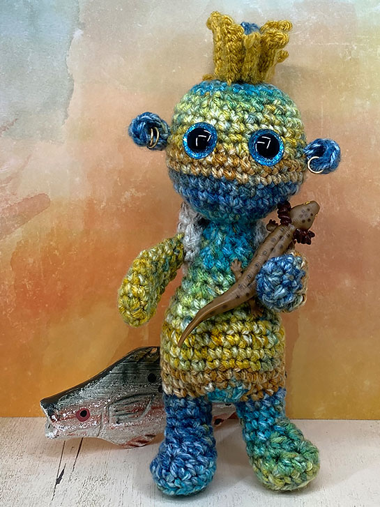
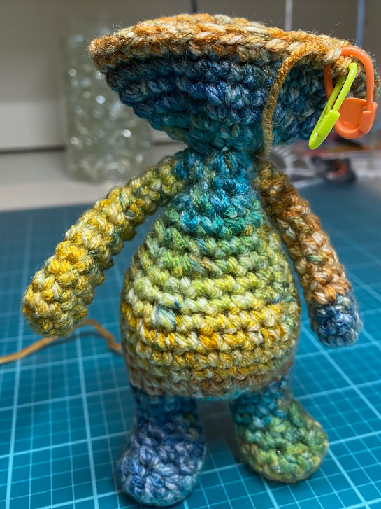
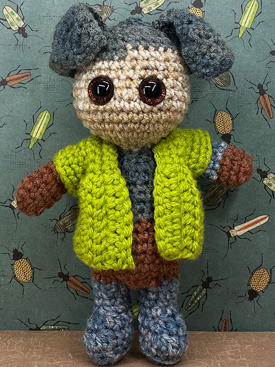
This is Trout. He is one of the tribal hunters. He specializes in fish tickling and various aquatic foods. Fish tickling is a skill that requires immense patience, and careful movements. His coloring is designed to camouflage him so he can glide through the streams, rivers and lakes to find his prey.
This Impkin has Type 2 Arms* with the Standing Body Type 2*. His head fin is actually two Fin Ears* stitched together, back to back and then sewn to the head.
This is my current Impkin. He’s in a partially completed state because I didn’t get anything done last week. Instead, I’ve been riding the Vertigo Merry-go-round, which is a lot of no fun.
However, I am pushing through, slowly, to what is normal for my life.
So far, this Impkin has Type 2 Arms* with the Standing Body Type 2*.
I loved this yarn as soon as I saw it in Hobby Lobby. It is I Love This Yarn brand, color Amber Honey. I love to make Impkins from varigated yarns that are more mottled, making each stitch slightly different, rather than those yarns that change color abruptly. While both will work and can be very effective, this type is my favorite.
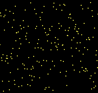
Sometimes you just want to make some noise! In drawing terms, that means you don’t want a boring straight line; you want a straightish squiggly line which looks hand-drawn. Or you don’t want a flat surface, you want it to have some texture. You can generate these kinds of effects by adding some random noise, but how? There are a couple of ways to do this. We’ll cover some simple examples here.
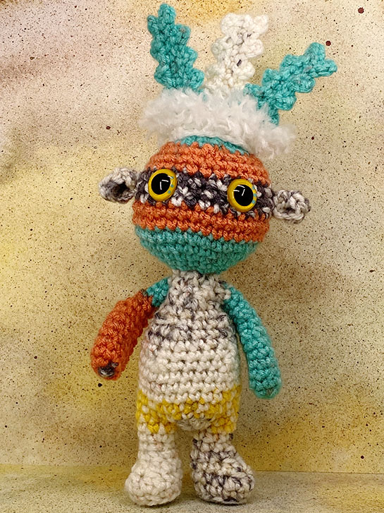
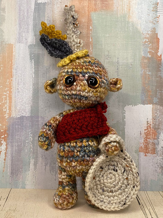
This is a Sky Singer. Sky Singers are the keepers of the day. They watch the skies for signs, to pass on to the Earth Keepers and the Plant Growers.
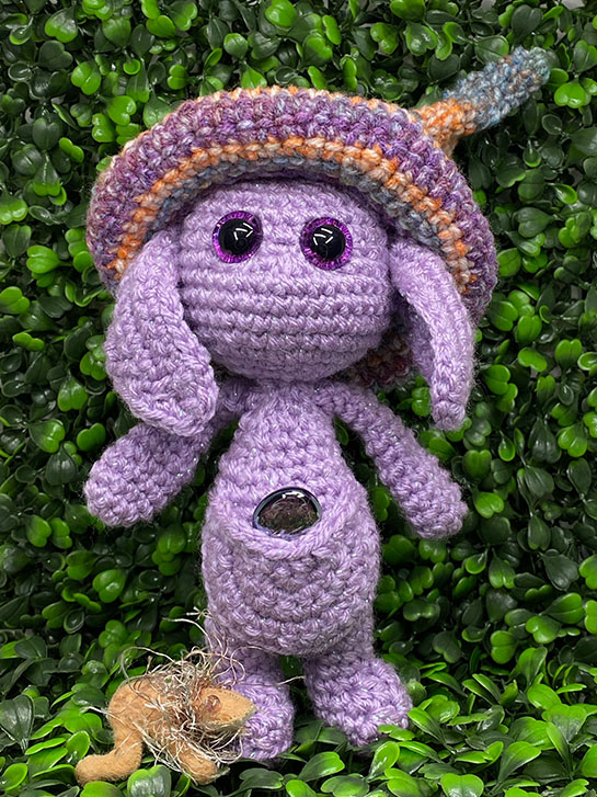
I often see many mythical creature impkins posted in Megan’s Crafty Intentions Facebook group. However, most of them are elven, forest, or magical beings from more northern European ideology.
I wanted to take this mythological concept in another, more tribal direction. When I saw the Painted Canyon color way from I Love This Yarn at Hobby Lobby, I knew exactly what I wanted to make.
Welcome to February!
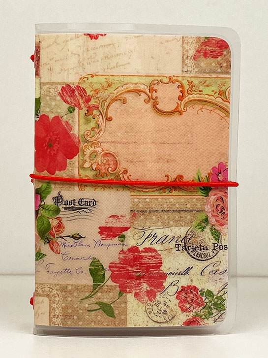
This month I am focusing on a theme of Romance. Valentine’s Day is February 14, so it seems appropriate. I’m going with roses and other flowers, pink, red, white and gold, hearts and other items associated with romance.
Above is the cover I’m using for my micro art journal. I used this one last year and I liked it so much, I’m going to use it again.
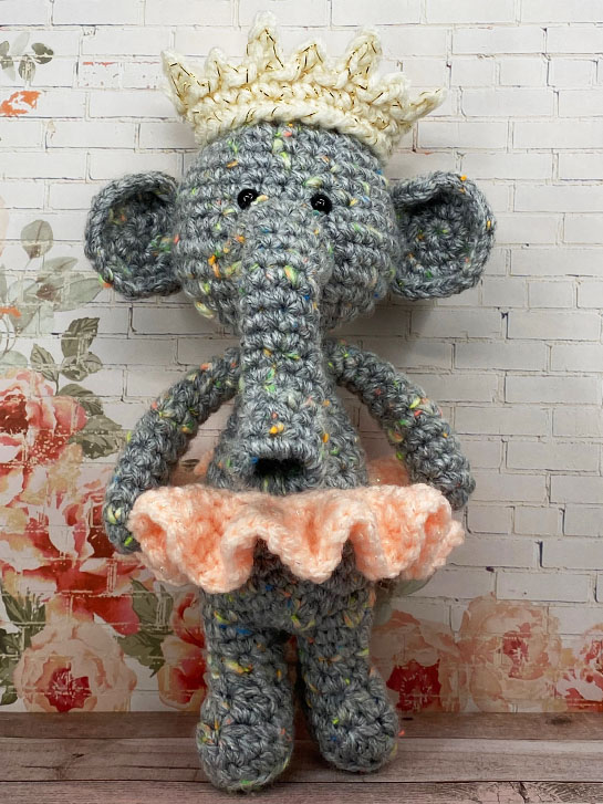
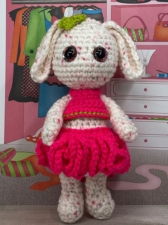
I’m so happy to introduce you to Ellowyn Hortensia Elephanta, a Prima Ballerina. If you know her well, you may call her by her nickname, Ellie.
She has Type 2 Arms* with the Standing Body Type 2*, along with Large, Round Ears*, and a lovely curved Snoot*. She also has a small, thin improvised tail with a few hairs at the end.
Since she is constantly dancing, you will usually find her dressed in her favorite Tutu* and wearing a Wide Crown* with golden touches.
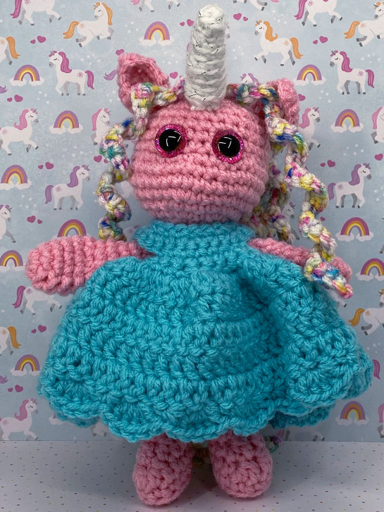
Meet Pinkie Pony! She’s a very outgoing MLP** Impkin Cosplayer. She loves to dress up and appear at various Comicons across the U.S.!
Pinkie has Type 2 Arms* with the Standing Body Type 2*, along with Pony Ears*, and a Unicorn Horn*. She also has a lovely, rainbow colored, Long Curly Mane*, of which she is very proud!
This little impkin demanded a “party dress”. I didn’t have the heart to say no, so after several attempts, I came up with this lovely blue dress.
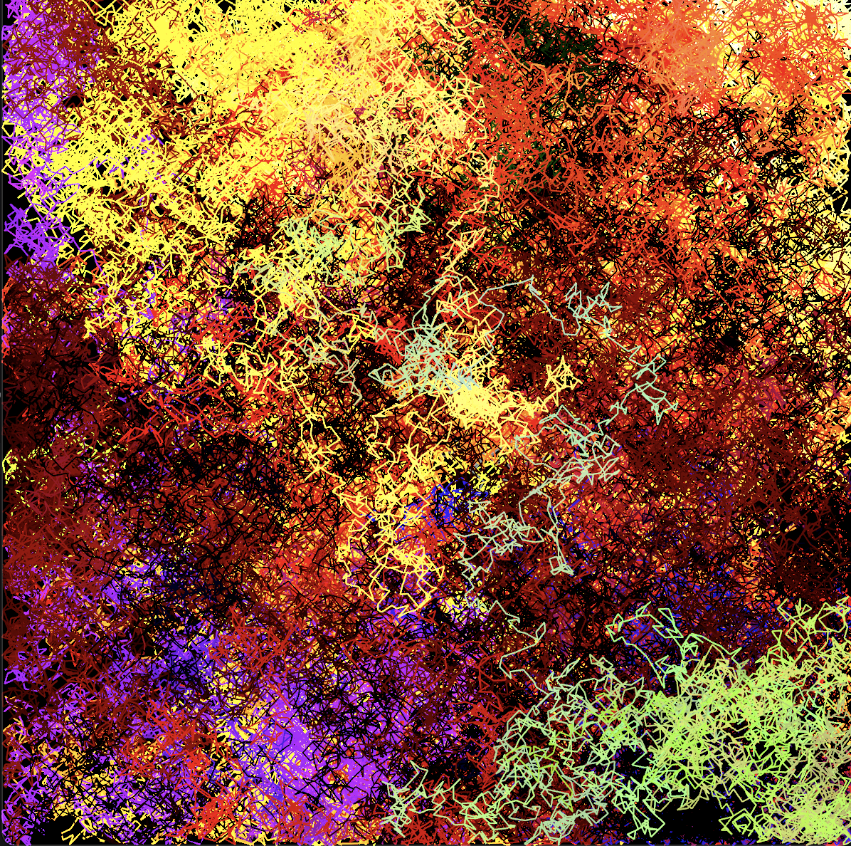
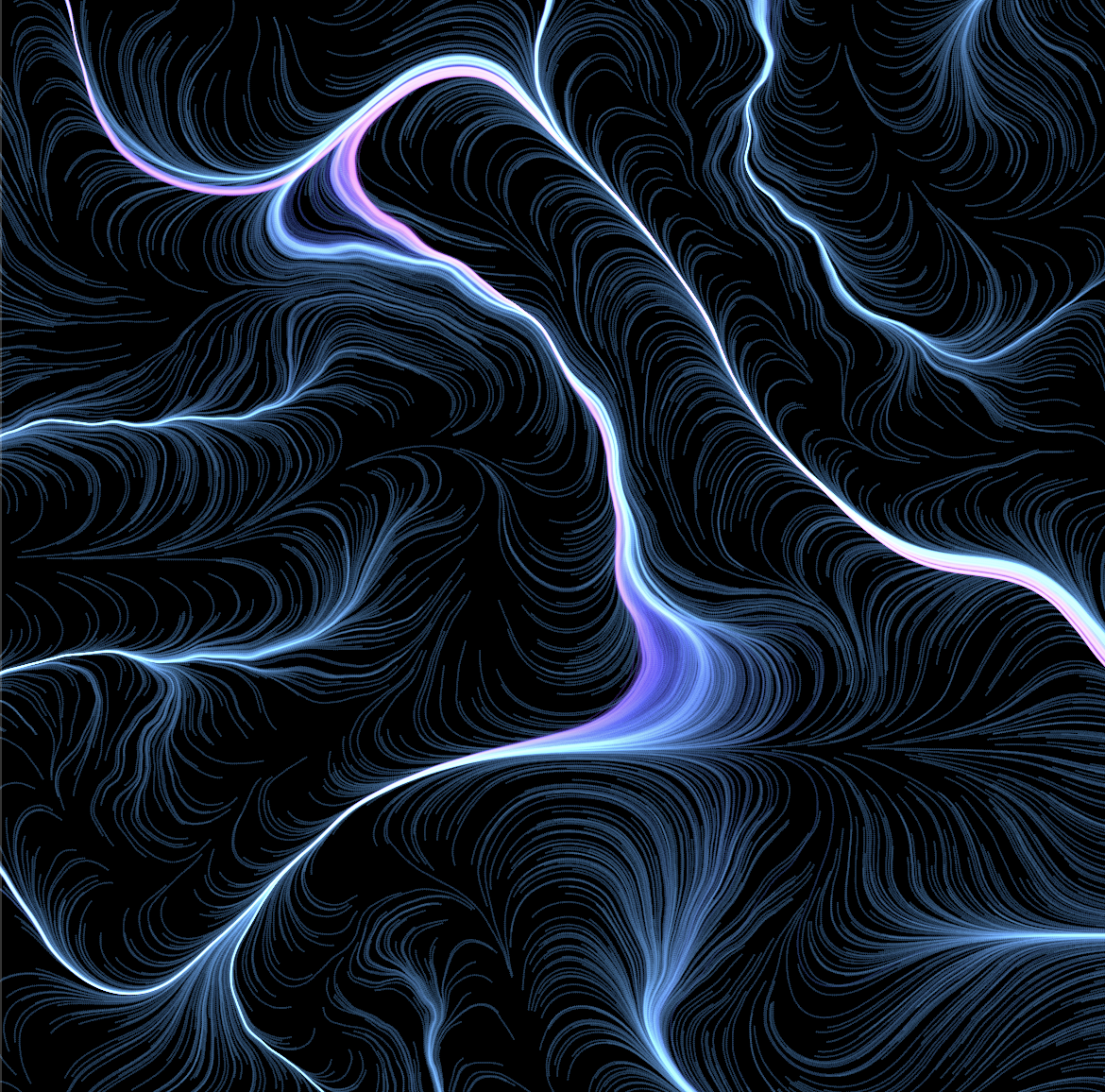
Way back when I did my very first The Artist's Husband post , I used Javascript and p5.js to create a drunken lines drawing, a drawing where the direction of a line (as well as its color) is chosen by random. Doing this over and over again eventually fills the windows with a colorful image such as the one at the top of this post.
Here is a Nannou app which does pretty much the same thing:
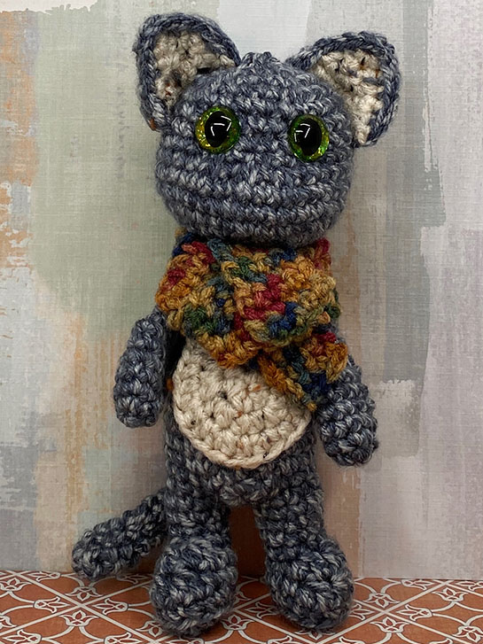
This is Toby Faraday. He’s an old, curmogenly type who’s currently trying to figure out where he put his glasses. They’re probably sitting on his desk, in his study, but he can’t find them… because he’s not wearing them!
This impkin has Type 2 Arms* with the Standing Body Type 2*, which is my personal favorite. He also has a Panel Belly*, Cat Ears* and a Cat Tail*.
Toby is often seen with one of his collection of scarves because he’s always too cold. The Scarf* in this case was made using warm, fall colors.
This is Charles. Actually, his full name is Charlemagne Puppington III, but he doesn’t like to tell anyone that, preferring everyone to just call him “Charlie”!
Charlie is an Entomologist and an upstanding member of the Royal Canine Entomological Society. He spends all of his time outdoors hunting down new and interesting species, and often testing them for their culinary adaptability… by eating them! So far, only a few of his subjects have bitten him back, but he has suffered through a few trips to the doctor for bad reactions.
Who’s your favorite fashionista? I’m sure Brie Blanc knows all about them and has some strong opinions about their clothing choices!
Often, Impkins tell you want they want to be, and what accessories they wish to have while they are being made. That was certainly the case with this one! She wanted an outfit that was high design and was hot pink trimmed with green, and I had no idea how to make it.
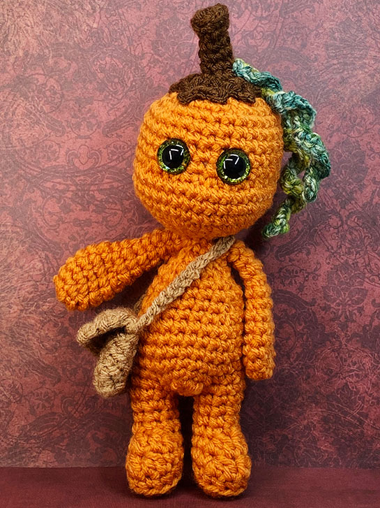
While she’s a bit out of season, today I’m introducing Pumpkin Spice. She’s a fall kind of gal, venturing out to collect her latte from Starbucks, and gathering up cinnamon, nutmeg and vanilla spices and flavorings which she stores in her every-present Sachel*.
This was the third Impkin that I made. She has Type 2 Arms* with the Standing Body Type 2*. Like every proper pumkin, she wears her Pumpkin Stem Cap* atop her head.
In my last post , we set up a basic sketch in Nannou. This week, we’ll look at a Nannou app. A Nannou app is like a Nannou sketch, but with more capabilities and tighter control of what is happening. They are very similar; in fact a sketch is just a shortcut for an app when you don’t need the features an app provides. This can save you some typing.
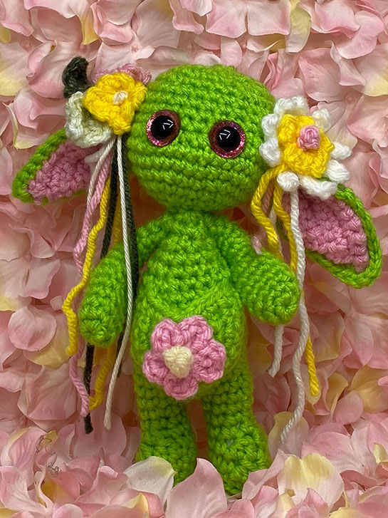
Please say “Hello” to Cherry, a Wood Nymph Impkin. Cherry is most often seen in the Spring and early Summer playing and gathering herbs and flowers in meadow openings, and beside small brooks, in between the trees.
This was actually designed by my 13-year old! She sketched out everything she wanted and then gave me the drawing. She did a great job, incuding detailed information.
I let her pick out all the yarn colors and went to work.
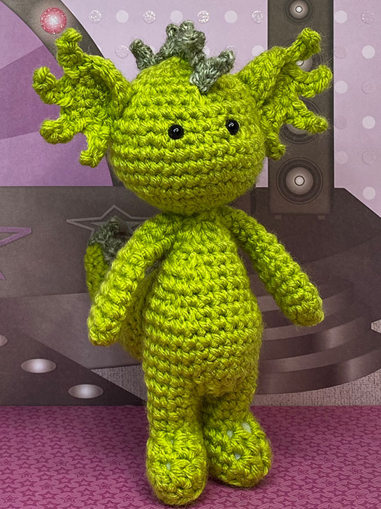
I’d like you to meet Elvis, an Impkin Dragon. Elvis is a musician, and loves to DJ for the other Impkins!
I started this character with Arms, Type 2* and Standing Body, Type 2*. My intention was to create a dinosaur, because that was what that skein of yarn was crying out to be. I did add the Dinosaur/Dragon Tail* before this little one woke up and his personality emerged.
Periwinkle is my second impkin. We’re not going to talk about the first one. It was a “learning experience”, LOL!
I wasn’t exactly sure how she would turn out, given that I chose the yarn for her body and her hat before I had a clear image. I just knew I wanted to use those yarns. I chose the Arms, Type 2* and Standing Body, Type 2* for her, picked up my hook and began.
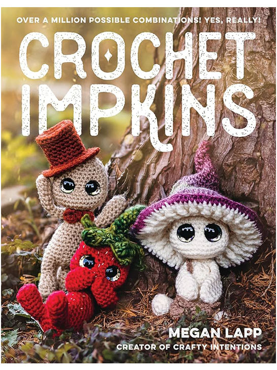
Today, I wanted to introduce you to the Crochet Impkins book by Megan Lapp , owner of Crafty Intentions! .
Megan is a gifted pattern designer who specializes in unique, fantasy-based crochet designs. Her patterns are very well written, clear, and easy to follow. While she suggests that you have a good grasp of basic crochet stitches, and be at about an intermediate level, she actually has patterns that suit every skill level from beginner to advanced.