I’m finding that, if I choose carefully, a project takes me about a week to complete. I don’t crochet all day, every day. Just when the time allows. But I’m getting a better feel for how long it takes me to complete something.
So I was cruising around on Etsy, and I found an adorable pattern that looked like it wouldn’t be too difficult, but it would be fun when completed.
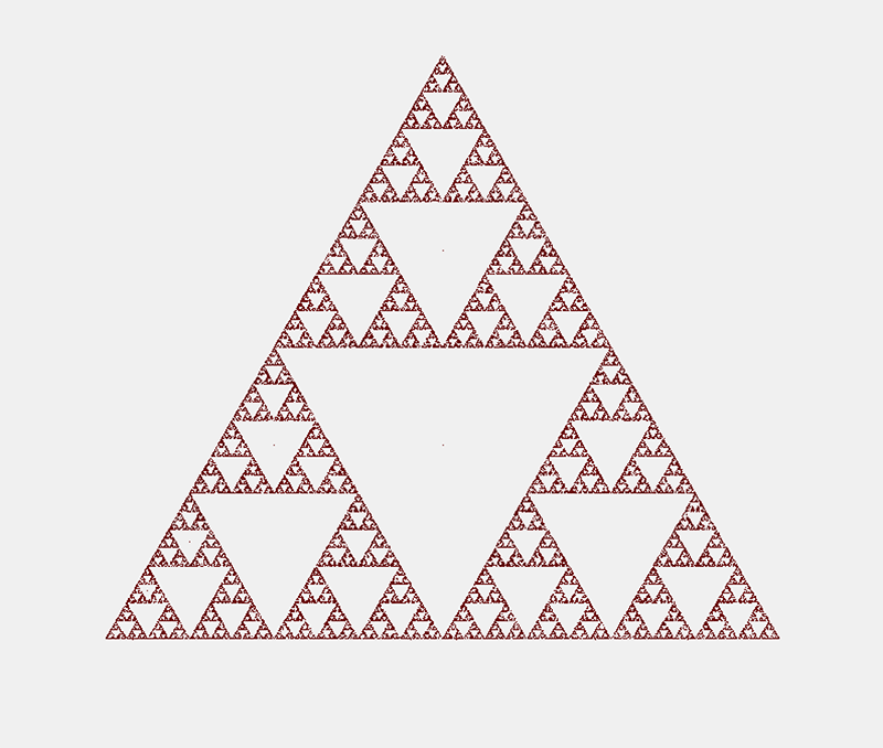
Today, we’ll play The Chaos Game! It’s easy to play, and it goes like this:
First, put three points on your paper. These will be the vertices of a triangle (so don’t put them in a straight line!) Any triangle will work, but be sure to leave lots of area inside where the triangle will be to make it easier to see what it going on.
Next, you need a way to randomly choose one of those vertices over and over. You can roll a die, and if you get a 1 or a 2, that could reference the first vertex, a 3 or a 4 could reference the second vertex, and a 5 or a 6 could reference that last vertex. If you are a Dungeons and Dragons player and happen to have a 3-sided die, feel free to use that!
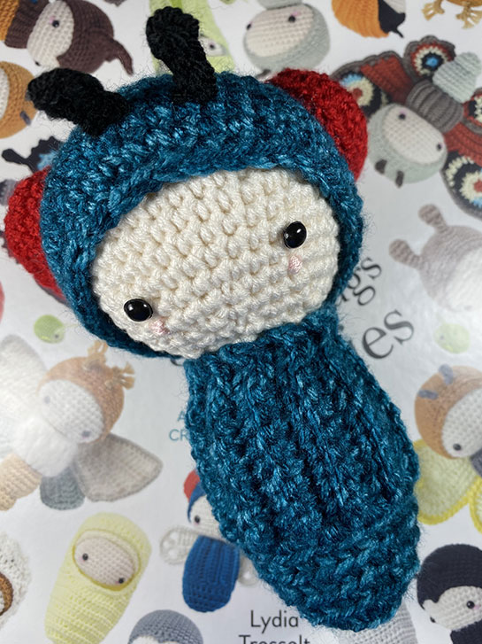
It’s hairdo day for my little doll! I think she’s very cute!
This hairstyle is a wig that is crocheted flat and then stitched together. Next time, I will choose a lighter weight yarn, as this turned out a bit heavy. Fortunately, the “stub” neck style is very sturdy, and the head isn’t flopping over.
I have to say, making the “curls” wasn’t a lot of fun. It was difficult to get the hook through the chain after each section of 2 single-crochets.
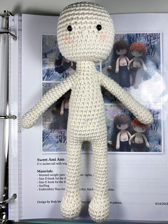
I’m so excited! Isn’t she cute!
Her head came out perfectly and, as far as I can see, I didn’t make any mistakes!
That’s a first!
Now, to try crocheting her some hair! I think I’ll make her a dark blonde. Just dark enough to provide contrast to the body, but lighter than brown.
Stay tuned!
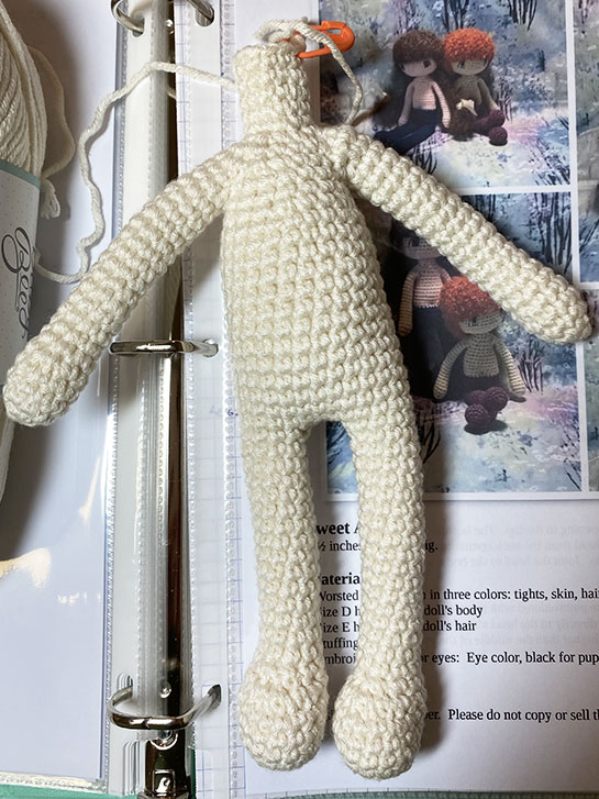
I’m taking a short break from the Bina the Bear pattern because I found a cute, crochet doll pattern, for free, on Ravelry . It is Sweet Ami's by Beth Webber.
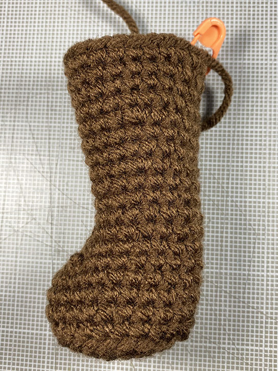
I only had a minor problem, with the left arm, but I’ve gotten this far without any major issues. I’m much happier with the tops of the feet for this project. They are much better than Bina’s!
Next I have to make the head. It is done separately and then attached. It looks pretty easy, so I should be able to get it done in one day.
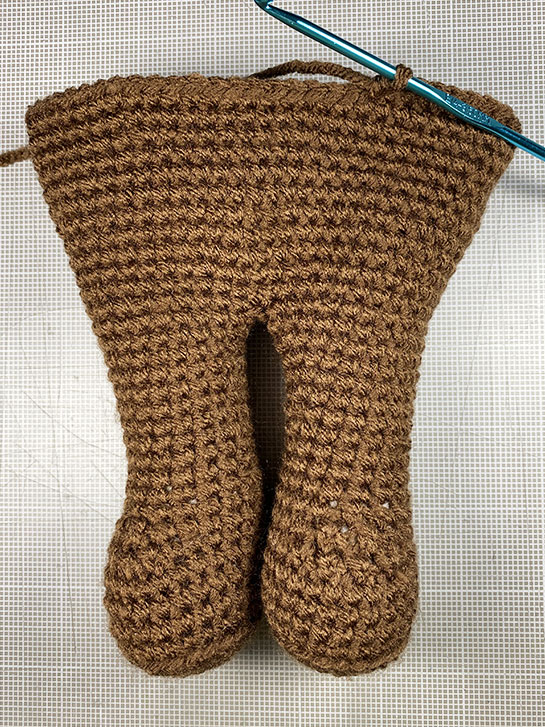
The largest part of this project, the body, is almost done. I did make some mistakes, but about half-way through, I got the hang of it. After that, things got much better!
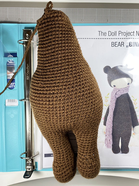
After a few more rows, I have to do the tail, and stitch it to the body. Then, I can move on to the arms.
Bina is starting to shape up.
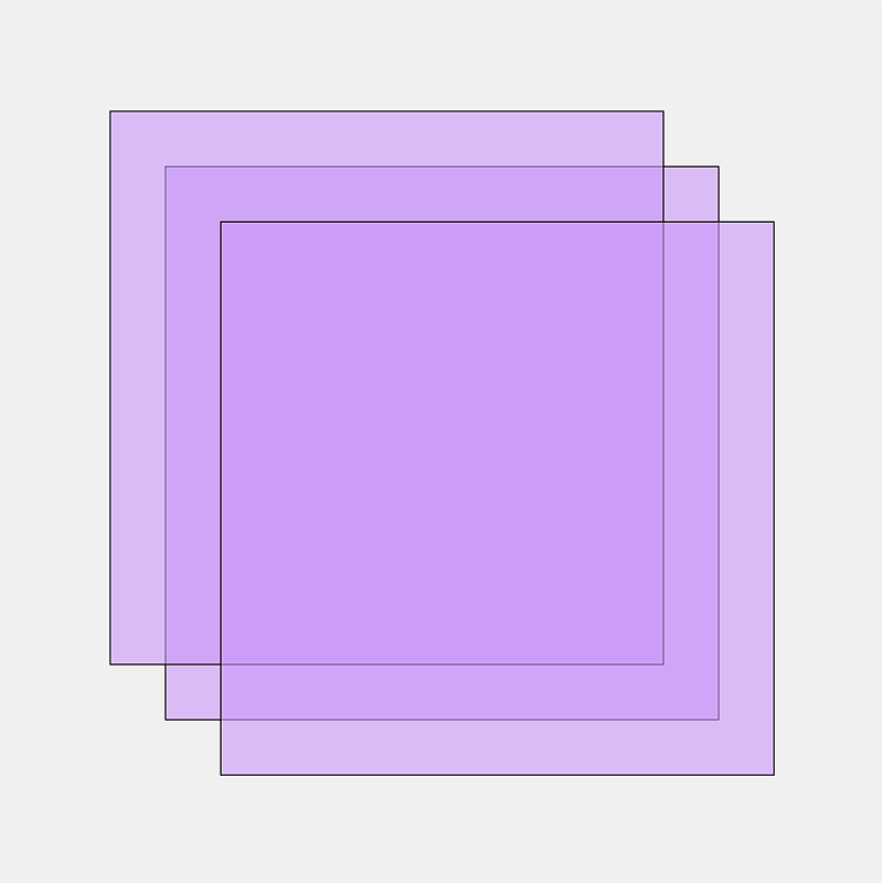
Let’s draw some squares!
Last week I introduced Clojure as a possible replacement for Javascript for my generative art pursuits. Clojure has the Quil library that provides many of the same capabilities that p5.js provides to Javascript. Let’s look at a simple example. This Javascript/p5.js program generates an image like the one at the top of this post.
function setup() { createCanvas(800, 800); background(240); stroke(0); let size = 500; let offset = 50; let centerX = width/2; let centerY = height/2; let topLeftX = centerX - size/2; let topLeftY = centerY - size/2; fill(200, 150, 250, 150); rect(topLeftX, topLeftY, size, size); rect(topLeftX-offset, topLeftY-offset, size, size); rect(topLeftX+offset, topLeftY+offset, size, size); } The program is fairly simple: create the canvas, fill in the background with grey, set the stroke (line) color to black, set the fill color, and draw three rectangles slightly offset from each other. If you’ve been following along with my previous posts, this looks pretty basic. The only remotely tricky thing going on here is that the fill() function has a fourth parameter. The first three set the red, green and blue components of the fill color, while the fourth sets the transparency. This is what allows us to see the through the squares, and is what causes the gradations of color where the squares overlap.
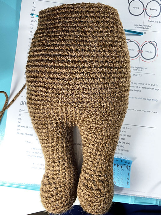
This body is growing. I’ve added stuffing to the feet, legs and part of the body.
It’s fun to see this shape up, but I now realize one leg seems to be a row shorter than the other.
I bought a new row counter, so maybe that will help?
Well, I have two legs and got them crocheted together.
And I’ve learned some things:
I don’t know how to do the invisible decrease properly, I have holes at the top of the feet, where the stuffing shows through. They just look messed up to me.
Crocheting on dark yarn requires good light. I keep messing up the stitch count. I think I may be skipping over a stitch occasionally because I didn’t see them.
I finished the first bug from the Lalylala book. So I feel ready to tackle a bigger-sized project.
I’ve chosen another Lalylala, but this time from her Doll Project. Bina the Bear , appears to be the first one, since it says No.I on the instructions. I figure it will be the least complicated and give me practice with the basic project without any additional things added, other than ears and tail. And both of those look fairly easy.
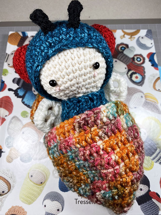
I finished all the parts for the blue bottlefly! I am so happy with the way she turned out. And I am happy that I am giving crochet a go. Some parts have been a bit of a struggle, but mostly, it’s been fun!
The wings were easier to make than I thought they would be. I was worried, because there was a graphic “chart”, but the instructions were also written out. I didn’t really have any problem following either, after I understood them.
If you’ve been reading my posts each week, you’re probably aware that I have been working mostly in Javascript, using the p5.js drawing library. There are many things to like about Javascript, but also many ways for it to slowly drive you bonkers. I won’t go into all those reasons here, but I will say it’s time to try something new. I’d like to try to do some generative art using the Clojure language. This is way out of my comfort zone, since I don’t actually know Clojure, and it is not a simple language, but I thought I’d share my experiences with it here.
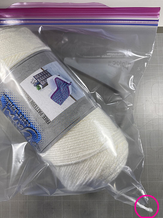
As I am purchasing yarn for amigurumi, I need a way to store it, use it, and keep it clean.
I came up with this idea yesterday morning, but I’m sure I’m not the first person to ever think of it.
This is a gallon ZipLoc bag, which fits the yarn nicely. I cut off one of the bottom corners, and thread the working yarn through the hole. Then I sealed it.
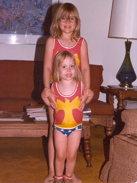
Anybody remember Underoos ? I think I see a few hands out there!
My daughter’s each got a set of Wonder Woman Underoos for Christmas one year. I’m guessing this is 1978, which would make the younger one about three years old. I’m sure someone will correct me.
They still make a form of Underoos! I found them on Amazon .
Apparently they are for adults now.
Yesterday, I made the “body suit” for the fly. It’s made from the same yarn as the hat.
I got to learn how to crochet something that is flat and basically rectangular. In addition, this has a pattern to the upper part. I’m not totally sure if it’s right-side out, since I lost track of which was the front and which was the back side of the piece. But other than that, I think I did ok with it!
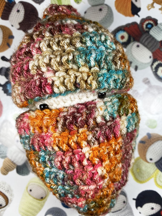
The pupa was sitting very quitely in the corner of my desk most of the day yesterday. Towards the evening, though, I noticed it rocking a bit. This morning, I saw a pair of little eyes peeking out, and shortly after a beautifully transformed head! Now she is looking much more like an adult Blue Bottlfly with huge red eyes!
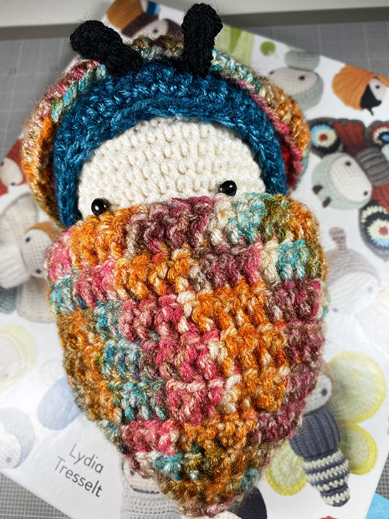
Seriously, I worked and worked on this hat. It took several rounds of crochet followed by several froggings… But I finally got it! The eyes were actually the hardest, to make sure they matched each other! The antennae were super easy, surprisingly. Stitching it all together turned out to be easier that I thought it would be also!
The Entanglement library has a few grid-based tangles now: Huggins, W-2 , Ambler and Emingle. But we have limited control over the grid: we can affect the spacing in the x and y directions, and we can add some random fluctuations to where each intersection on the grid ends up. Wouldn’t it be nice if we could warp the grid in some more dramatic ways? Yes, I thought so too! So I spent some time adding some more grid options. This turned out to be harder to do than I thought it would be – I ended up having to rewrite big chunks of the Tangle class, then I ended up subclassing Tangle and creating a special class just for grid-based tangles: GridTangle.
I did it! And with a minimum of frogging!
During the pupa stage the white, characterless maggot takes on the form of an adult fly. This is the pupa for my fly amigurumi. I love the way it’s little eyes peek out of the casing!
As you can see here, she is just beginning her transformation. After we’re done playing, she will go to sleep and wake up as an adult blue bottle fly.
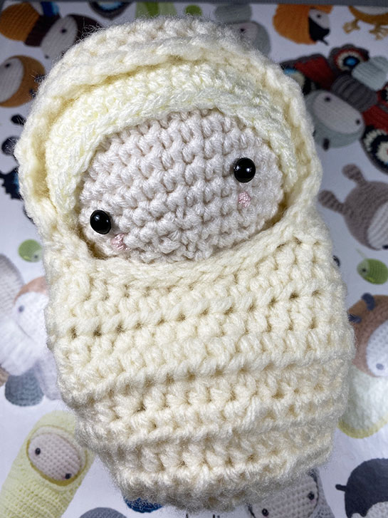
Well, I think I’m getting a bit faster at making mistakes, LOL! Seriously, this is the little, hooded sleep sack that turns the larva into an “egg”.
I learned how to do Half-Double crochets, how to increase them and decrease them. I did NOT learn how to “turn, chain two, hdc 1” very well. I had difficulty with this step. I also messed up the counting for leaving the opening in the sack, so it’s actually in the wrong place. But I kept going because I figured I was into it this far, I might as well finish it.